

These are the docs for the Metabase master branch. Some features documented here may not yet be available in the latest release. Check out the docs for the latest version, Metabase v0.49.
Line, bar, and area charts
They’re pretty useful.
Line charts
Line charts are best for displaying the trend of a number over time, especially when you have lots of x-axis values. For more, check out our Guide to line charts and Time series analysis tutorials.
Bar charts
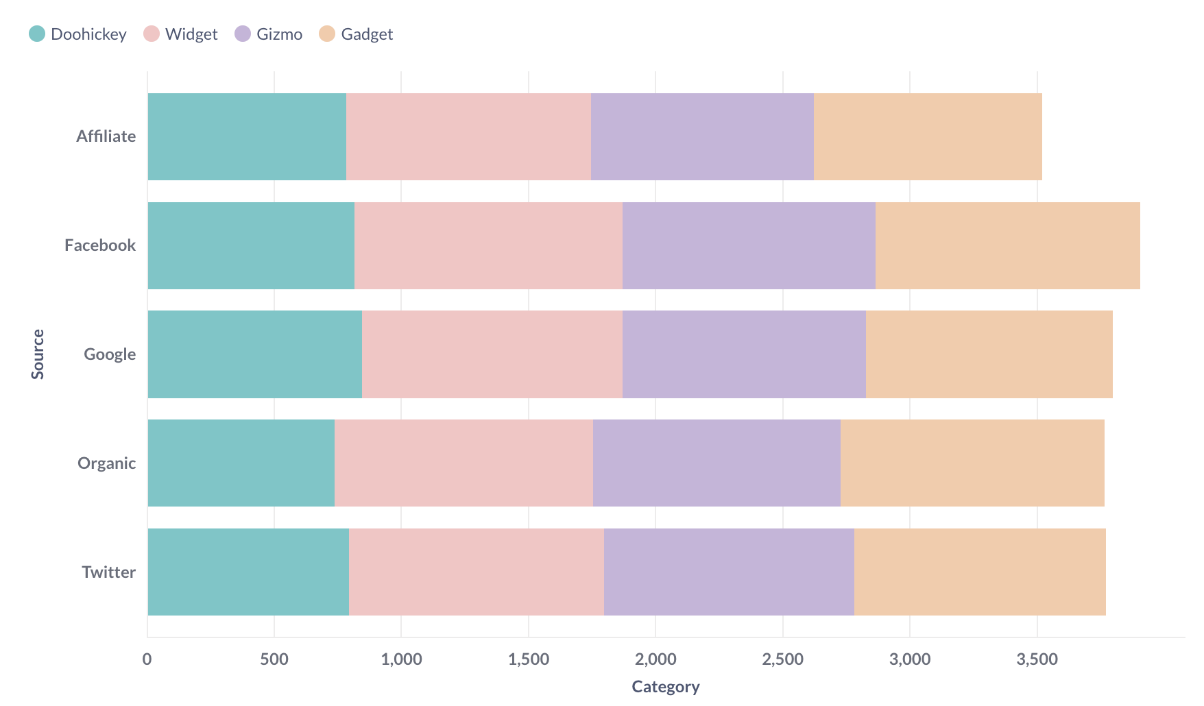
If you’re trying to group a number by a column that has a lot of possible values, like a Vendor or Product Title field, try visualizing it as a row chart. Metabase will show you the bars in descending order of size, with a final bar at the bottom for items that didn’t fit.
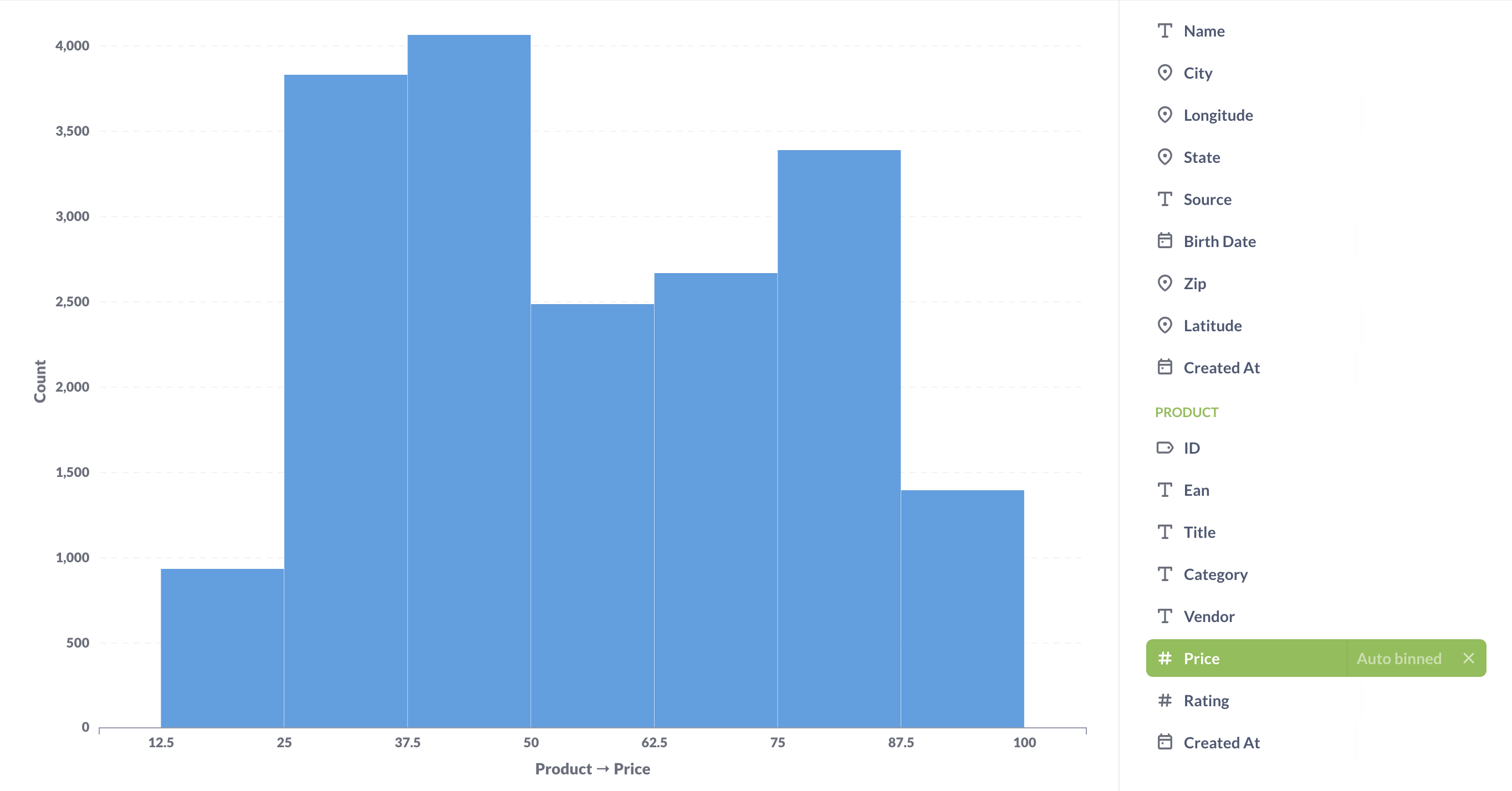
If you have a bar chart like Count of Users by Age, where the x-axis is a number, you’ll get a special kind of chart called a histogram, where each bar represents a range of values (called a “bin”). Note that Metabase will automatically bin your results any time you use a number as a grouping, even if you aren’t viewing a bar chart. Questions that use latitude and longitude will also get binned automatically.
Histograms
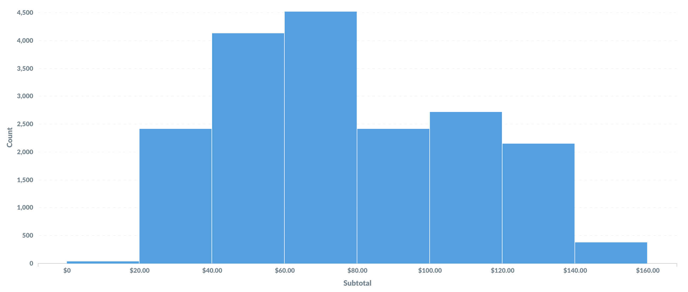
By default, Metabase will automatically choose a good way to bin your results. But you can change how many bins your result has, or turn the binning off entirely, by clicking on the area to the right of the column you’re grouping by:
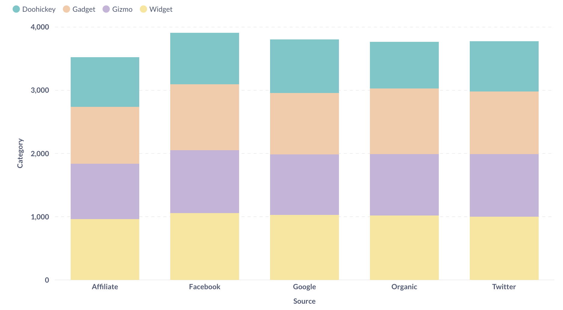
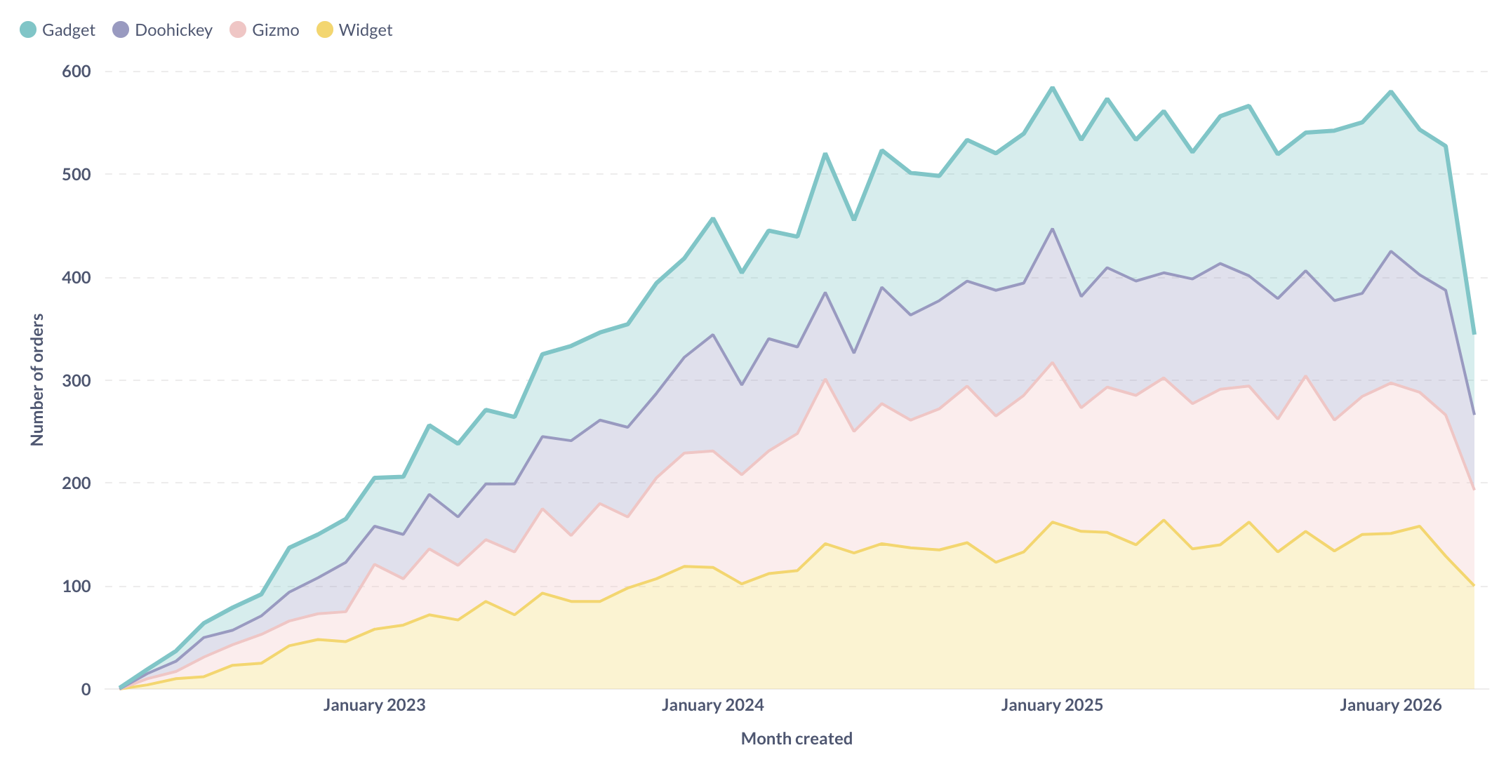
Area charts
Area charts are useful when comparing the proportions of two metrics over time. Both bar and area charts can be stacked.
Options for line, bar, and area charts
These three charting types have very similar options, which are broken up into the following:
Trend lines
Trend lines are another useful option for line, area, bar, and scatter charts. If you have a question where you’re grouping by a time field, open up the visualization settings and turn the Show trend line toggle on to display a trend line. Metabase will choose the best type of line to fit to the trend of your series. Trend lines will even work if you have multiple metrics selected in your summary. But trend lines won’t work if you have any groupings beyond the one time field.
Data
In the Data tab, you can choose which columns you want to plot on your x and y axes, which is handy when your results have more than one column (like in a series breakout).
You can also:
- Add another series to add another time series to the chart.
- Add a series breakout to view your current metric by another dimension (though you can’t add an additional series breakout if you have more than one metric/series).
To reorder series and breakouts, drag and drop the sidebar cards to rearrange them. On line charts and unstacked area charts, reordering will change the order of series in the legend. On bar charts and stacked area charts, reordering series or breakouts will also reorder the bars or areas.
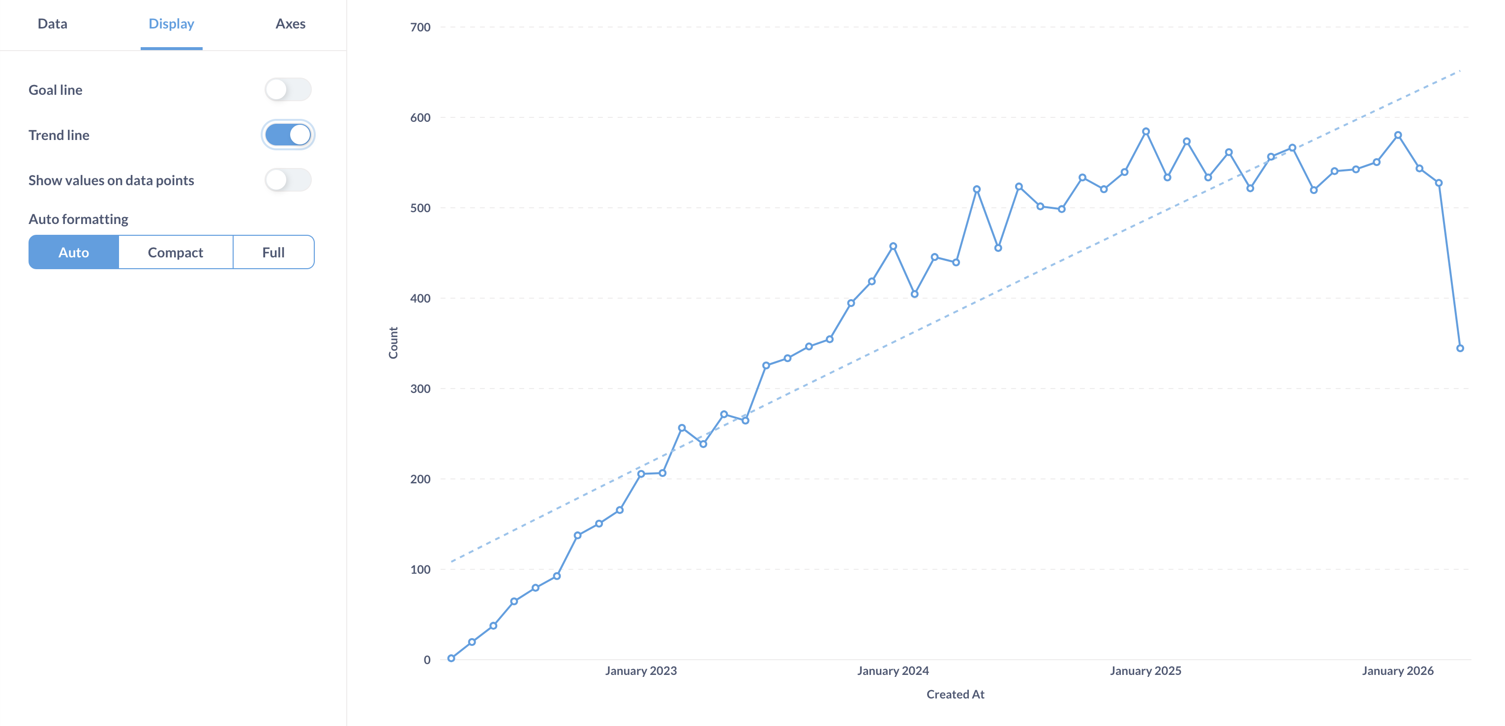
Display
There’s quite a bit you can do in this tab, but the options available will depend on the data in your chart.
- Set the colors and labels for the series on your chart.
- Change the style of your lines for Line and Area charts, and choose whether to display dots on the lines.
- Specify how to handle missing values. Use the “Replace missing values with…” setting to change how your chart deals with missing values. You can use linear interpolation, or display those points as zero or as nothing.
- Add a goal line. Goal lines can be used in conjunction with alerts to send an email or a Slack message when your metric cross this line.
- Add a trend line. If you’re looking at a time series chart, you can turn on a trend line to show where things are heading.
- Show values on data points. The default setting will try and fit as many values on your chart as will fit nicely, but you can also force Metabase to show the values for each and every data point, which it will do begrudgingly. Showing values also works with multi-series charts, but be aware that the more data points you add, the more crowded with values the charts will become.
Axes
There are three main ways to configure axes:
- Change the scale for your axes. If you’re looking at a time series chart, your x-axis can use a time series scale or an ordinal one. When using “Timeseries”, it will always be displayed in ascending order, so oldest to newest, while “Ordinal” will display in the order the data is returned. Your y-axis can use a linear, power, or logarithmic scale.
- Hide or show the tick marks on your axes. You can also choose to rotate the tick marks on the x-axis to help them fit better.
- Edit the range of your y-axis. Metabase sets an automatic range by default, but you can toggle that off and input a custom minimum and maximum value for the y-axis if you’d like.
Labels
Here’s where you can choose to hide the label for your x- or y-axis. You can also customize the text for your axes labels here.