Area chart
Also known as
Area graph
What is an area chart?
An area chart is a type of line chart where the space between plotted values and the x-axis is filled in with a solid color.
You can think of an area chart as a cross between a standard line chart and a bar chart. In an area chart, you still have a line that connects data points (usually plotting change over time), but by filling in the area between that line and the x-axis, you’re highlighting both the data’s relationship to zero and the relationship of any subcategories to a total.
When to use an area chart
Area charts are a great choice when:
- You’re plotting multiple subsets of data that, together, make up some total value.
- You need to represent volume and changes in volume over time.
- Your data contains too many x-axis data points for a stacked bar chart.
Consider a different visualization, like a bar or line chart, if:
- You’re only measuring a single series over time.
- Your data is highly volatile, subject to frequent and/or significant swings.
- You’re measuring a large number of subcategories within one chart.
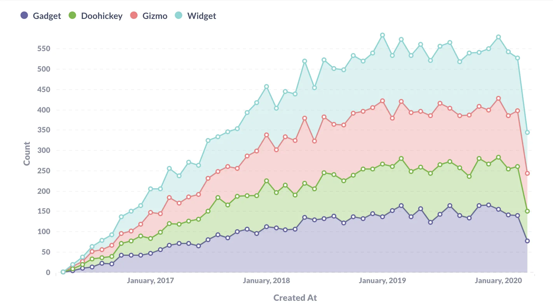
Example area chart
Similar to a stacked bar chart, stacking data on an area chart works best if you have a small number of categories to track — too many and your area chart will start to get chaotic or unreadable.
Figure 1 shows Orders broken by out by Product → Category, visualized as a stacked area chart. Using this visualization, we can understand both the rise and fall of individual product categories and how orders have performed as a whole: