When I start a new task I often look for inspiration on DataViz blogs with lots of colorful and motley dashboards and visualizations. But in reality, it is not practical and a business dashboard should be simple and up to the point. So I had a conversation with a UX designer who gave me useful tips on how to make a dashboard both beautiful and user-friendly. Here it goes:
Practice minimalism to create beautiful dashboards
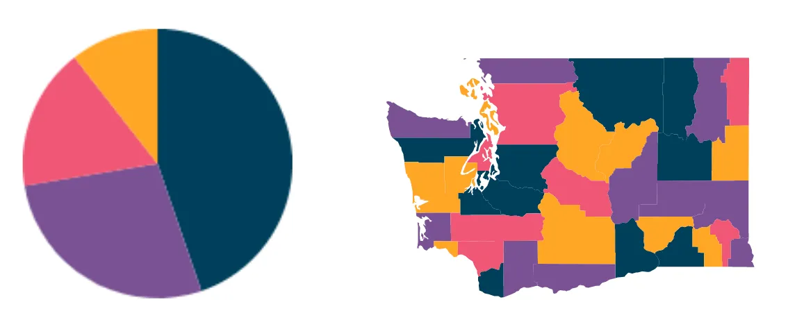
Stick with the finite number of colors, usually up to 4, with the accent on the main color. Do not use contrast colors for a dashboard - it will make it harder for the user to comprehend the information. You can use services that can help you pick the right palette like this one.

Color contrast is a UX principle that can make a difference in your dashboards
It’s important not only to pick colors but also to match them correctly. Here is a handy tool to help you with that.
Beautiful dashboards respect negative space
Sometimes you have an urge to fill every single gap in your dashboard with an important number and/or graph. Never underestimate the importance of white space. Otherwise, you might end up with a complete mess.
Pick essential content only for your dashboards
Key questions to answer before you start building a dashboard: “What’s the goal of this dashboard? What can it be used for?”. Answer those to be able to get rid of unnecessary items on the screen.
Focus on the most important information only to build dashboards with a beautiful UX
We are usually overwhelmed with the information and complexity. And in this complexity, it is easy to lose useful insights. Use the color as the helper marker and highlight important categories/KPIs/groups to help the user quickly find insight.
Remember the logic behind the colors on your dashboards
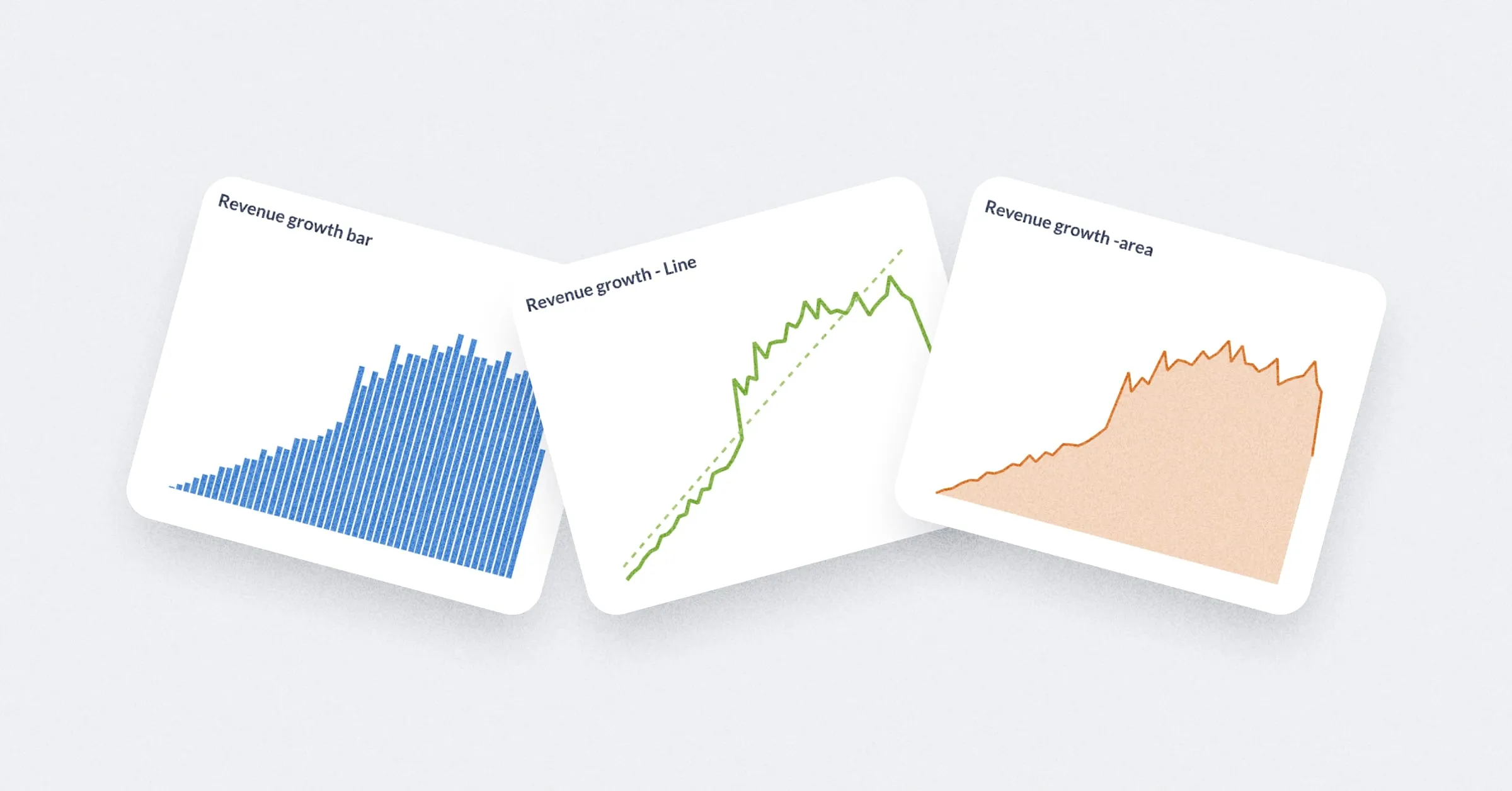
When you need to visualize change or prioritize information it is always a good idea to use simple and relevant colors: green for good/growth, yellow for watch-out/without changes, red for alert/drop.
Use the reading pattern for a better UX of your dashboards
Most people are used to explore information from left to right and from top to bottom. So when you decide how to place the information in the dashboard - use this simple rule: put the most important things on the top left and least important - on the bottom right.


