




What goes on an engineering team dashboard?
An engineering team dashboard gives leads and EMs one shared view of delivery health — how fast the team ships, how stable releases are, and where flow breaks down. This page is the hub: an example layout, the dashboards an engineering team typically builds, and the metrics worth putting on them.
For: engineering leads, EMs, platform and developer productivity teams. What’s inside: an example dashboard, six dashboards an engineering team builds, ten metrics that belong on them, and a five-step build order.
What does an engineering team dashboard look like?
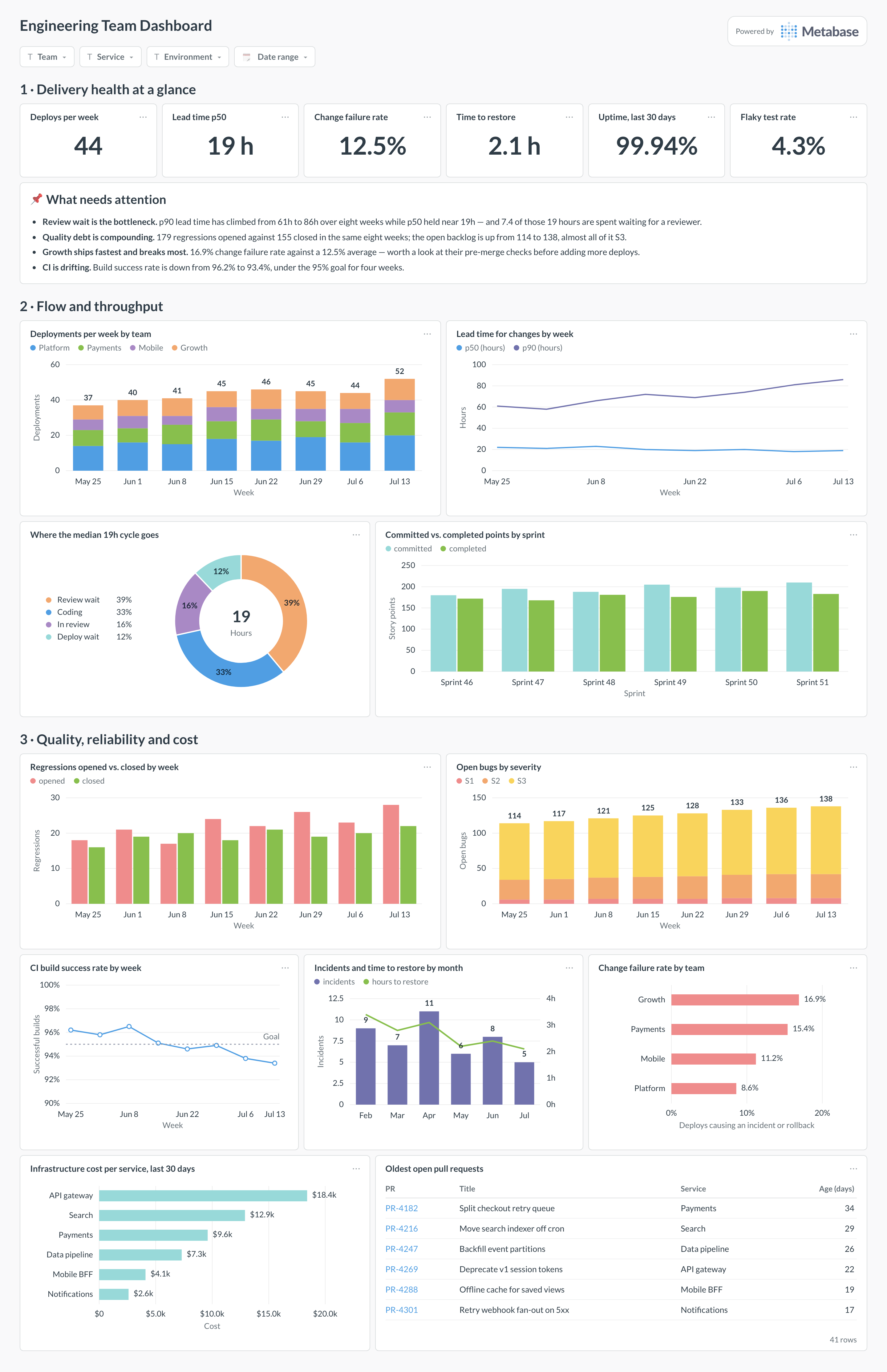
Here’s the shape most teams land on. Delivery health sits at the top as a handful of scalars anyone can read in five seconds; the middle section is flow — deploys, lead time, where the cycle actually goes, and what each sprint completed against what it committed; the bottom section is the consequences half, where regressions, CI reliability, incidents, and cost name the specific thing to fix.
Which dashboards does an engineering team build?
Engineering dashboards divide by what breaks: delivery flow, the pipeline that carries it, and the quality of what comes out the other end. Build the delivery view first — it is the one an EM opens weekly — and add the others as each becomes a recurring argument.
Which metrics belong on an engineering team dashboard?
Ten that earn their place on the hub, paired so speed never gets read on its own. All of them are team- or service-level; none of them are per-person.
- Uptime — the share of time your services are actually available. It is the headline reliability number and the one number outside engineering already knows how to read.
- Deployment frequency — how often you ship to production, split by team or service. The DORA throughput metric, and the fastest signal that batch sizes are growing.
- Lead time for changes — time from merged commit to running in production. Track the median and the p90; the gap between them is usually where the process problem lives.
- Cycle time — how long a work item takes from started to done, broken into coding, review, and deploy. The breakdown is what makes it actionable rather than a number to feel bad about.
- Queue time — how long work waits before someone picks it up. On most teams it is the single largest slice of cycle time and the cheapest one to fix.
- Change failure rate — the share of deploys that cause an incident or a rollback. This is the counterweight that stops deploy frequency being gamed.
- Time to restore service — how long from an incident starting to service being healthy again. Recovering fast matters more than failing rarely, and it is the more improvable of the two.
- Regressions opened vs. closed — new defects against fixes, alongside open bug count split by severity. If the lines diverge for more than a couple of sprints, quality debt is compounding.
- Build success rate — the share of CI runs that pass, read next to the flaky test rate. A red pipeline nobody trusts taxes every change the team makes.
- Cost per service — infrastructure spend attributed to the team that owns it. It keeps speed and spend in the same conversation, and it is what makes a platform migration arguable in numbers.
How do you build it?
- Land the four sources in one place — source control, issue tracker, CI, and incidents — and pick the join key first. Service or repo, mapped once, is what lets a deploy, a bug, and an incident end up on the same row.
- Write down when a change is “deployed”, when an item is “started” and “done”, and what counts as an incident. Put those definitions in Metabase models every card reads from, because DORA numbers are almost entirely a function of where you draw those lines.
- Build the delivery spine first: deploy frequency, lead time, change failure rate, and time to restore. Four cards, and they are the ones you will still be reading in a year.
- Add the diagnostics — cycle time broken down by phase, queue time, regressions opened against closed, CI success — so that when a headline number moves, the explanation is on the same page.
- Add filters for team, service, environment, and date range, set an alert on change failure rate and on the bug backlog crossing a threshold, and subscribe the engineering channel before each sprint review.