11 min read

This post was originally published in the Data Analysis Journal and written by our analytics engineer, Thomas Schmidt.
→ Implement these strategies in your next presentation to ensure your data insights drive informed decisions.
Have you ever tried getting directions in a foreign country from someone who doesn’t speak your language? That’s how I felt the first time I presented a complex data analysis to an executive team. While the data made sense to me, it felt like I was speaking a foreign language to them. Just like a translator bridges gaps, we need to translate our analyses into something executives can act on. Effective communication isn’t just about sharing insights—it’s about ensuring those insights are understood and drive decisions. In this post, I’ll share lessons I’ve learned on turning data into clear, actionable messages for executives.
In our data jobs, we are often driven by curiosity and the joy of solving problems using data. However, it’s crucial to understand two key aspects before diving into analytics projects: the core problem and the audience.
Stakeholders often approach us with a proposed solution in mind (“I need data X”). By digging into the ‘why’ and understanding the core problem behind the request, we can choose a better approach that serves their needs, leading to better project outcomes. Knowing the problem you are trying to solve will inform your decisions and influence what next steps you recommend.
We don’t want to find ourselves in a situation where our audience feels like we are speaking a foreign language to them. Executives haven’t been along for the entire analytical journey that we went through. Thus, we need to translate our findings for them. Before crafting a communication, consider the following
Don’t try to communicate to too many people at once: In case your audience is too broad, try to narrow it down to the decision-maker and tailor your communication to their needs.
Executives need quick access to essential insights to make informed decisions promptly. In the fast-paced world of business, they juggle multiple priorities and have limited time for detailed reports. This is where the concept of TL;DR (Too Long; Didn’t Read) becomes invaluable. I first learned about this concept while working at Shopify where we used a similar approach for our communication (be it for presentations, reports or even longer Slack messages). Let’s give it a try:
Executives will love you when you start using TL;DRs:
→ Adopt the TL;DR approach to enhance clarity and efficiency in executive communications.
When crafting a powerful TL;DR, the focus should be on what is most relevant and important to the audience:
Pro Tip: Add links to specific slides or sections with detailed data for those who want to dive deeper.
Example of a Well-Crafted TL;DR:
Example: Improving Customer Service Response Times
TL;DR: Faster response times lead to higher customer satisfaction.
A side note: We also want to make sure to use KPI precision that makes sense for executives. They are usually not interested in the decimal precision number. Thus, rounding is mostly fine (except you know your audience will care about it). If you want to read more about TL;DRs, find some additional instructions in this article.
As we learned in the TL;DR section, attention is a limited resource in our day to day world and we need to fight for it. Here are some tips that have worked well for me in the past, along with good and bad examples.
Apart from using TL;DRs, make sure to use concise and direct communication. Avoid “bullshit” and unnecessary information (here is a good book on that topic) and aim for placing your main message in the headline of your messages, slides or report sections.
Use concise and direct communication. Avoid unnecessary information and place your main message in the headline.
This message could use some work:

Better version:

The 2nd message lets you parse the information quicker and decide whether it is relevant and you want to dig deeper (i.e. continue reading in the thread). There are a lot of great additional examples in the book “writing without bullshit” in case you want to read further.
The above tips connect well with the next topic we are going to cover: Clutter.
In the Slack message example above you saw a lot of additional information that did not support the message e.g.
These are extreme examples but we tend to add such “clutter” to our presentations or reports as well. When was the last time you listened to a presentation and started thinking about something else since you could not follow all the information on that single slide? In those cases, the presenter lost your attention because of cognitive overload. Decluttering can help to reduce the cognitive load for your audience and make it less effort to parse your presentation or report.
Things you can start doing today:
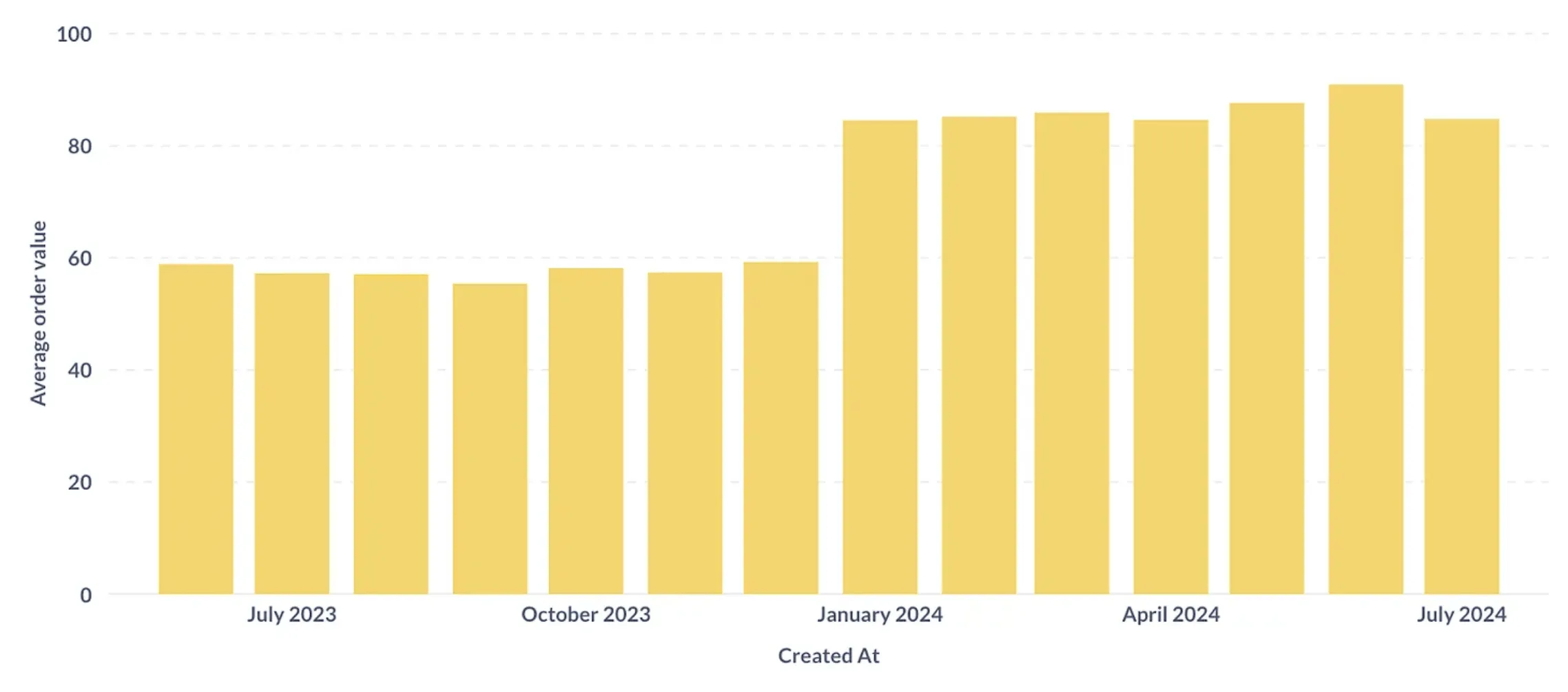
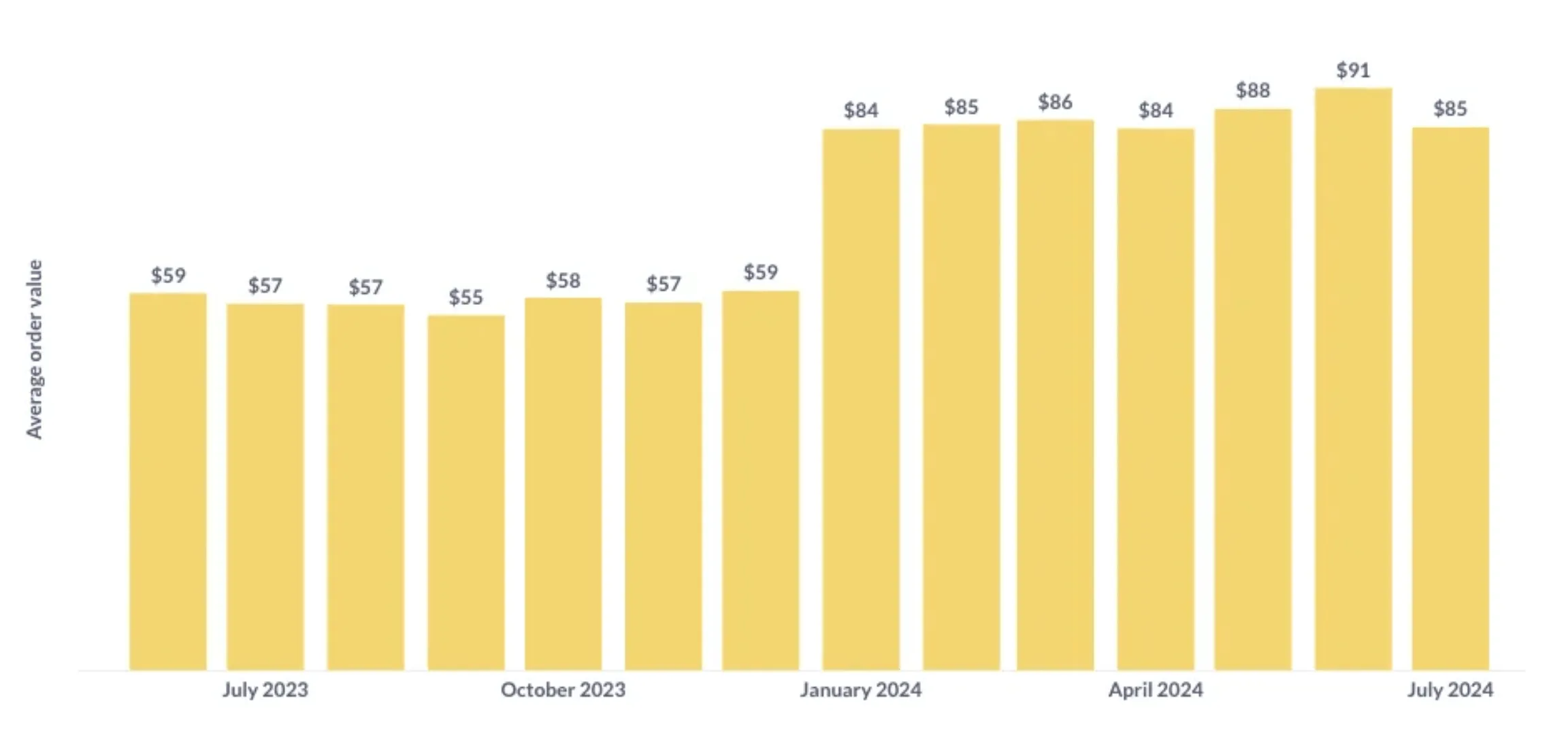
If you are using a BI tool, you will usually also find options to reduce clutter there. Here is an example that uses Metabase, an open source BI tool (which, as you know, is behind the blog you’re reading right now.). It mostly comes with reasonable defaults but we can still tweak it a bit:
This chart could use some work:
Better version:
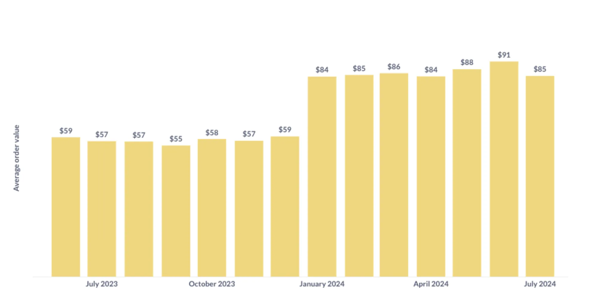
Colors are a very powerful tool in our communication tool box - if used wisely and consistent. Make sure to be intentional about your use of color. One of my favorite examples is to use it for visual connections between slide titles and my charts where I try to color a category I mention in the same way as it would appear in the chart. Additionally, you can use black vs. gray color and bold vs. normal text to create a visual hierarchy. This helps guide the consumer through the content. Here is an example:
This chart could use some work:
Better version:
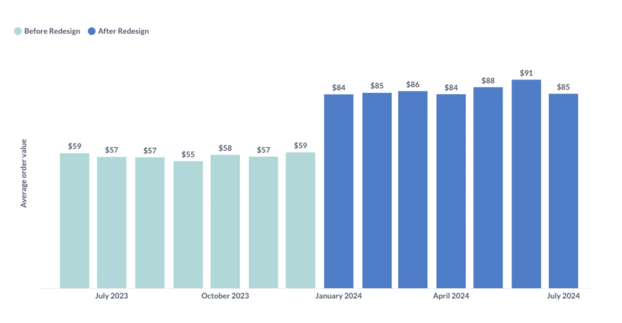
Adding a clear indication of when the Shop redesign happened that led to the increased AOV can help us make our story stand out. This helps to reduce the cognitive load and allows your colleagues to process the content in a shorter time while increasing the chance that they perceive your message. This can also help across slides: If you stay with your color palette, your audience will quickly realize and it can be powerful to connect the dots with your previous story.
“Don’t caveat everything”
Once, an executive at Shopify told me that Data Scientists tend to caveat everything and he often wished that folks were bolder about their recommendations. While it is natural as data professionals to want to highlight the nuances and limitations of our analysis, it is important to remember that executives are looking for clear, actionable insights. They prefer confident recommendations to make strategic decisions quickly over being walked through the details of your analysis.
Some examples:
You might argue that there are cases where it is important to add caveats. A good approach in those cases is to have an appendix and refer to it. This might give you more confidence and executives have the chance to dig deeper if needed. However, they mostly will ask you directly if questions arise.
In conclusion, effective communication with executives requires thoughtful consideration of their time and needs. By understanding the problem and your audience, starting with a TL;DR, removing clutter, using colors wisely, and making bold statements, you can ensure your insights are understood and lead to actionable decisions. Implement these strategies in your next presentation or report to enhance clarity and effectiveness in executive communications.