7 min read
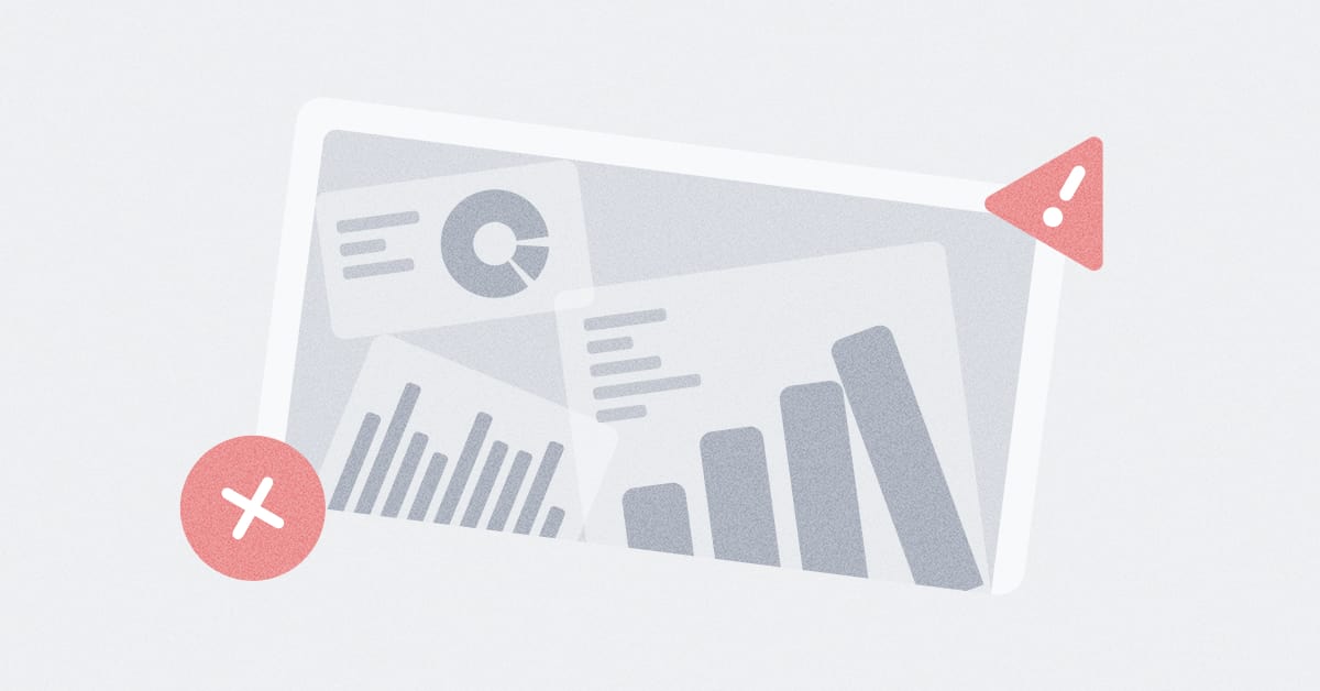
You build a dashboard. You select your charts, position them neatly, and hit share. But when your manager opens it up, there’s silence, then confusion. They’re not sure what to focus on or what decision it’s supposed to support.
Dashboards should make decisions easier, but instead, they often become a confusing mess of charts and numbers.
The good news is that these issues are fixable. Once you recognize the patterns, they’re much easier to avoid.
Here are five dashboard mistakes that we see often, and how to fix them. This article is designed to help you create clear, informative, and compelling dashboards.
The hardest part of making a dashboard isn’t building charts — it’s choosing which charts not to build.
You know how it goes: you’re unsure which metrics matter most, so you include everything — a chart for every KPI, a graph for each segment, just in case.
The result is a dashboard that shows a lot but says little.
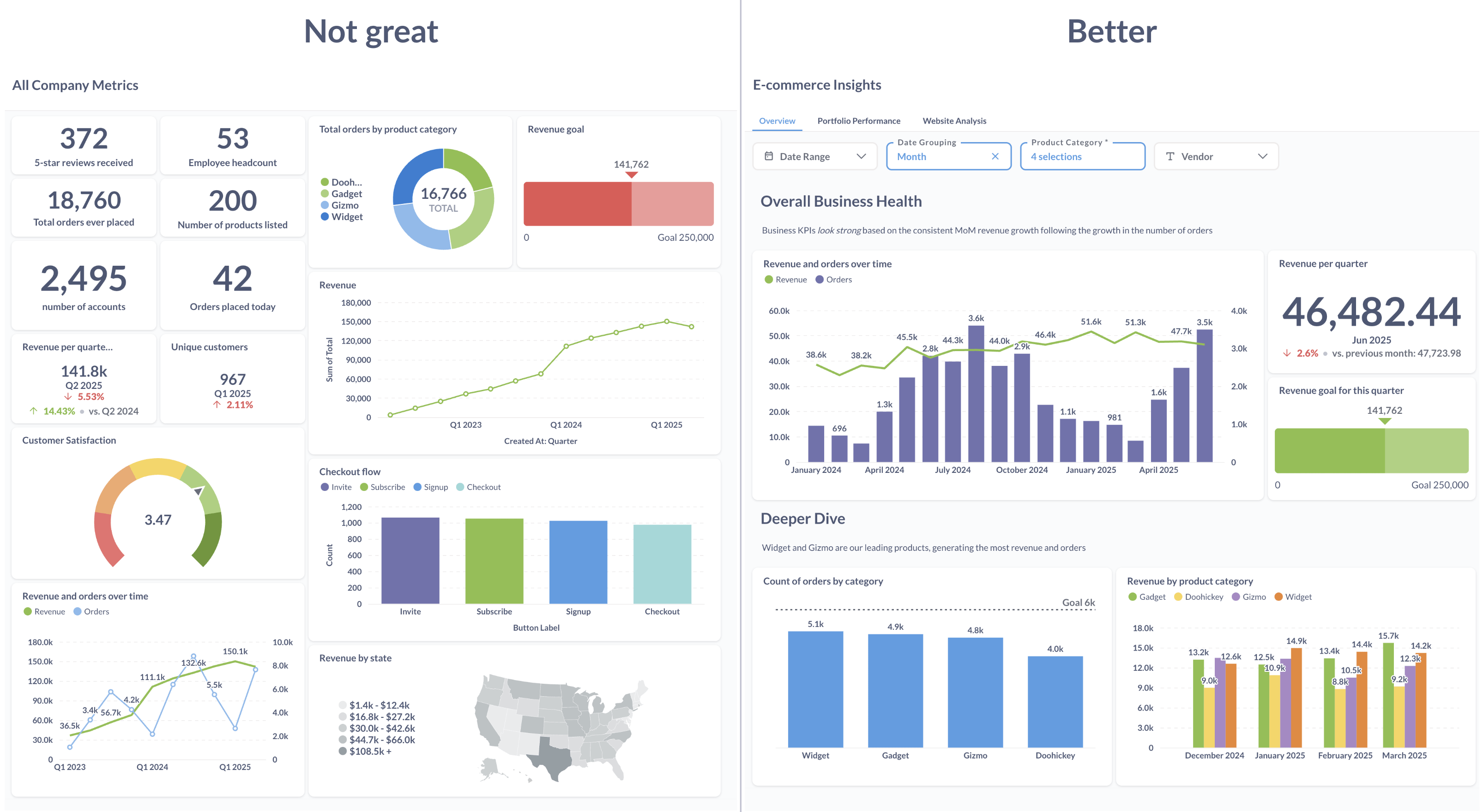
What specific question should this dashboard help answer?
Instead of a broad “Marketing Dashboard” with everything from website traffic to email open rates to ad spend, focus on a specific question, like “Which marketing channels are driving the most sign-ups this month?” That makes it clear what metrics matter.
For each chart, ask:
Does that email open rate chart help explain which channels are driving sign-ups? If not, it belongs on a different dashboard.
Quick tip
Ask: If someone had only 30 seconds with this dashboard, would this chart be worth their time? If not, leave it out.
We’ve all seen:
These aren’t just visual problems — they bury the key message. When your brain works too hard to decode the chart, it has less energy for the actual insight.
| What do you want to show? | Use this chart |
|---|---|
| Compare values (like sales by product type) | Bar chart |
| See trends over time | Line chart |
| Show parts of a whole | Pie chart — but only with a few, clear slices |
| Compare totals and see what they’re made of | Stacked bar chart — like total revenue split by sales channel |
| See a data spread (like user ages) | Histogram or box plot |
For example, say you want to compare revenue by category: Music ($5,310), Subscriptions ($4,703), Tools ($4,680), Toys ($4,391), and others. A pie chart might look nice, but can you instantly tell which one is the smallest? It’s tricky. A bar chart makes the difference obvious at a glance.
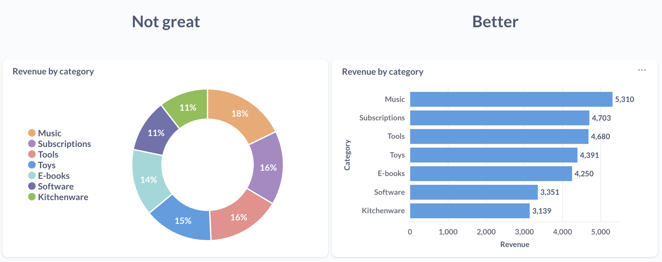
Visualization translates numbers into shapes. Choose shapes that make key ideas clear without extra cognitive load.
We wrote a full guide on this if you want to go deeper — Which chart should you use?
Quick tip
If your chart needs an AI agent to explain it, you probably chose the wrong one.
Imagine walking into a room with hundreds of sticky notes on every wall. Some are related, some aren’t; there’s no obvious starting point. That’s what a poorly organized dashboard feels like.
Most people don’t read dashboards — they scan them. Without a clear visual flow, they’ll miss critical insights or give up entirely.
Think of your layout like a story — it should guide the viewer through the data, not just display it.
Quick tip
Ask someone who’s never seen your dashboard to explain what they think it shows. Their confusion will point to areas you should restructure.
Color is excellent for drawing attention — but only when used with intention.
But many dashboards go overboard. Every chart uses different colors. Bright blue and green show up with no clear meaning. Some bars are red — does that mean something’s wrong? Or is it just the default?
When everything is highlighted, nothing stands out. Your brain can only track a few color signals before they become noise.
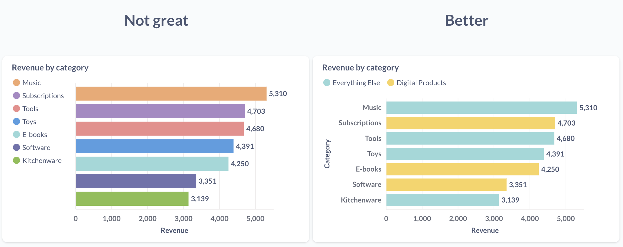
Color isn’t just for looks. It’s part of the message.
Quick tip
If you’re not sure whether a color is helping, try removing it. If the message still lands, you didn’t need it.
Numbers without context are easy to misread.
Is 25% good? Is 10,000 high or low? That spike on the chart — exciting or alarming? Compared to what?
Dashboard builders usually know what “normal” looks like, but your viewers might not. Without that context, they might make the wrong call.
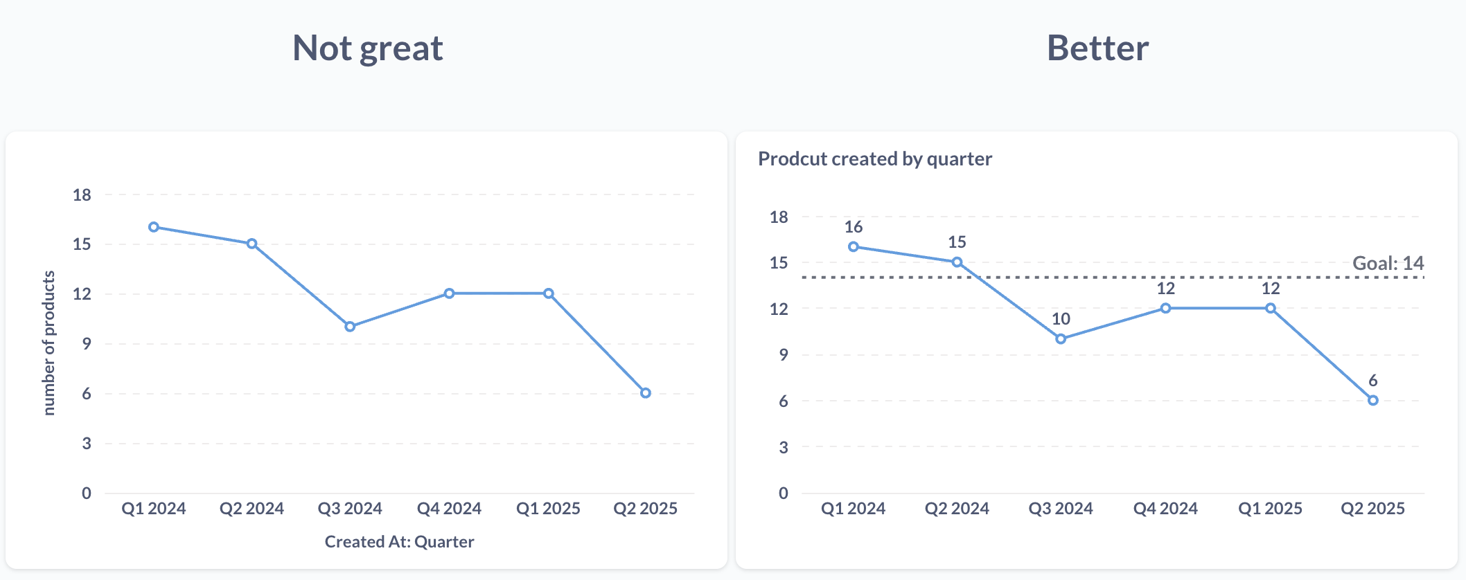
Remember: Your dashboard might make perfect sense to you because you have the context in your head. Your job is to bring that context into the visual.
Quick tip
If someone opened your dashboard for the first time, would they know what they’re looking at?
Before sharing your dashboard, check these points: