

‧
6 min read
The perfect chart: choosing the right visualization for every scenario
The Metabase Team
‧ 6 min read

Share this article
To reach its full potential, data must make sense to more than just the pros. And unless you can see the image in one of those green and glittering Matrix screens, chances are you’ll benefit from a clear and attractive chart.
Data visualization techniques convert raw data into legible and informative graphs, tables, charts, diagrams, color blocks, or whatever visual format will best communicate the story your data is trying to tell. And to tell that story well, you need to match it to the appropriate chart.
So let’s talk about some common scenarios in data presentation, and which chart will best support each narrative. For more on this topic, check out Which chart should you use?.
Best chart for time-based data
If you want to demonstrate changes over time, averages over time, minimums and maximums, or seasonal trends, you’ll need a chart can organize data points from individual temporal increments (hours, days, months, etc.) relative to one another within a broader period.
That’s where the line chart comes in handy. These temporal graphs are easy to read and understand, and give a clear visual reflection of relevant flows — whether the numbers are enjoying growth, shrinkage, or fluctuations.
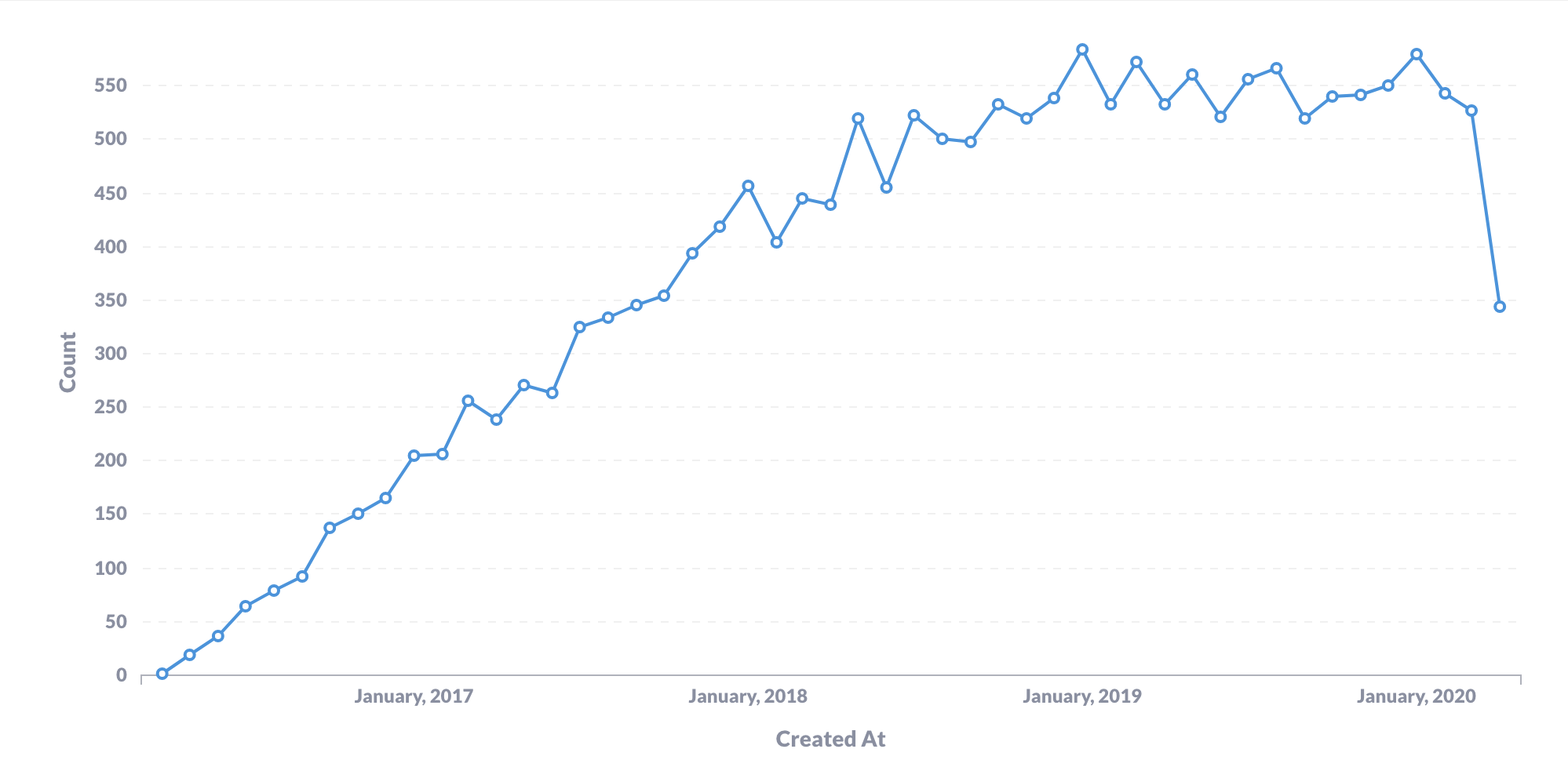
Example: Use a line graph to show how the number of orders you’ve received has changed over time.
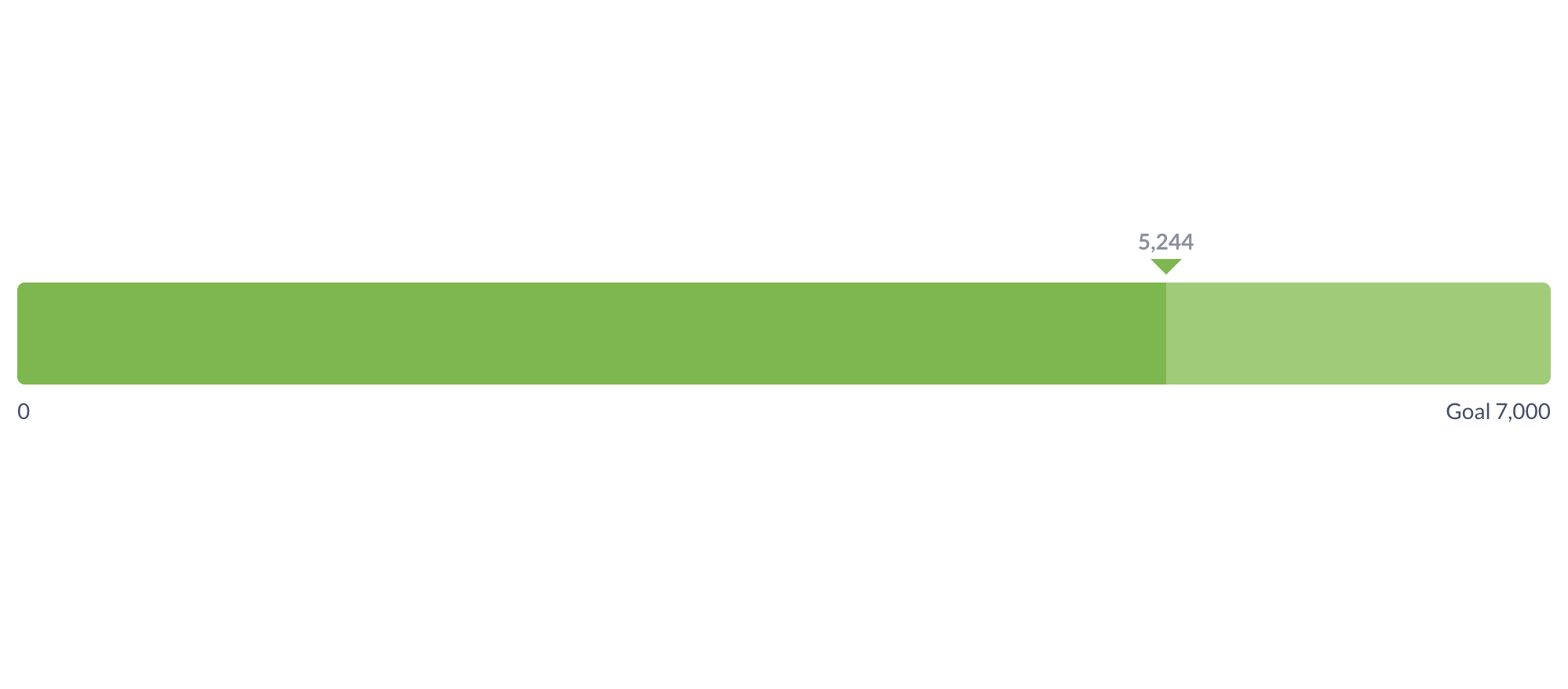
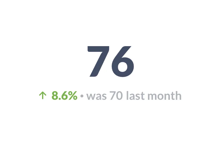
Best chart to show progress against a goal
If you want to compare how far you’ve come compared to how far you still need to go, reach for a progress bar. This is a simple chart with major storytelling potential, especially if that progress ends up exceeding original expectations.
Progress bars can be useful in a number of scenarios, like visualizing fundraising progress, project completion percentages, or the number of new users within a target.
Example: Use a progress bar to show how many users out of your total user base have converted to the latest version of your application.
Best charts for overlapping data
If you want to compare different values from similar metrics, you have a plenty of options depending on your specific use case.
Bar charts allow you to contrast static numbers such as report values or survey responses. Trend charts compare one temporal measurement as an is:was statement (e.g. user engagement was 35%, is now 60%). And multiple line charts in combination can be a useful way to show two correlating metrics over a similar time period.
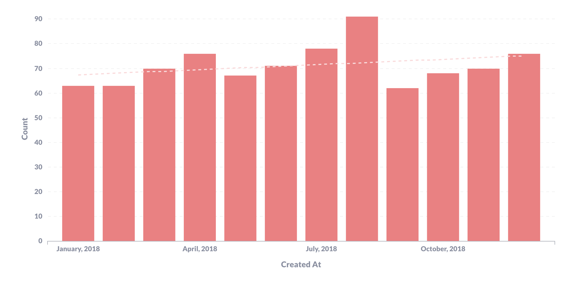
Example: Use a bar chart to demonstrate new user sign-ons over the past 12 months in combination with a trend chart to contrast the number of users in this month versus the last.
Best charts for data visualization
If you want to understand correlations between two different measurements, consider using a scatterplot to measure patterns that emerge from the relationship between those two measurements. One measurement gets tracked along the x axis, the other along the y axis, with dots representing correlative measurements in the appropriate positions. The scatterplot also represents the best chart to use with the tableau data visualization guidelines.
Opt for a scatterplot when you’re tracking discrete data points rather than aggregating trends.
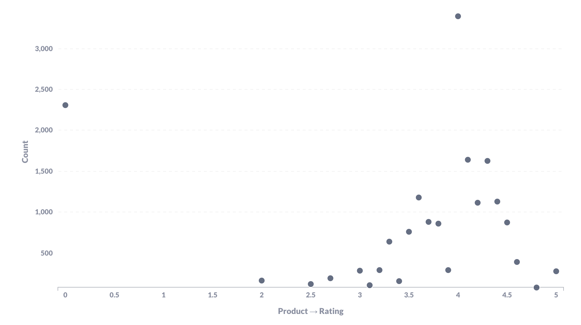
Example: Use a scatterplot to demonstrate the relationship between a product’s rating and units sold. You also can convert your scatterplot into a bubble chart by making the size of each “dot” represent the price of the product.
Best charts for visualizing funnels
If you want to demonstrate a funnel, use a funnel chart.
This dual-purpose visualization is used to show either increasing or decreasing measurements, most often relating to some eliminatory process like sales funnels, talent funnels, or product funnels. A funnel can also be one of the best charts to show percentage change.
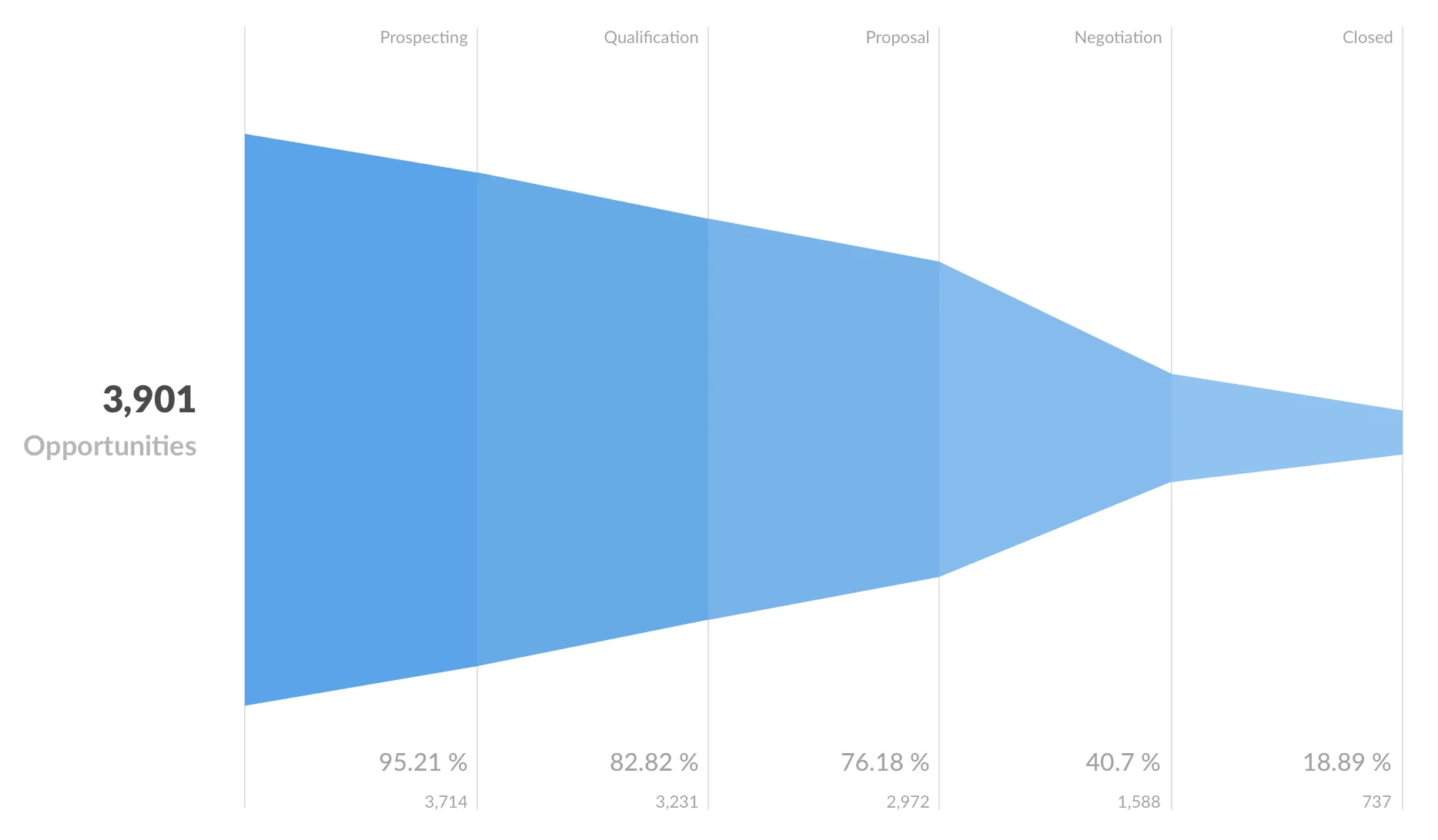
Example: Use a funnel chart to show the number of leads at prospecting, qualification, proposal, negotiation, and closing stages.
Best charts to measure relative changes over time
If you want to show how a measurement shifts over increments of time, you have two options depending on the number of categories involved.
If you’re measuring one category, use a bar chart, where each bar represents an increment within your time period (most commonly weeks or months.)
If you are measuring multiple categories, you’ll want to use a stacked bar chart, where each bar represents an increment within your time period, while also containing a distinct representative segment for each category. The size of each segment correlates to its category’s individual measurement, while the size of the bar overall indicates the total measurement for that increment of time.
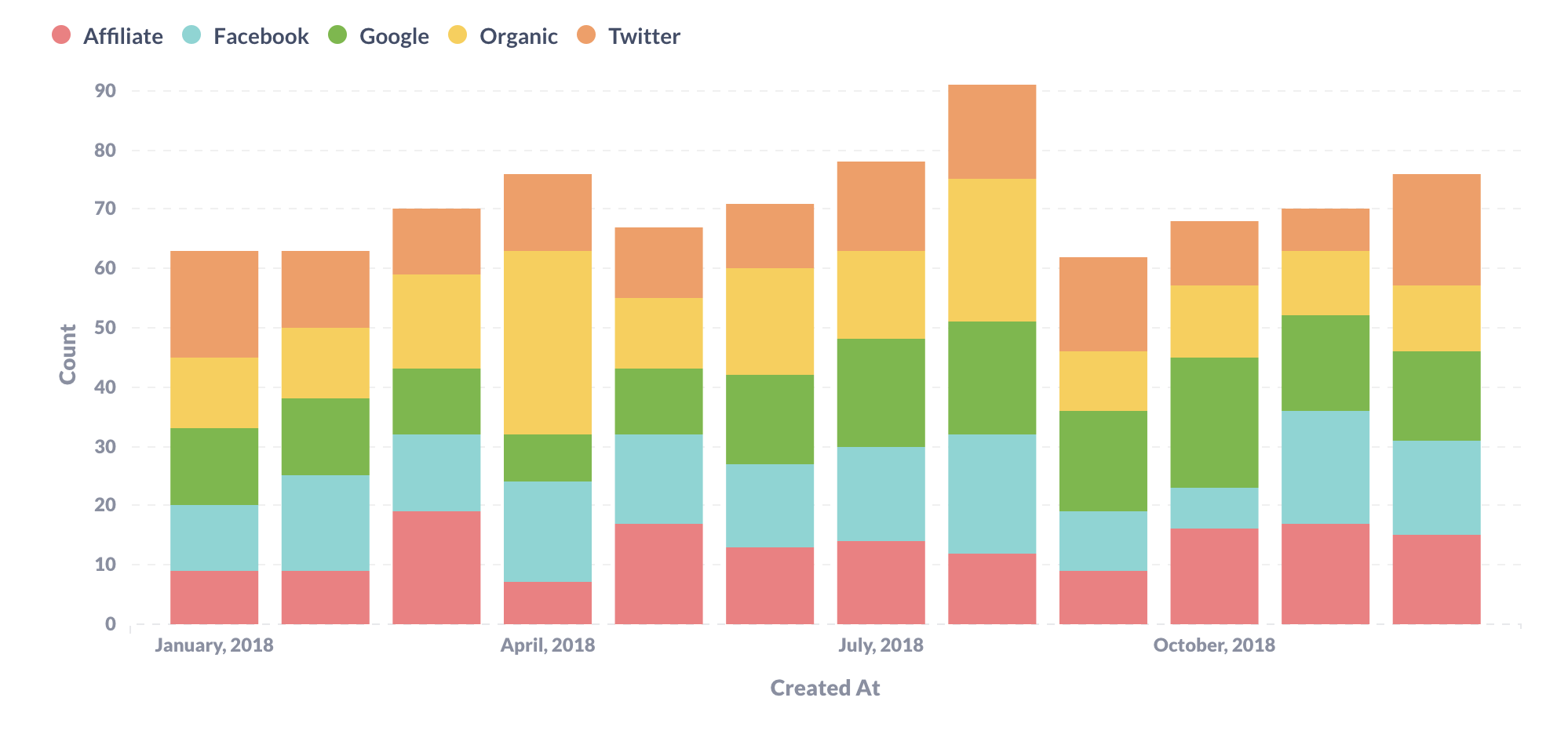
Example: Use a stacked bar chart to show total number of new users during each month of the year, with segments representing the source of those new users.
Best data visualizations for regional data
If you want convey data based on geographic location, you’ll usually reach for a map. There are a few different map-making visualization options to choose from; which one you pick will depend on your specific use case.
A pin map allows you to place a dot (or “pin”) over locations, like those of individual people, orders, or branch locations.
With a region map (or choropleth map), you can demonstrate trend differences by region, like by country or state. A grid map allows you to track those same trend differences over a broad geographic location, without taking into account specific regions within that location.
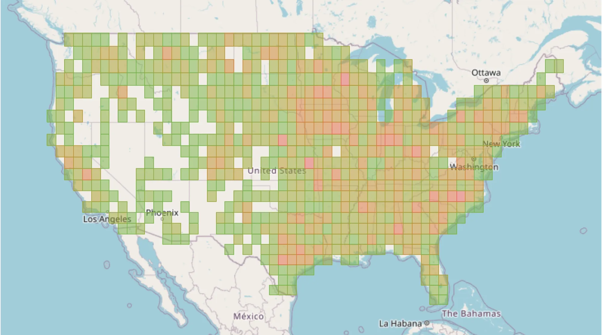
Example: Use a grid map to visualize user concentrations based on geographic locations.
Let Metabase choose the best chart and data visualization for you
If your thing is more data and less design, you can always let Metabase decide how best to visualize your information so you can stay focused on the details.
Metabase is an open source data analytics solution designed for data and non-data pros alike, allowing quick, easy, and beautiful data referencing. Our product also provides actionable insights that lets you better communicate your data story to your C-suite, your stakeholders, and your team.
Sign up for a free trial today to see what else Metabase has to offer your organization.