6 min read
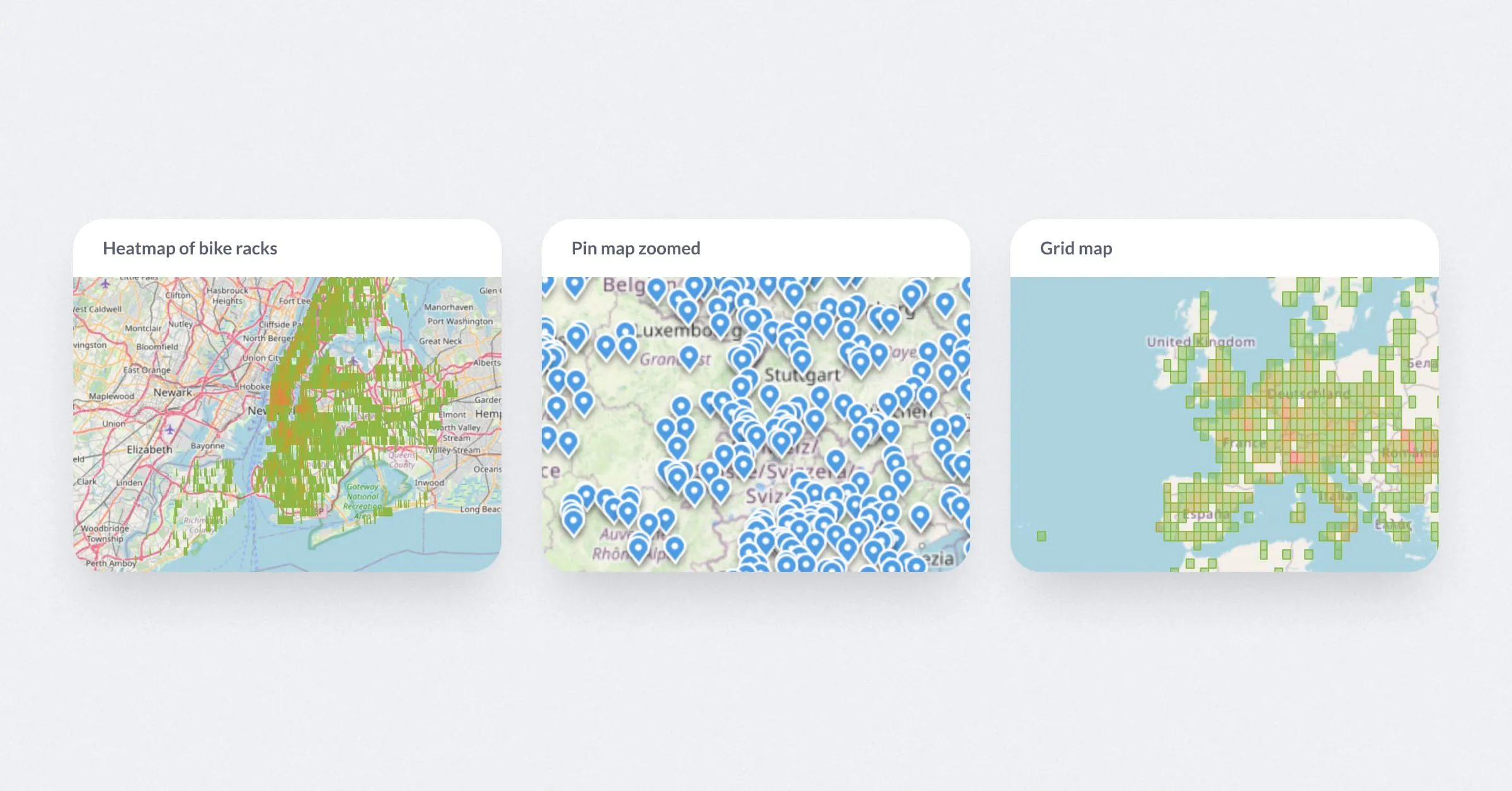
Maps are a powerful way to visualize data, but they work best when used thoughtfully. In this article, we share the basic philosophy behind putting your geospatial data on the grid, like summarizing information to reflect how people naturally think about geography—neighborhoods, states, or countries—rather than scattering individual data points across a pin map. We’ll explore why region maps often tell a clearer, more actionable story and how considering the shape of your data can help you choose the right visualization to highlight patterns and drive better decisions.
We also covered this in a dedicated webinar, check out the recording here.
To help you get started, here’s a quick cheat sheet with everything we’ve discussed about visualizing maps in Metabase, including a philosophy behind picking which map to use. Bookmark it and use it as a reference for your next maps visualization.
If you’re interested in maps, check out this guide — it covers everything you need to know about map visualization in Metabase.
Map data visualizations display data linked to specific geographic locations. Rather than showing individual data points, they group data by regions—such as countries, states, or neighborhoods—to reveal patterns and trends. This approach makes it easier to analyze how data varies across different areas. Common use cases include visualizing sales by region or population density by city. Map visualizations help transform complex data into clear, actionable insights by providing a geographic context.
A pin map displays a single discrete marker for each point of interest. Great for pinpointing exact locations using latitude and longitude. While they look nice, keep in mind that too many points can clutter the map and make trends hard to spot.
A grid map is a map with values overlaid graphically in a regular grid, e.g., as squared 10km by 10km colored to show values. These break down data into a grid, similar to a 2D histogram, and work well when you don’t have specific categories. They’re especially useful for data on natural events, like wildfire locations.
A region map is a map that shows information for geographic regions (such as countries or states), e.g., by coloring each region to show a value. If you want to show data by country, state, or neighborhood, region maps give a clear snapshot of distribution by area. They’re a great choice for highlighting patterns or differences across regions.
Metabase supports custom maps, allowing you to upload a JSON file to create region-based visualizations.
While this offers flexibility, there are a few best practices and limitations to consider:
Technical limitations to keep in mind:
The choice of map will depend on what you’re trying to communicate. Metabase has 3 different map types for 3 different types of data:
| Data type | Map visualization type |
|---|---|
| Individual data points | Pin map |
| Summary by coordinates | Grid map |
| Summary by regions | Region map |
Before you drop data points onto a pin map, ask yourself: is it necessary? Just like we don’t create bar charts with raw data, the goal of visualizations is to summarize information and highlight the bigger picture—not overwhelm with every individual detail. Pin maps work well when exact locations matter, like tracking deliveries or identifying store locations. But in most cases, summary maps are more effective.
<p>Tip: For nested regions like City > Borough > Neighborhood, use a map for the smallest region (e.g., neighborhood) with dashboard filters for parent regions. This reduces clutter and makes data exploration easier.</p>
Do you even need a map?
Not all data benefits from a geographical representation. Ask yourself: does the geographic relationship between areas matter? For instance, do you care that Texas is next to New Mexico, or are you only focused on the metrics? If geography isn’t relevant, a bar chart might convey your data more effectively and reduce cognitive load for viewers.
Maps are just one way to tell a story with your data. Choosing the right map (or deciding if you need a map at all) helps to make your visuals clear, actionable, and aligned with your goals. By focusing on how people naturally interpret geographic data, you can help drive better decisions.
Start simple, experiment, and remember: the best visualizations make it easier for your audience to see the bigger picture.