5 min read
‧ 5 min read

While data visualization and dashboard creation traditionally fall under the purview of data analysts or BI developers, the world of self-service analytics means that everyone — non-analysts included — gets to take a stab at exploring data and creating charts of their own.
With that freedom to explore may come some trepidation, especially if you’re used to someone else handling all things chart-related. With that in mind, we’ve put together some advice on traps to avoid when visualizing data. These aren’t hard and fast rules; try out different chart types and don’t be afraid of making mistakes, just remember that data visualization is all about clear and precise communication.
We’ll use Metabase for our examples, but these principles apply to whatever BI tool you’re using.
If you’re a designer, you know firsthand the importance of balancing clarity with aesthetics. Make sure you’ve clearly identified the purpose of your chart or dashboard before you start playing around with colors or styles. Form should follow function; that is, your choice of chart should support the message you want your data to communicate, not obfuscate it.
Mixing several different types of charts on the same dashboard may look impressive at first glance, but it’s not usually a great idea. It takes some serious cognitive effort from the viewer to switch from reading a line_chart to a funnel chart to a bubble chart, all while trying to process the data in those charts. Try to keep like items together, or at least establish some pattern that repeats on your dashboard. The same goes for colors: if you’ve attributed meaning to certain colors in one chart on a dashboard (e.g. red = low, yellow = medium, green = high), make sure you maintain that same color scheme throughout.
Finally, in many cases, the clarity that a table offers will be more effective than any splashier chart type.
Do you really need to see a separate line for each of the fifty states in your chart showing how orders performed last year? If so, it may end up looking something like this monstrosity:
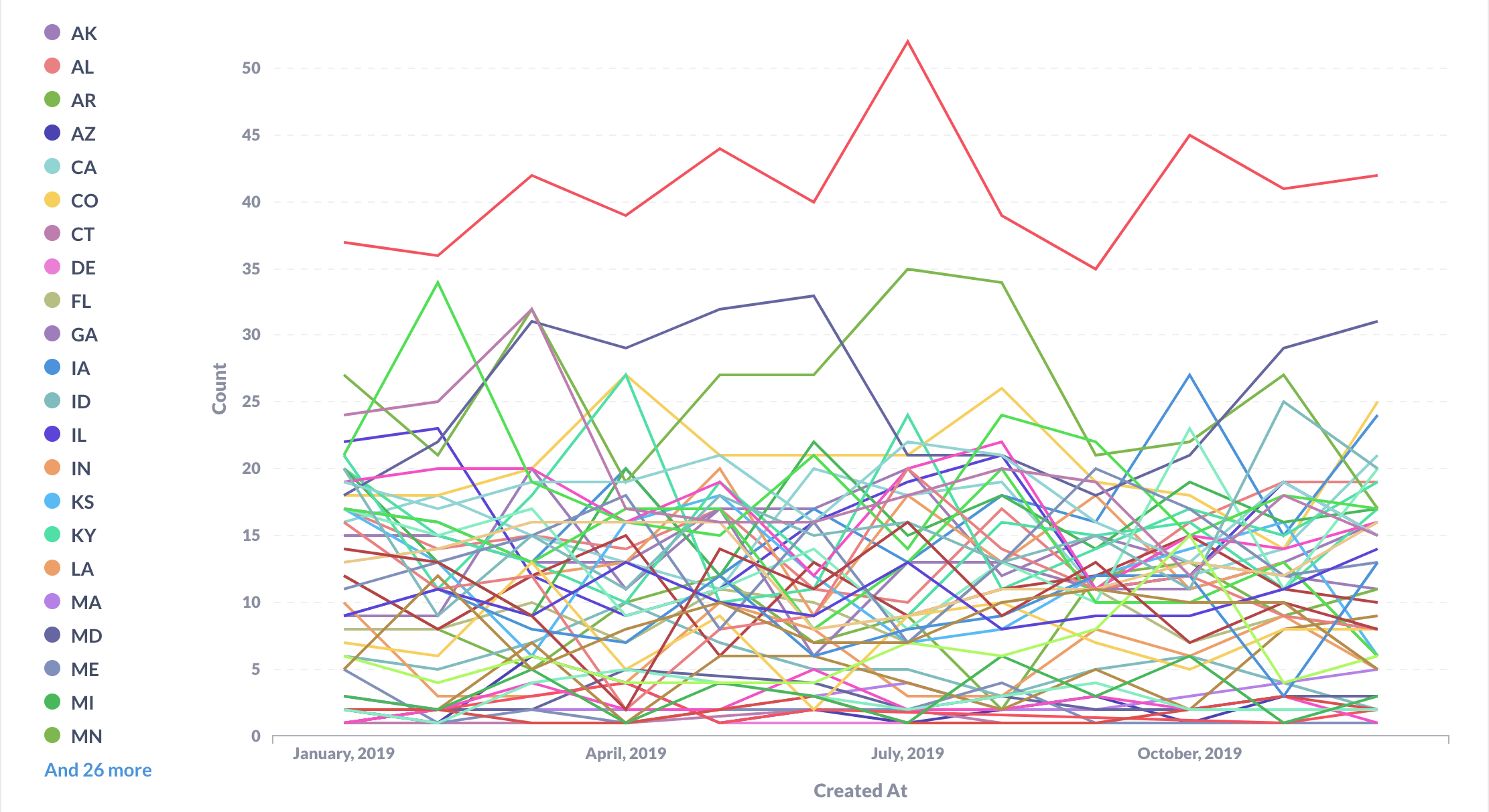
Data visualizations are only useful if they allow your brain to quickly process a lot of information. If you’ve overloaded your chart with way too many series, you’re removing any advantage to using a visualization in the first place, as you’ll have to spend a lot of time parsing each line to really get what the chart is communicating.
The line chart above is an extreme example (and probably not one anyone would think was a good idea), but it’s important to keep legibility in mind when creating charts with multiple series. Try to keep the number of series in a chart to no more than five or six, as any more than that will result in a chaotic and unreadable visualization. Limit those categories to your “top movers” — largest customers, fastest selling products, or areas of particular concern.
And if you still need that data from all fifty states, consider placing a table alongside your line chart that acts as an index for the full list. Otherwise, opt for aggregating that data or filtering to limit the number of visible series.
This is well-worn territory, as pie charts get a lot of hate. And while they have their place (like comparing parts to a whole for two or three categories), that hate’s not entirely unfounded. It’s really easy to produce a misleading or unclear picture of your data with a pie chart — just look at the two charts below that show the same data:
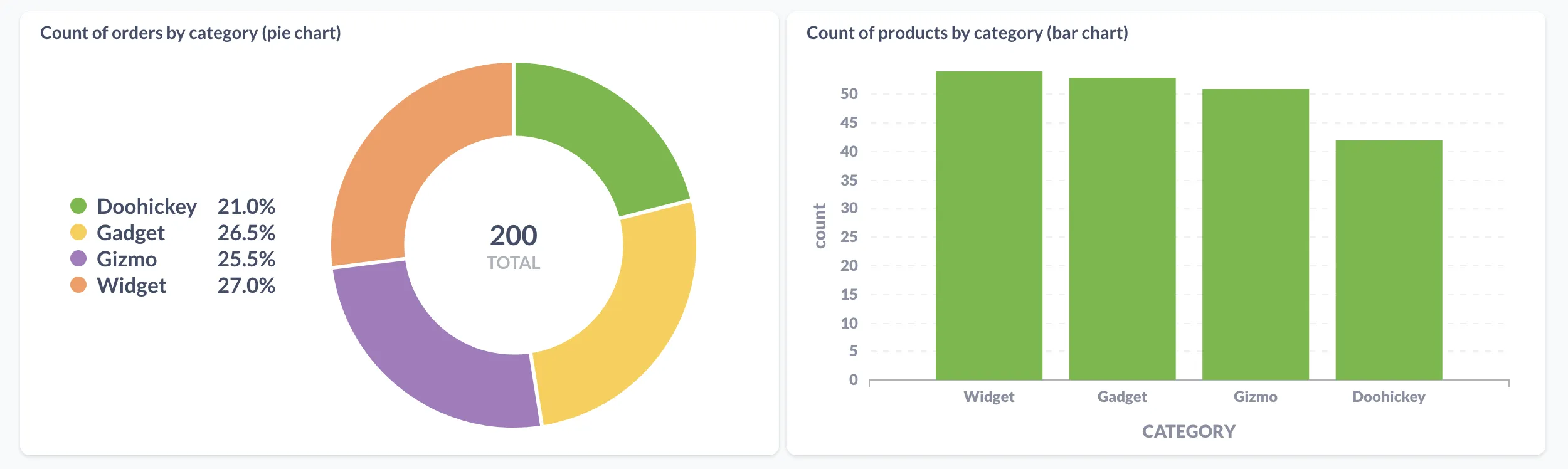
Since the pie chart segments (left) are all relatively close in size, the viewer ends up relying mostly on the key and its listed percentages to interpret the data, rather than the visualization itself. Your chart probably isn’t that effective if your viewer has to check a key, then the chart, then the key again, then the chart. The bar chart on the right allows the viewer to much more easily gauge the relative height of each bar compared to others, since the human eye has an easier time discerning lengths than angles.
A good chart can be understood at a glance, but that doesn’t mean you won’t ever have to explain where those numbers came from. This is where titles and descriptions shine, so give some thought to what questions people might ask about your chart, and include that information alongside your visualization.
If you’ve been staring at the same chart or dashboard for too long, it’s easy to lose perspective about what’s working and what isn’t. Just like with a written report or design mock-up, it almost always helps to get a colleague’s input on your charts and dashboards. They can offer a fresh look at your work, identifying any points of confusion or overlooked areas. For example, you may want to have a designer check that your chart is easy to follow, or have an analyst confirm that the conclusions you’re drawing from that chart are supported by the data.