Which chart should you use?
Which type of charts and graphs should you use to best communicate insights from data? This guide will help you pick the right visualization for the job.
Picking the right chart comes down to two questions: what does the data look like, and what are you trying to communicate?
Let Metabase pick the chart for you
Metabase takes care of a lot of the details (like minimizing chart junk) so you can focus on what you want to communicate with your visualization. And for questions built using the query builder, Metabase will guess at the appropriate chart to display. For example, if you pick a metric, like the count of orders, and group those orders by time, Metabase will automatically select a line chart that plots the order count at each interval. While Metabase guessing the right chart type is nice, it’s not going to work every time: some visualizations require additional input (for example, Metabase can’t automatically know to display a progress bar, as you need to tell Metabase what the goal should be).
Native queries, however, are a different story. Metabase will always return results as a table, so if you need something other than a table, you’ll have to select a visualization type yourself. Metabase also put some guardrails in place; for example, if you don’t have geographic data in your results (like coordinates or State), Metabase will gray out the Map viz. But don’t get hung up on picking just a single visualization—you can always build a dashboard to show data using multiple charts.
Two charts to rule them all
Before we get into it, we should note: you don’t have to use every chart type to do proper analysis. Most of the time you’ll only need the old standbys: tables and line charts.
Tables
Often you’ll want to see a lot of measures at once, list their exact values, and be able to sort those measures. Maybe you simply want to add or remove a few columns, or add a couple of filters to make it easy for people to look up certain values. And that’s what tables are for. Tables in Metabase are one of the most versatile visualization types, so check out our article on everything you can do with the table visualization.
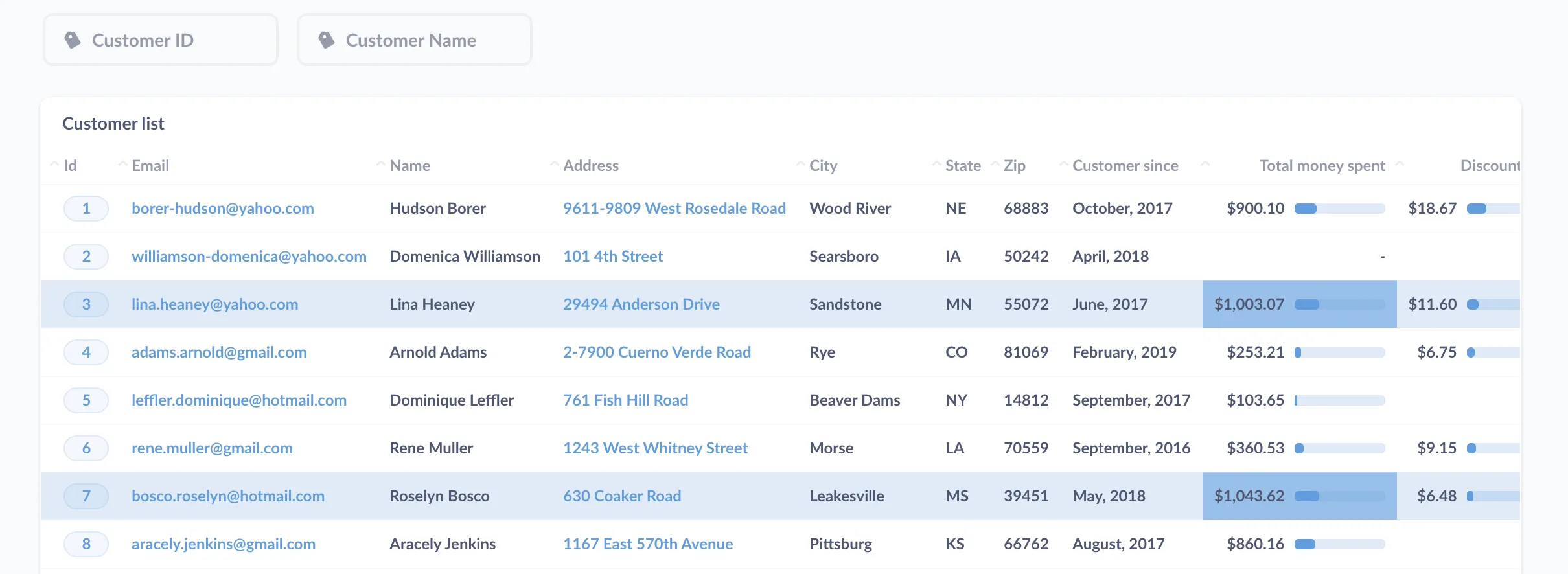
If you additionally want to summarize groupings of rows (like seeing the annual subtotal in a grouping of quarterly results), or switch up the columns and rows, you’ll want to use a pivot table. Check out How to create a pivot table to summarize your data.
Line charts
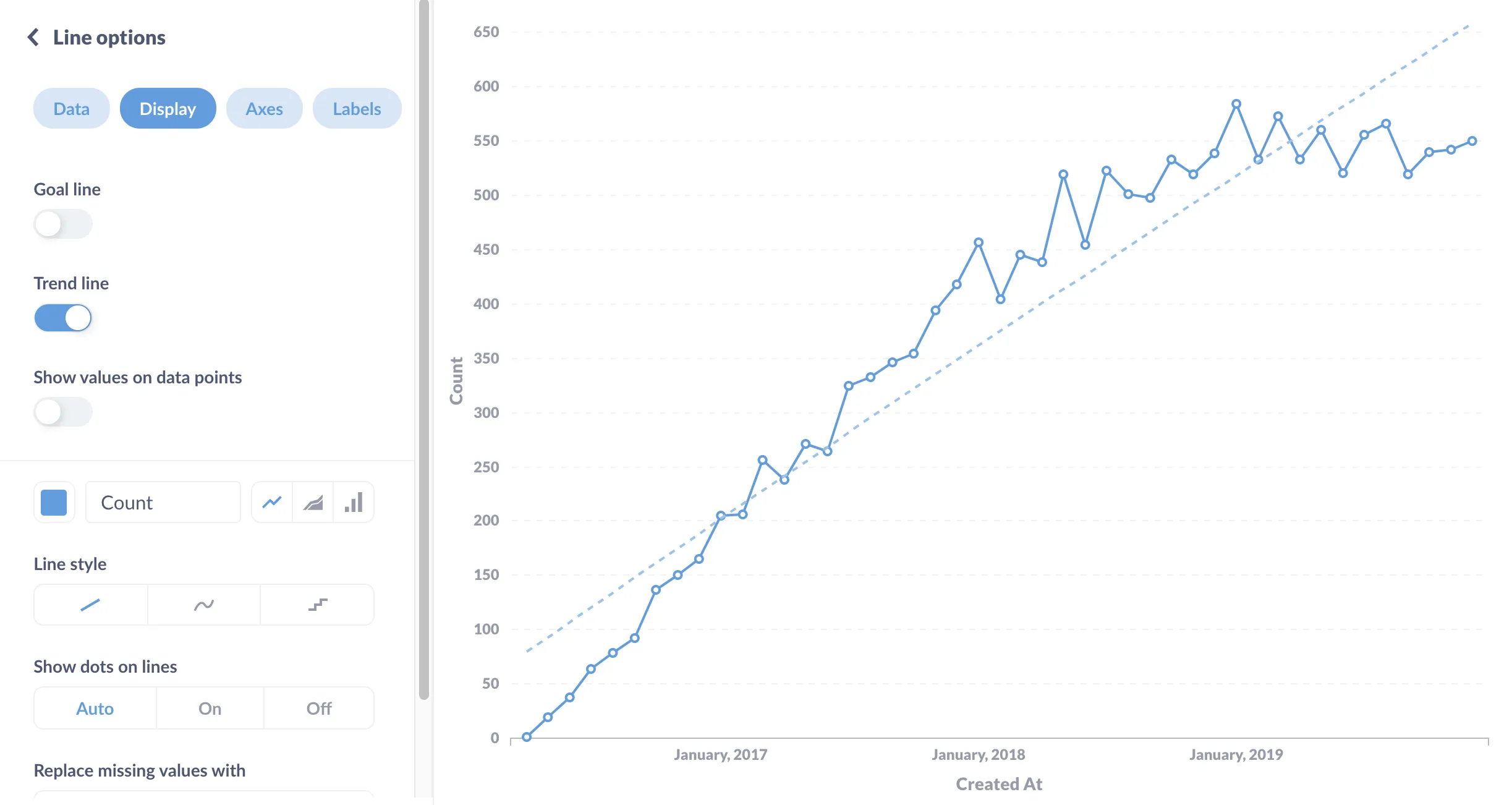
You’re also often going to want to present data as a time series to see how a particular measure changes over time (like a rolling 7-day average), and that’s when you reach for the line chart. Line charts give a simple shape to the data, making it easy to see if the numbers are trending up, or if they’re cyclical, or what the maximum value was for the past X weeks, and so on.
With that out of the way, let’s walk through some common scenarios to help you pick the right viz to communicate your findings.
When you only have one value
You have a few options in this scenario.
Static numbers
For static numbers, or at least a number that doesn’t change too frequently, use the (appropriately named) number visualization, which is good for at-a-glance values like the count of respondents in a survey. Keep in mind that a single number may lack context, so it’s best used on a dashboard that provides that, such as the number of surveys sent out or how many respondents we had last year.
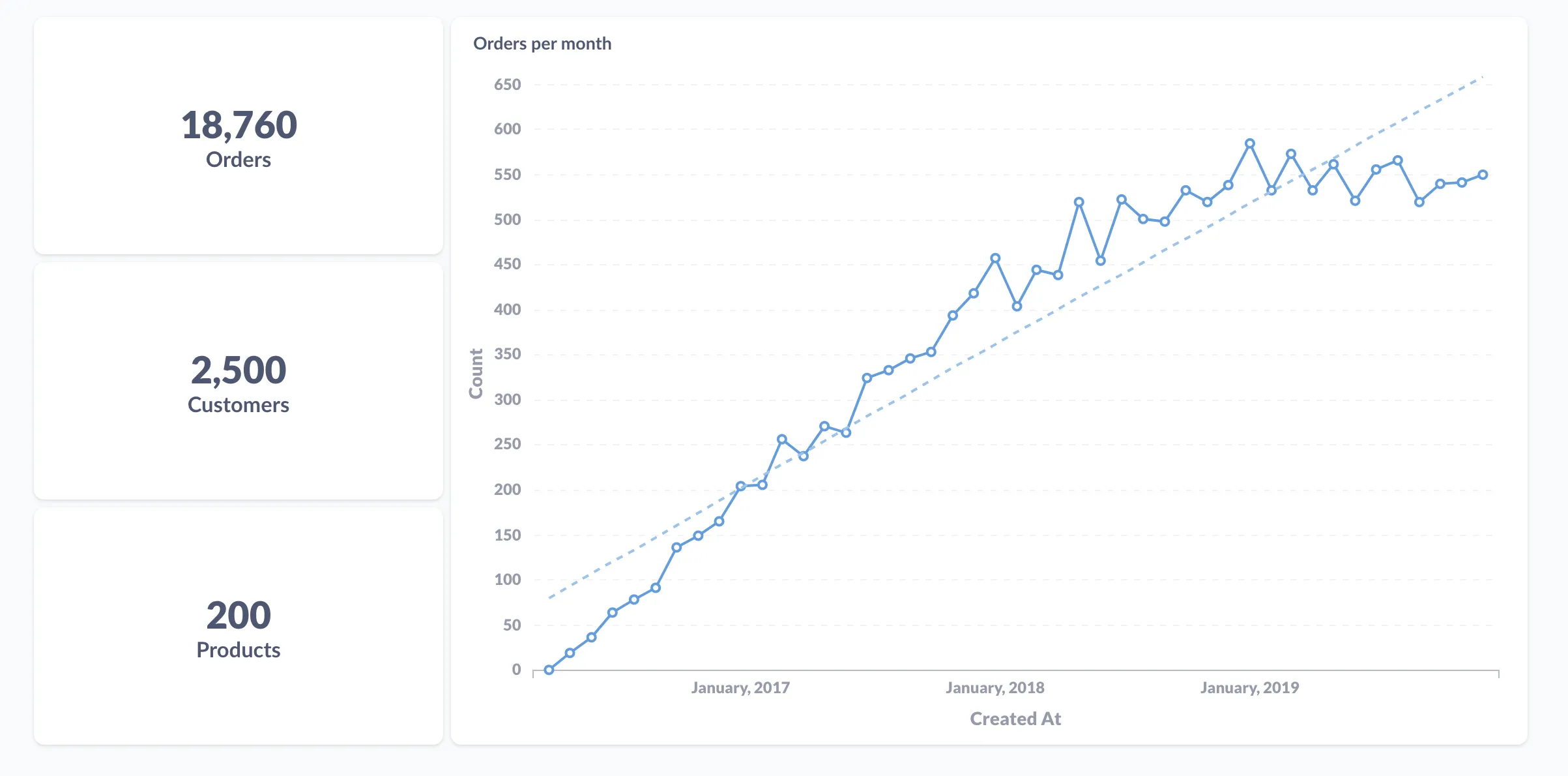
But even then, you should consider using the trend visualization if your number can be broken out by time (see comparing one measure over time below).

But even then, would a line chart be better? With a line chart, you can get a better picture (literally) of how the value has changed over time. Or you could go with the best of both worlds: a dashboard with a trend chart for the latest value (and its change from the last time period), paired with a line chart showing the history of that value.
Compared with a goal
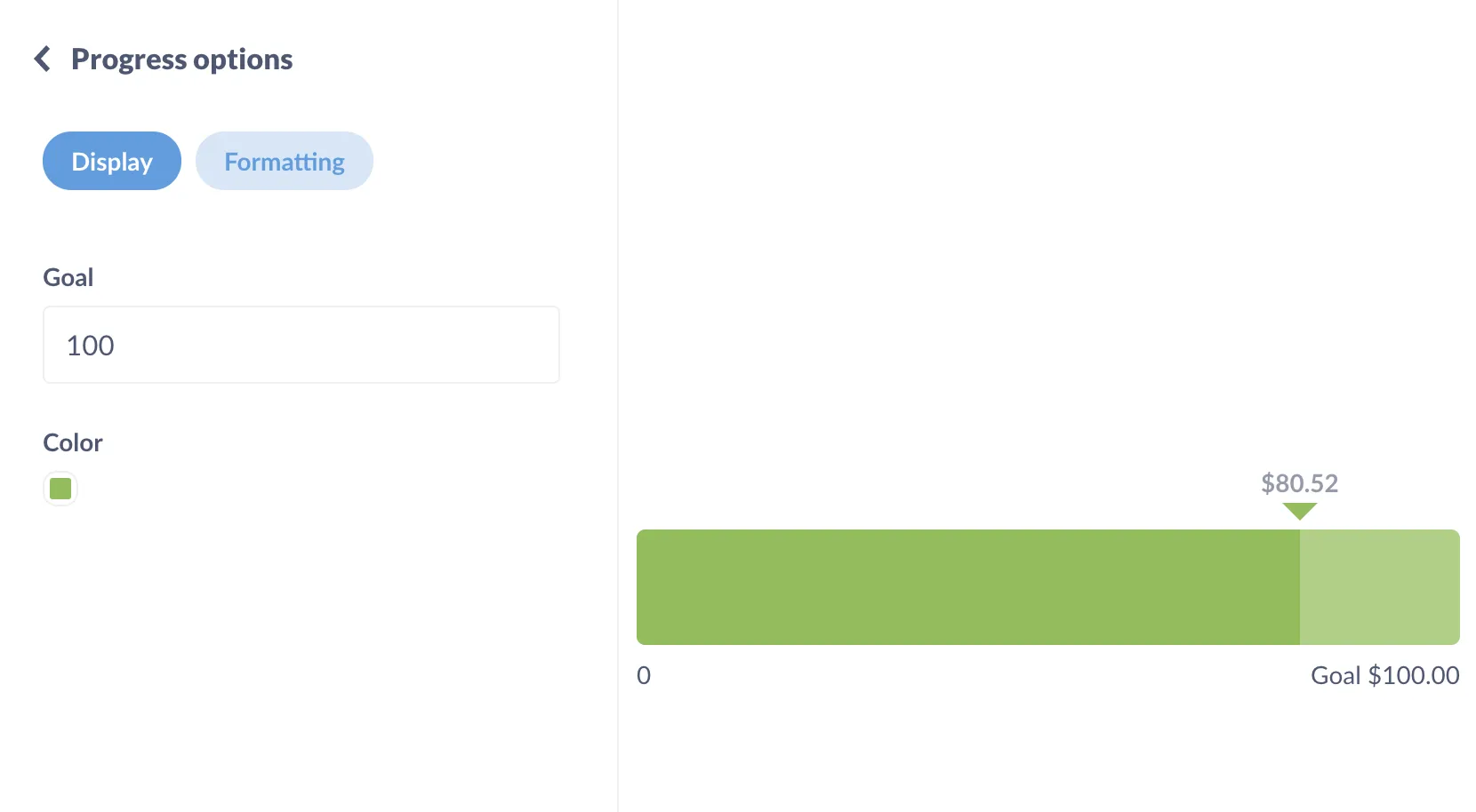
If you want to see a metric in the context of a goal, or limit, or other threshold, use a progress bar.
Position in a range
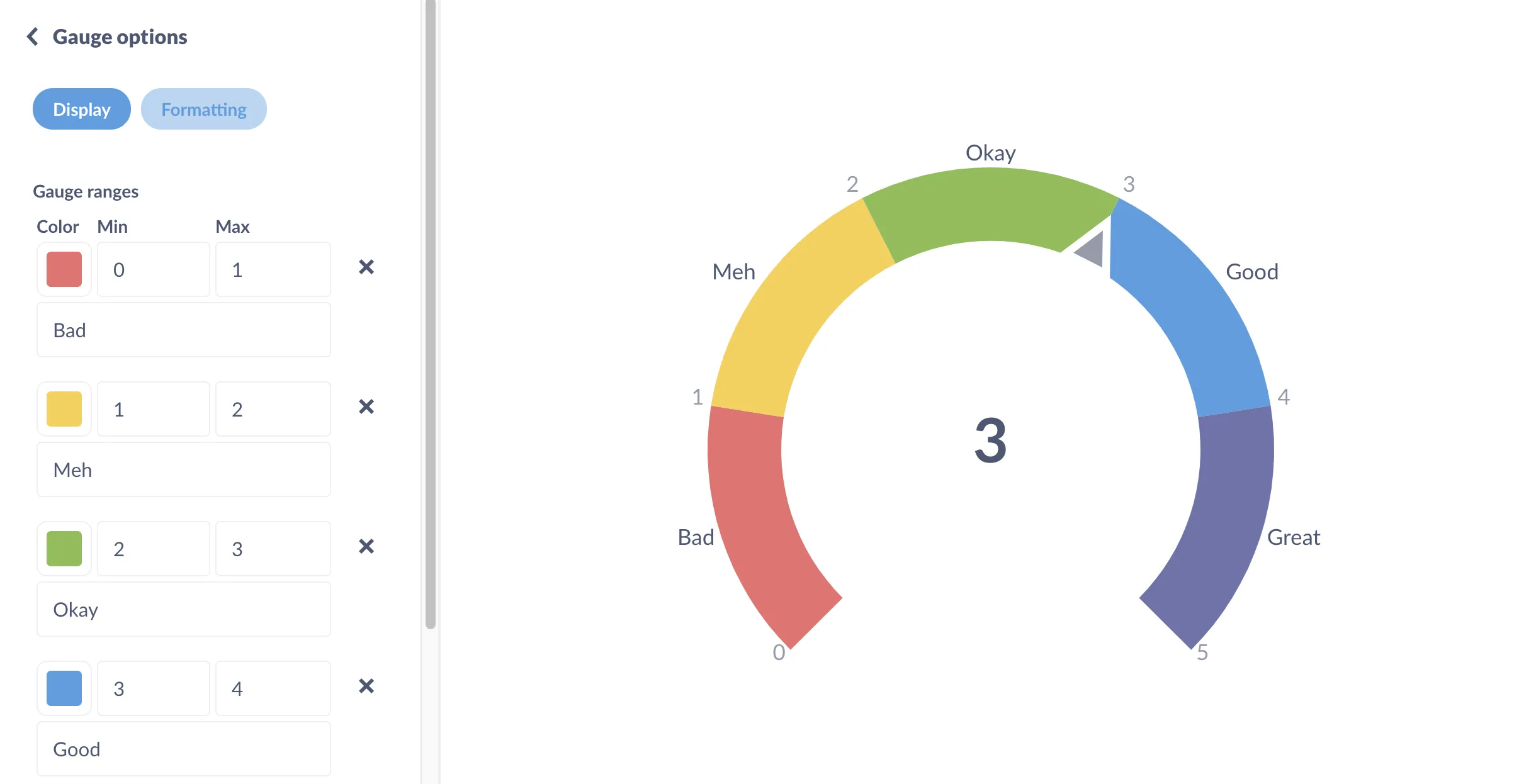
If the context of that number is a scale or range, use a gauge. Metabase will pick three partial ranges across the full range of values, but you can adjust the sizes of these ranges, or add additional ranges, and label them however you like.
Comparing metrics
Often we want to see how multiple values stack up against each other. The most common comparison is a single metric’s performance over time (how last week compares with the previous week, for example). But you’ll also frequently compare a metric across other dimensions, like sales across different product categories.
Static comparisons
For measures that won’t change, like responses on a survey or an annual report, you can compare values with a bar chart (sometimes called a column chart). If you have a lot of different items you need to compare, you should play around with switching to a row chart to see if that makes the bars more legible. For more, see Master the bar chart visualization.
One measure over time
When you want to compare and emphasize two sequential values of a metric, like this week’s value vs. last week’s, you can use a trend chart, which is essentially a time series in a box, showing the current value of the metric, and the previous value of that metric at whichever interval you’re tracking (last hour, day, week, etc.).
If you don’t need to emphasize the most recent delta, consider a time series instead so people can see the shape of the metric over time (especially useful if the most recent data is uncharacteristic of larger trends). Trends can also be good for situations in which teams look at a metric every week and know roughly its behavior; the trend viz is a convenient way to keep them posted on the latest numbers, like when throwing numbers up on a TV.
Line charts are the classic format for time series, but you can also present series values as a bar or area chart.
Multiple measures over time
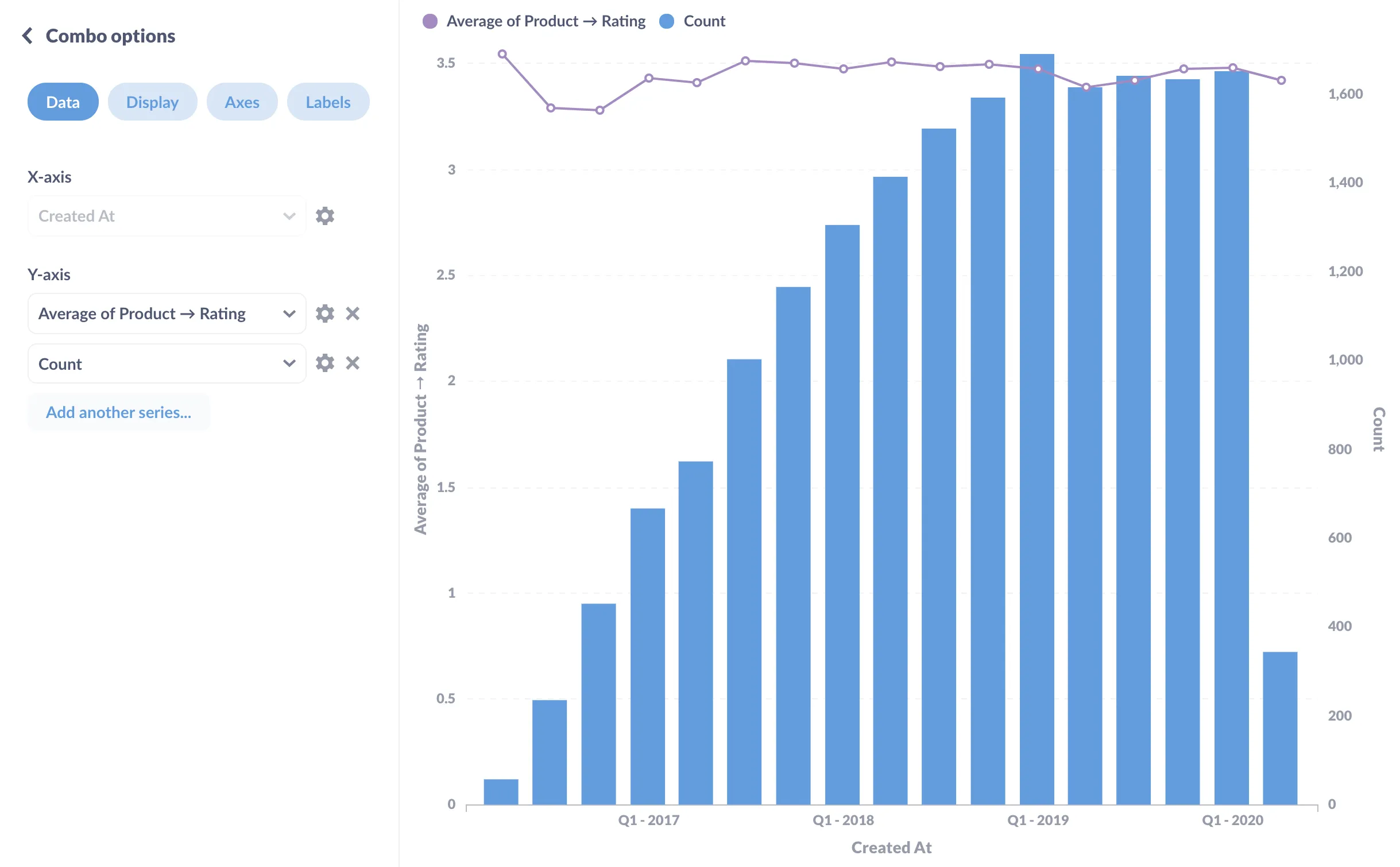
You could overlay two time series on a single line chart, with each line sharing the y-axis. If your measures have really different scales or units of measurement (say, dollars vs. quantity), then you could use a combo chart with two y-axes, to highlight this difference. Note the two y axes: average of product rating on the left and order count on the right.
Against a goal or benchmark over time
All you need to do here is add a goal line to your time series chart. You can also use goal lines to set up alerts, making them even more useful.
Showing the relationship between measures
You’ll sometimes want to see how two different measures correlate.
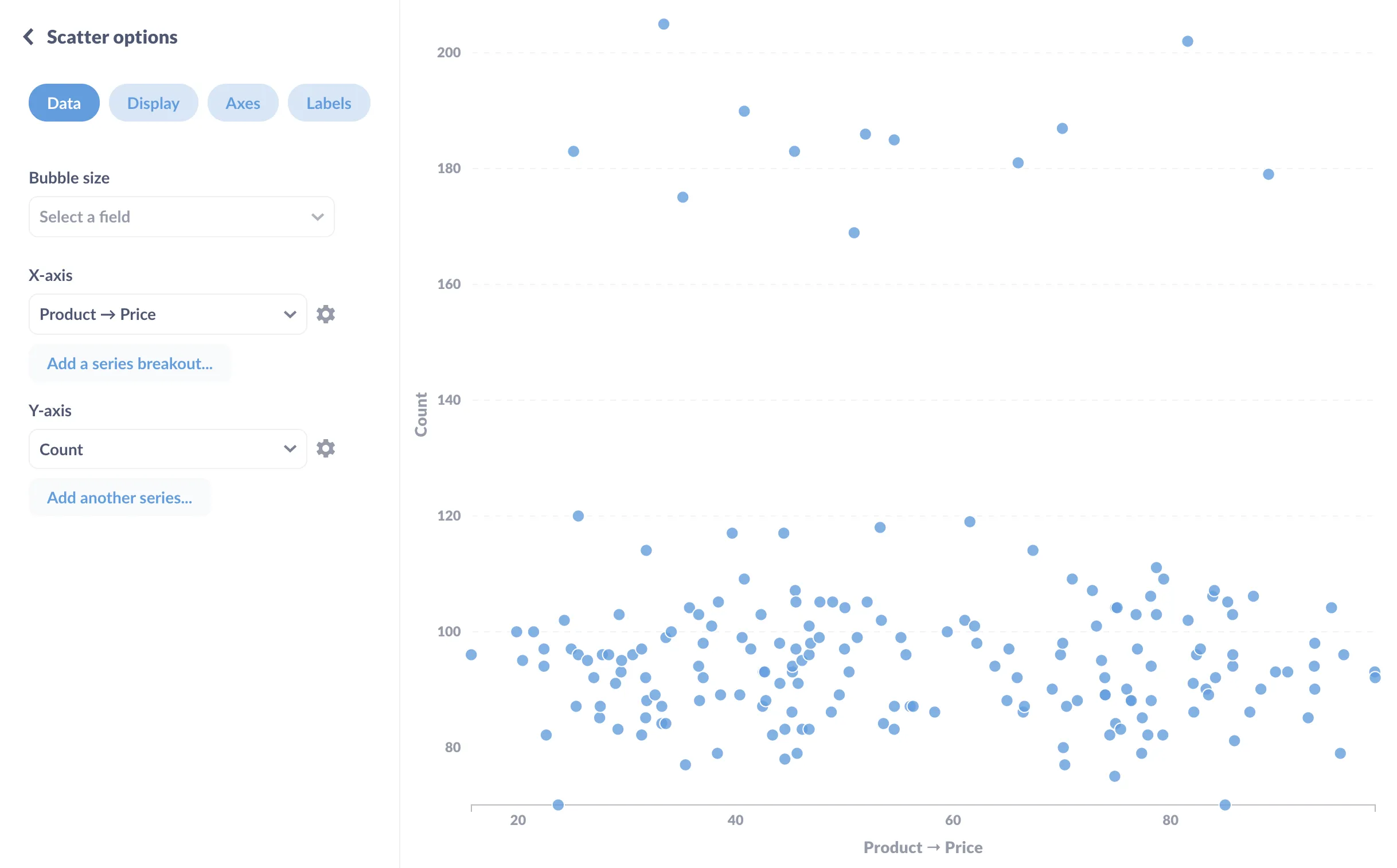
The basic way to see a relationship is to plot one variable along the x-axis and one along the y, and see if a pattern emerges. That’s a scatterplot. You’ll often see scatterplots used with data that hasn’t been summarized or aggregated, so that each point on the chart represents an individual record in the data—a single entry, person, session, specimen, etc.
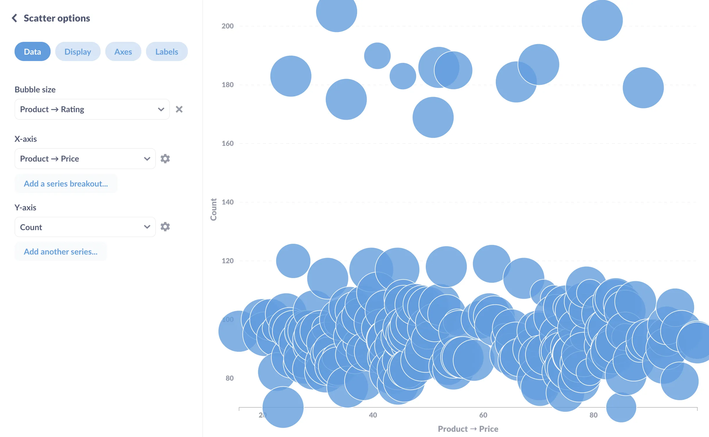
If you want to introduce a third variable, you could change the size of each dot to reflect the value of the additional variable, turning a scatterplot into a bubble chart. In this case, we’re telling Metabase to set the size of the dot to fit the product’s average rating.
Breakouts
A breakout shows the composition of a measure—how our sales break out by category, for example.
A metric with two or three groups or categories
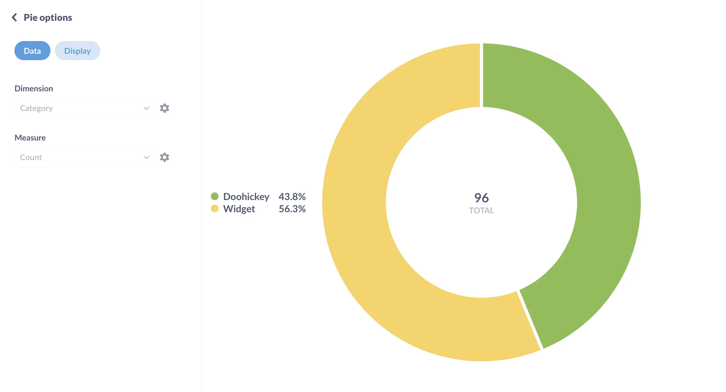
Pie or donut charts are good at showing how two or three parts make up a whole. The reason pie charts only work for two or three things is that any more than that and people start having a hard time comparing the relative proportions of the different parts. In that case, it’s better to reach for a bar or row chart.
A measure by its accumulating values
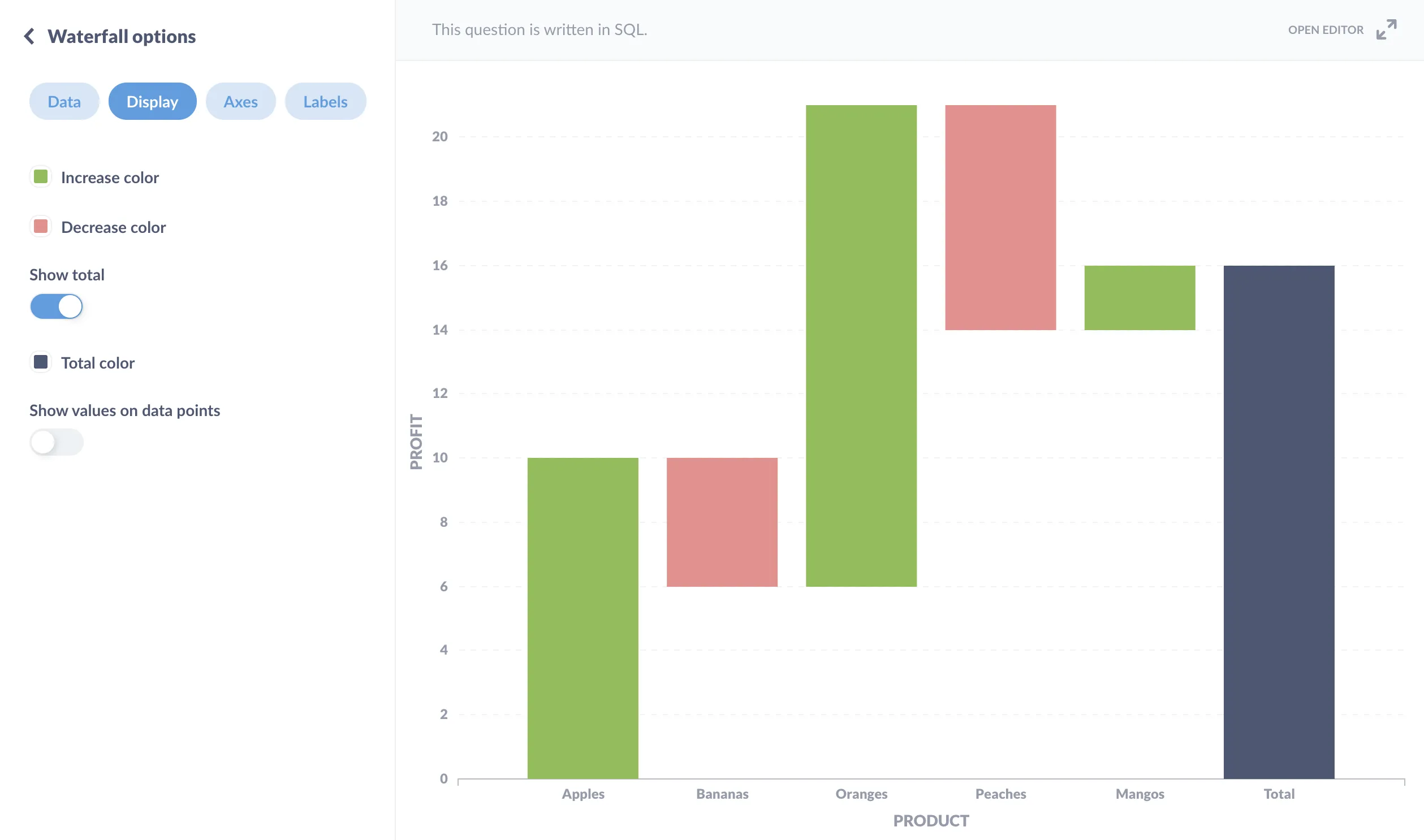
If you’re trying to visualize an accumulation, and when that value contains both postive and negative components, you’ll want to go with a waterfall chart. With Waterfall charts, you can include a total at the far right to display the cumulative value of the constituent inputs—each of the bars leading up to the total.
A measure by sequential steps
To see how a value drops off through a process, and at which step, you can use a funnel chart.
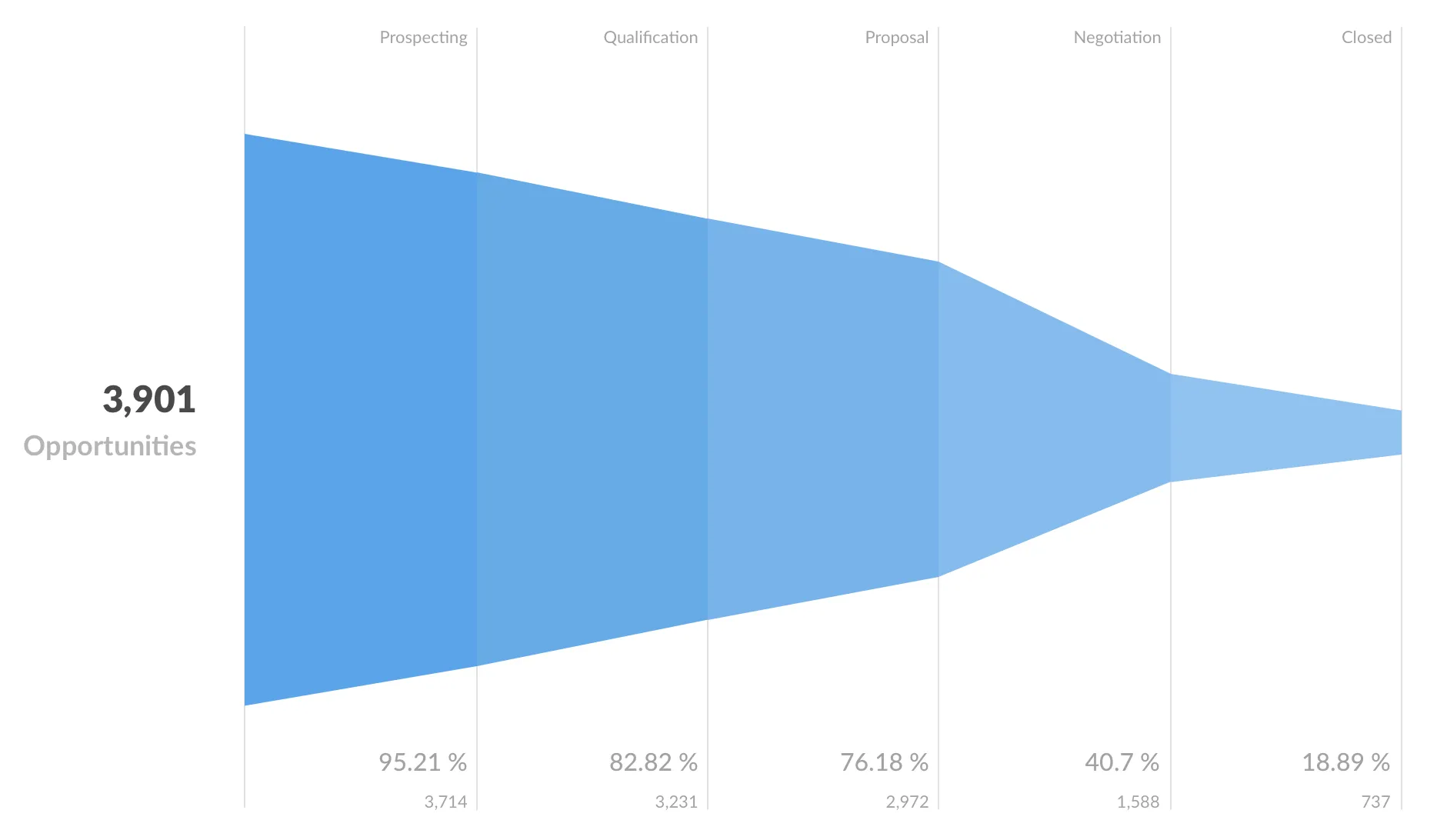
Funnel charts can also show the composition of a population, for example, a starting population where each step is an education level that further winnows that population: high school, bachelor’s, post-graduate, and so on.
You can also use a bar chart to plot the steps. Here’s a neat trick: on a dashboard, you can combine scalars to form a bar or funnel chart. All you need to do is calculate the measure at each step, then add them together on a dashboard card (just remember to add each step in sequence).
Categorical breakout over time
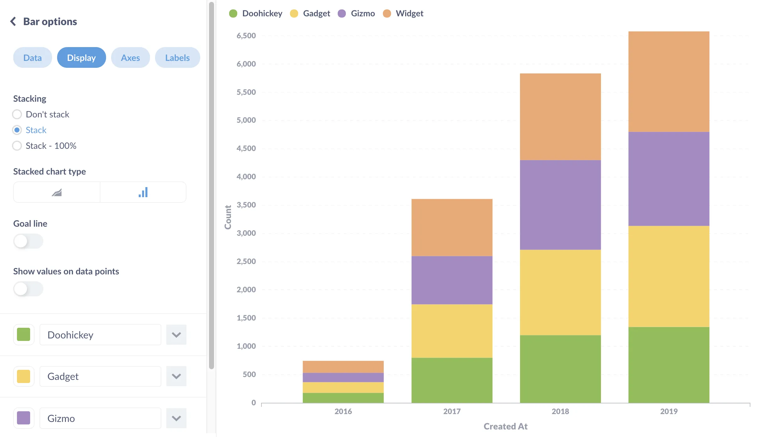
If you need to show how a number changes over time, and show the composition of that number at each interval, then consider using a stacked area or stacked bar chart. For example, let’s say we want to know both the total revenue (defined here as the sum of Order → Total), as well as how that revenue splits among our four product categories, Doohickey, Gadget, Gizmo, and Widget.
Relative changes among categories over time
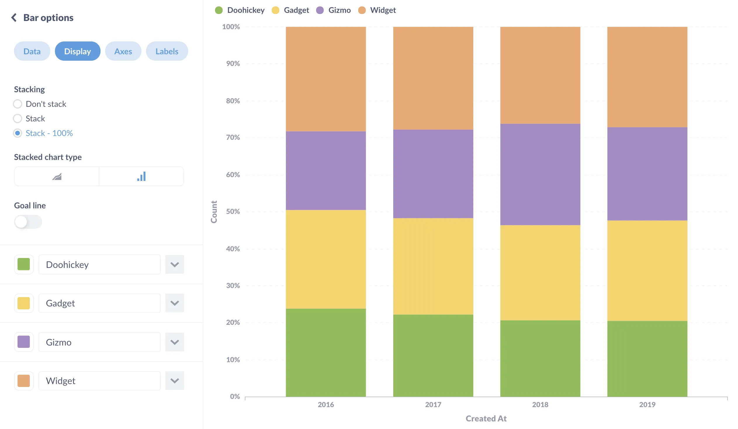
If you’re just trying to see how different categories change relative to each other over time, regardless of that count, you could use a stacked bar chart set at 100%.
Showing how values are distributed across a numeric range
The classic distribution chart is the histogram, which is basically a bunched up bar chart that bins values across a range, like taking the ages of each customer, splitting the customers up into age ranges, and counting the number of customers in each age range. Histograms are helpful for gaining insights into things like how much of an item people are likely to buy, the price range they are likely to purchase within, or even the time of year that most people make purchases.
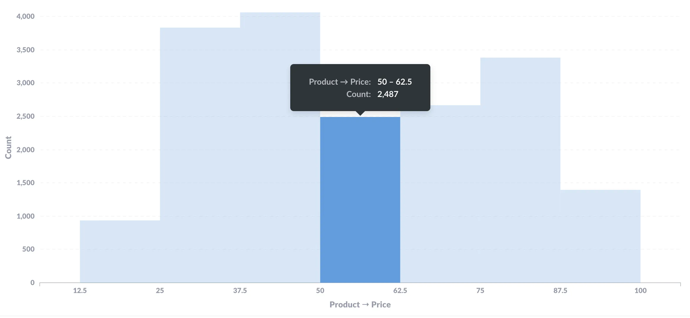
Check out Visualize your data as a histogram.
When your data contains geographic dimensions
So, obviously a map would be useful here, but which map? And do you really need a map, or would a table be the better choice?
Specific locations
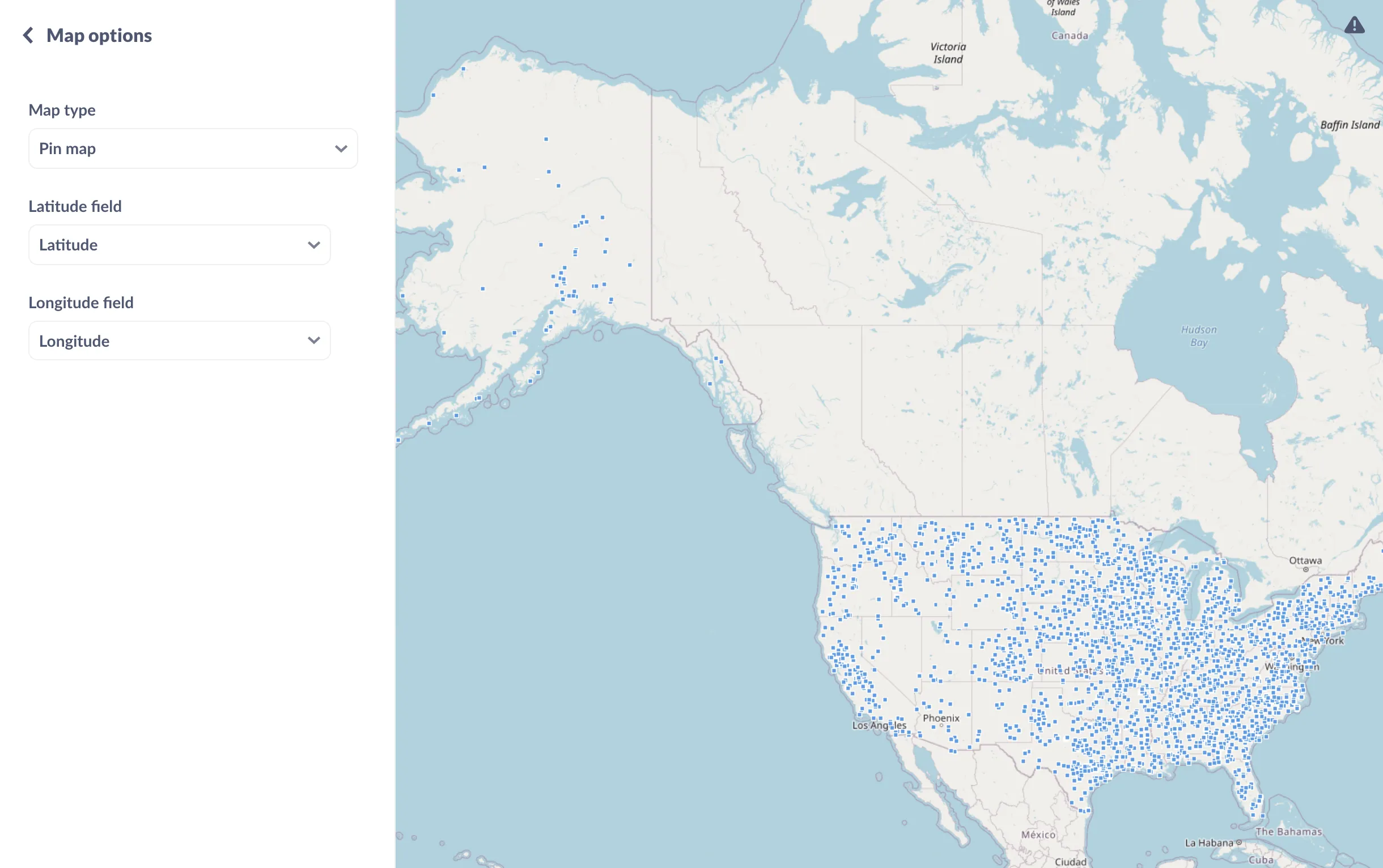
If you’re trying to plot specific locations of individual people or items, use a pin map.
Differences between regions
If you’re trying to understand how a measurement varies by a defined region like country or state, use a region map (also known as a choropleth map).
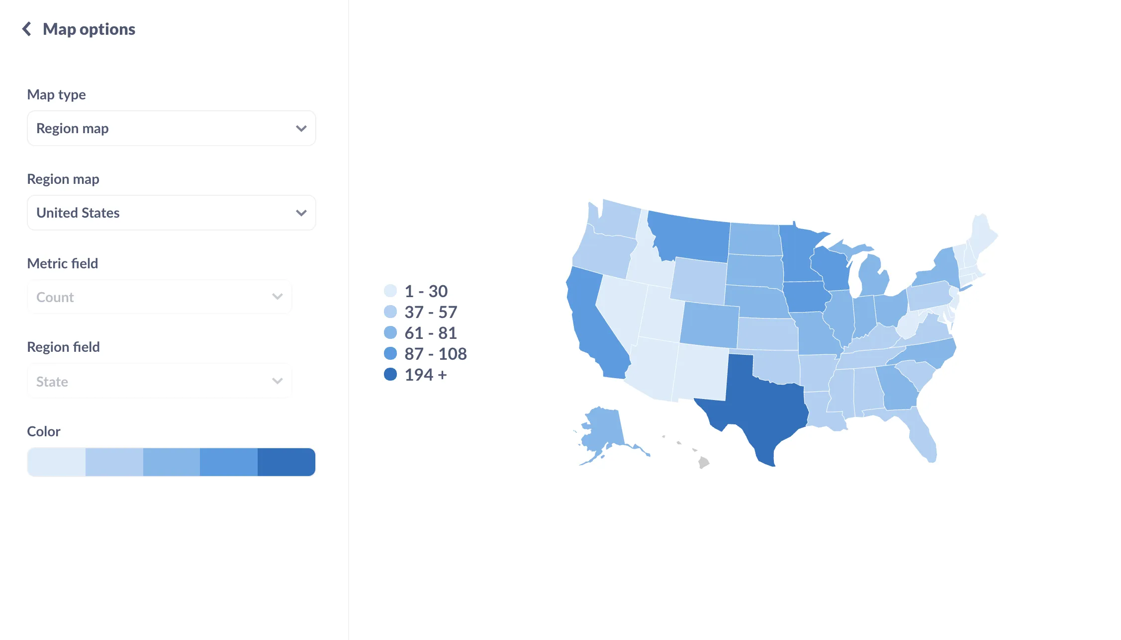
Region maps have defined borders (often political) and are shaded according to the values’ relative position in the total range of values. The values are binned, so that each shade corresponds with a bin (e.g., a bin could be values greater than 50 but less than 100).
Distribution of coordinates
If you’re less interested in exact locations, and are more interested in the hot spots, you can bin your coordinates to create a grid map.
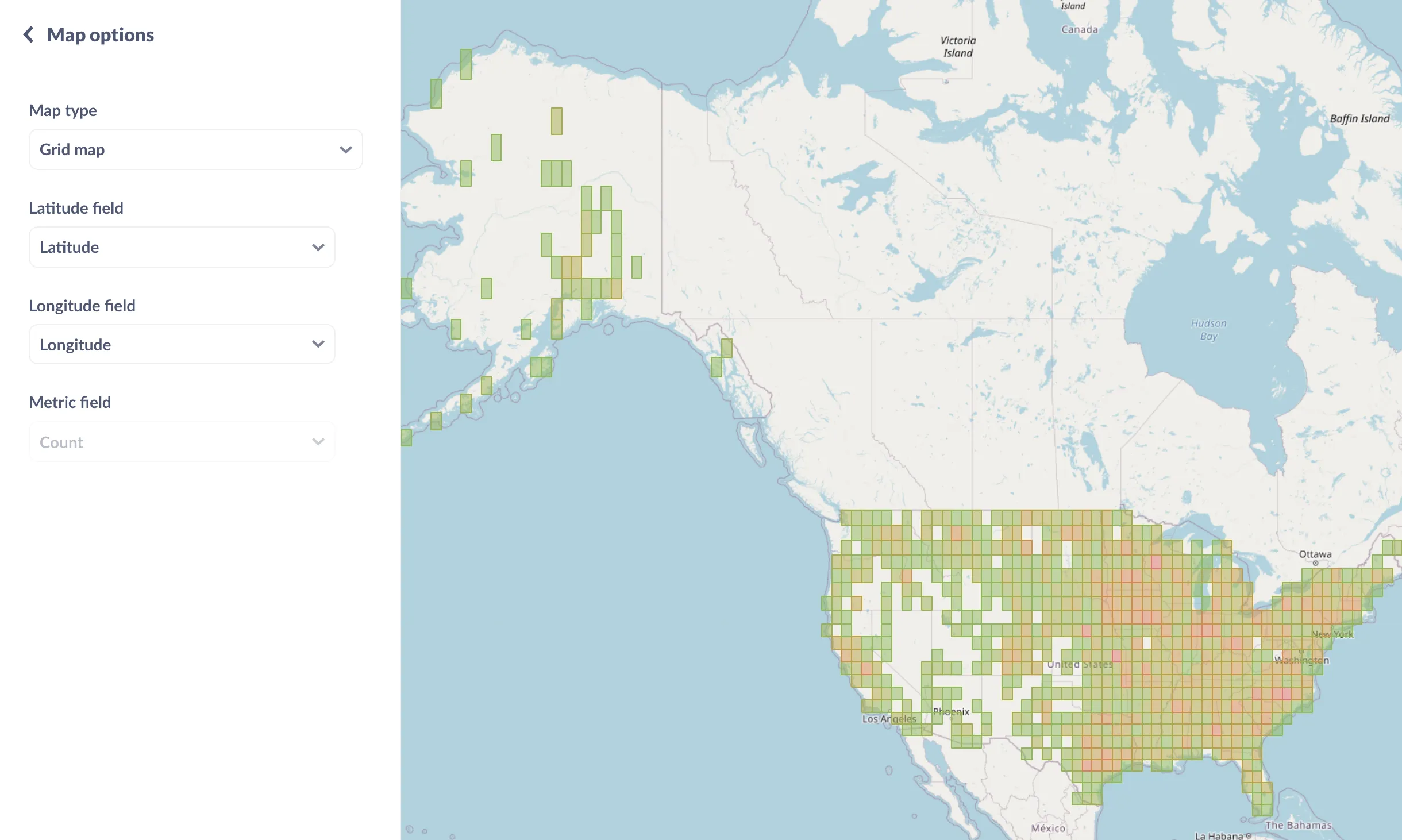 Grid maps are like heat maps that bin locations in a grid that overlays the map, and are good for showing where hot spots are.
For more on working with maps, see Maps documentation.
Is a map the best choice?
Then there are situations in which a map is not useful. For example, if you want to see how states stack up according to a certain value, you may want to display the data as a table, so people can sort that data and see immediately which states are pulling in the most revenue. That said, with Metabase you can always save a question as a map, and leave it up to the viewers to drill through the data.
Further reading
Once you’ve settled on your charts, it’s time to add them to a dashboard. Check out Best practices for BI dashboards.

