Histograms
Learn when to use a histogram, and how Metabase makes it easy to create histograms.
We’ll walk through creating a histogram, which is a type of bar chart that displays groups of data across a continuous range. Histograms are helpful for gaining insights into how much of an item people are likely to buy, the price range they are likely to purchase within, or even the time of year that most people make purchases.
Histograms versus bar charts
Histograms are a type of bar chart. While the bars on a typical bar chart represent categorical groups, the bars on a histogram represent ranges along a continuous, quantifiable spectrum.
In other words, you split the data into bins in order to view the distribution of values within a range. The bins are of equal length (and can be empty), and the bins are contiguous. The height of each bar represents the count (or proportion) of the items in the bin. The number of bins is up to the user, though Metabase will automatically select the number of bins for you.
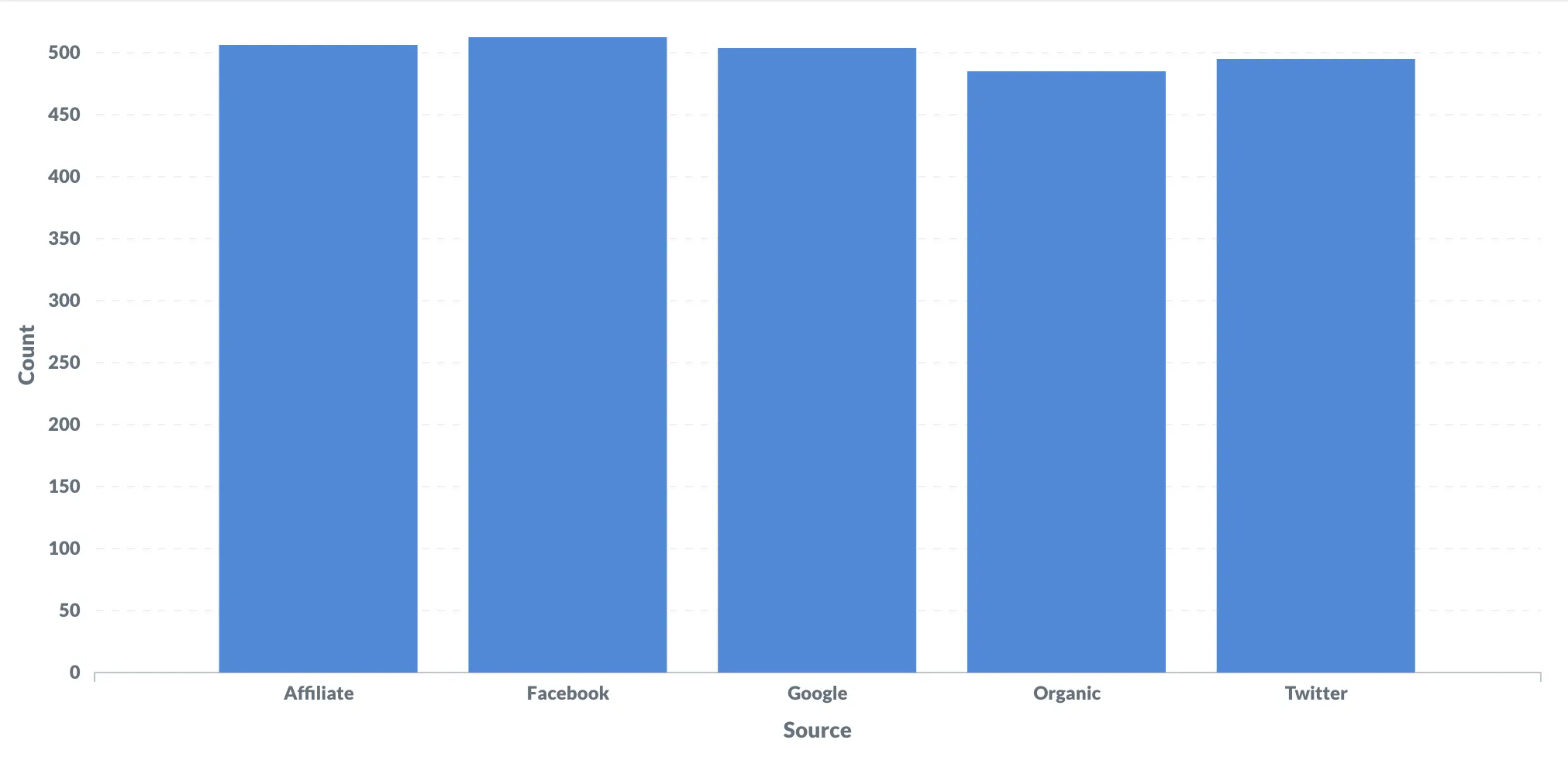
Here’s a bar chart that displays the count of people from the People table grouped by referral source.

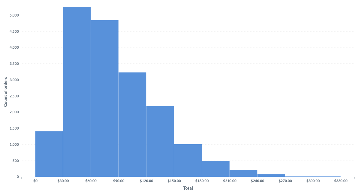
Here’s the histogram we’ll create in the walkthrough below.

Metabase makes it easy to create a histogram. In fact, if the data is suitable for a histogram, Metabase will automatically create a histogram for you.
Create a histogram
Follow along with Metabase’s Sample Database to create the histogram detailed below.
Select + New > Question. In the Query Builder under Pick your starting data, choose Raw Data > Sample Database, and select the Orders table. Then Visualize the results.
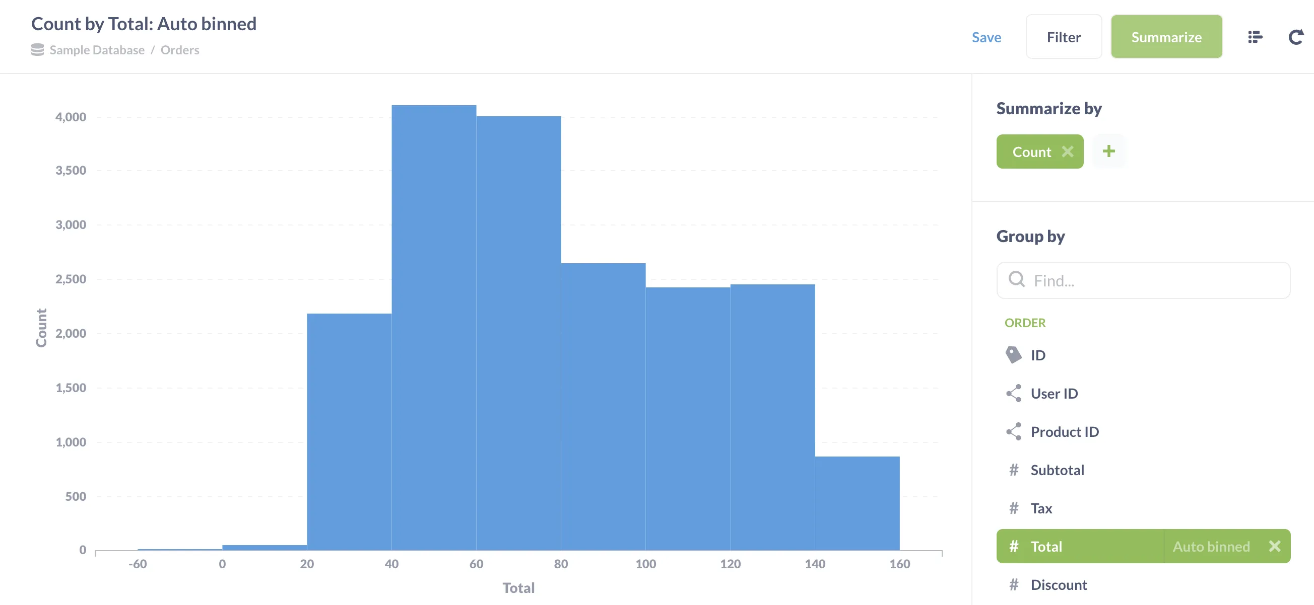
Once you’re viewing the Orders table, click Summarize. Scroll down and select Total, and click the + button to add the grouping. Metabase will automatically create a histogram for you!

The histogram shows that customers are most likely to make purchases totaling in the $40-60 range. If you hover over one of the bars, Metabase will display the count of orders in that range. You can also click on a bar to drill-through the data and see the orders that compose the bar.
Edit a histogram
Metabase gives you a lot of knobs for customizing a bar chart. For now, we’ll hone in on the settings that make histograms shine.
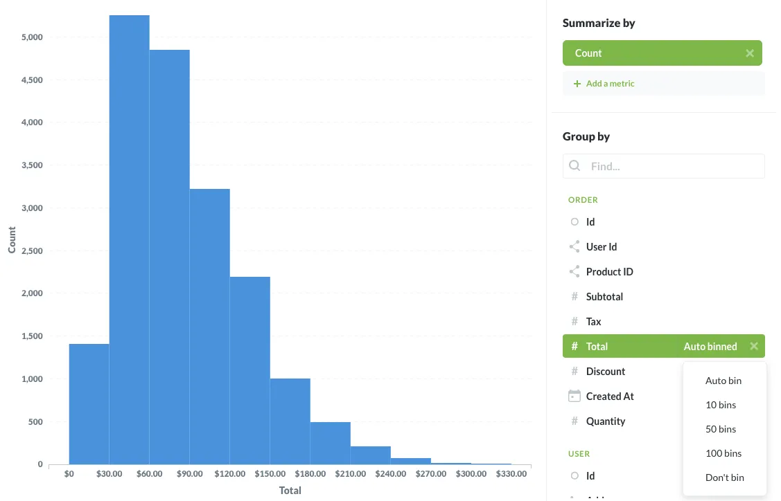
Metabase will automatically set the number of bins, but you can change how Metabase bins the data. Click Summarize, scroll down to # Total, and click on Auto binned. A dropdown menu will present the options: Auto bin, 10, 50, or 100 bins, or Don't bin.

Click the Settings > Axes. The x-axis scale currently says Histogram. Metabase detects when your bar chart should present as a histogram, and selects the best x-axis scale for your visualization.
If you toggle between the three options, you’ll see that Histogram is the only axes option in which the bars are flush with each other. The flush bars communicate that the x-axis represents a continuous range of data. Linear axes are good for displaying data in categories. Ordinal axes are good for displaying data that’s grouped in distinct number categories. For example, displaying how many ratings you receive that are either 1, 2, 3, 4, or 5.
Ordinals differ from histograms because ordinals group by distinct number values, rather than a continuous range of values.
You can also change the scale of the y-axis to make your chart easier to interpret. If the range of your data along the y-axis is tall, consider using a logarithmic scale. If your range is compact, you can display counts using a power scale (though you’ll probably never need to do this).
Happy histogramming!
Further reading
We’ll cover more visualizations types in future posts. In the meantime, check out:

