


Discover trends in your data
Learn how to cut through noisy data and spot the real trends in your metrics.
Trends show whether a metric is rising, falling, or staying flat, but real-world data often makes trends hard to see.
In each of these charts, can you spot the long-term trends?
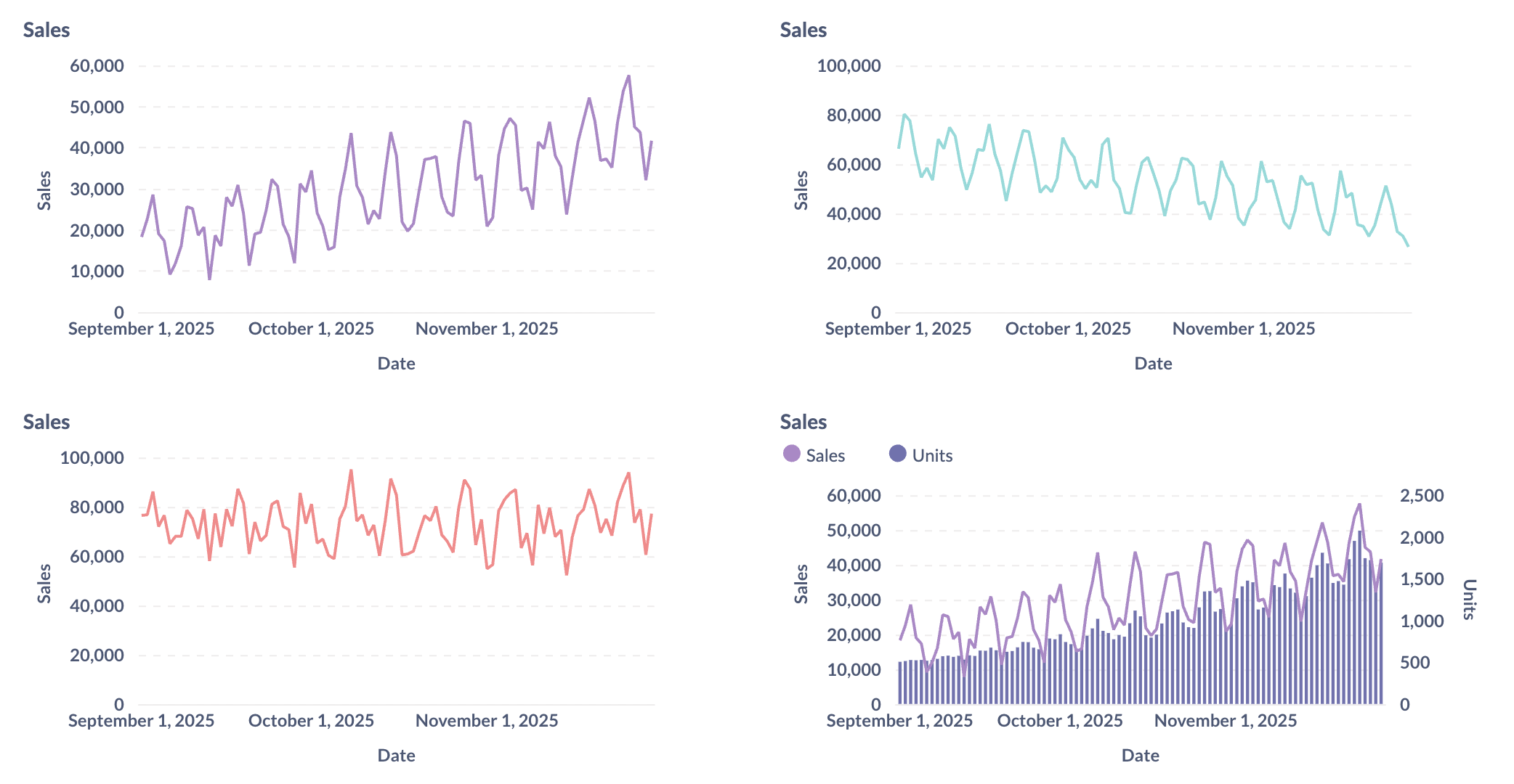
On a real dashboard, patterns aren’t always obvious. Daily values fluctuate, weekly totals can spike or dip, and even monthly views can include irregularities. Trends can be obscured by noise and repeating or seasonal patterns.
This guide walks you through different ways to see trends more clearly:
- Choose a time granularity: daily, weekly, or monthly appropriate to your data.
- Use rolling averages to smooth noise in the data and make the trend clearer.
- Add a trend line when you need a quick read on the overall direction.
- Look for overlapping trends by checking ratios and breaking results down into segments.
- Check for incomplete periods to avoid mistaking missing data for a real decline.
Choose the right time granularity to group your data
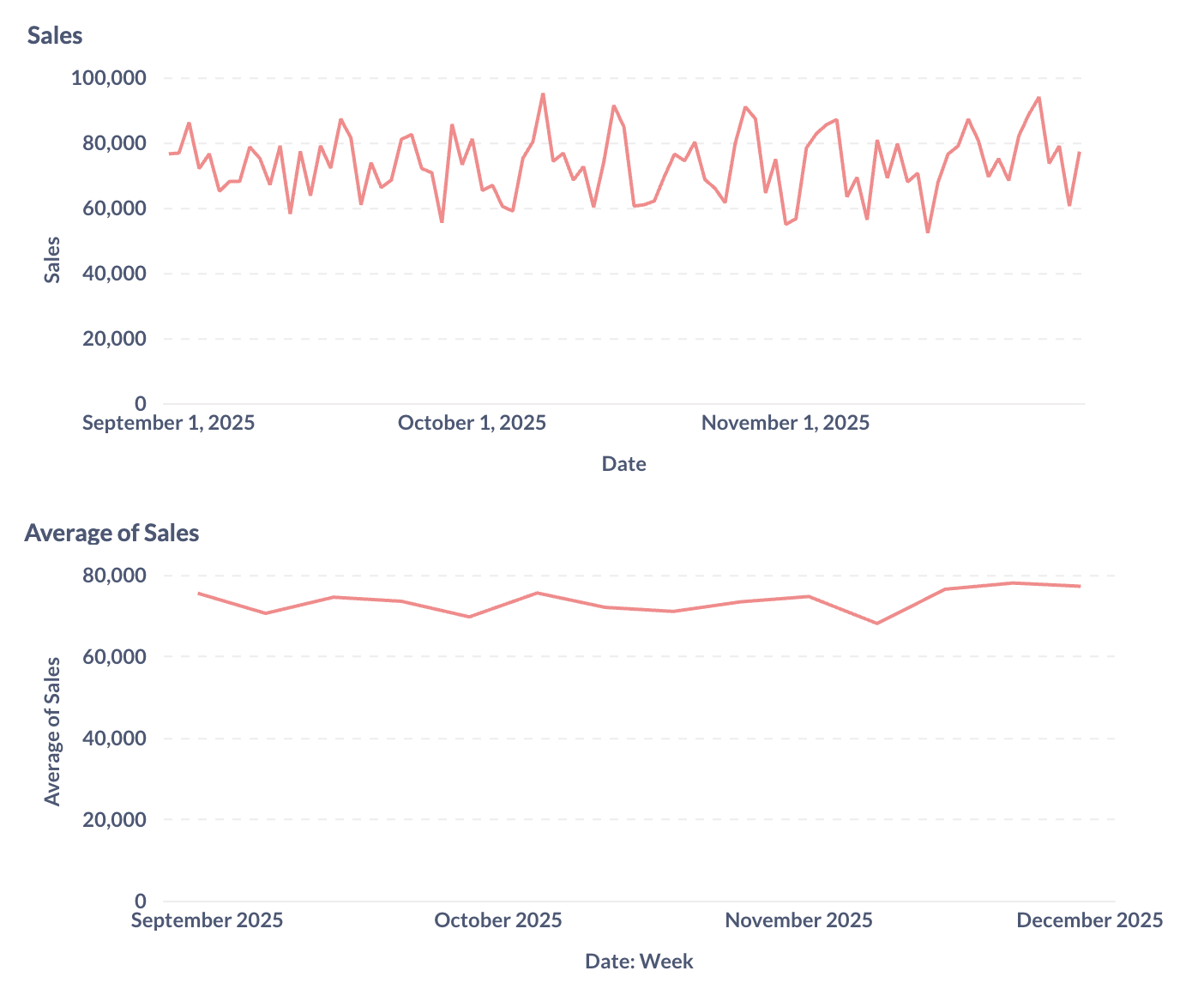
Granularity is the level of detail in your time axis: hourly, daily, weekly, monthly, quarterly, yearly, or whatever your data supports. Here is an example of one month of sales data, showing a fair amount of variation day to day.
If we look at the longer term, however, we can see that the overall trend is quite flat (top chart below). Averaging our sales by week makes clarifies the flat trend:
The time granularity you choose changes what you see.
- Finer granularity (like hourly or daily): useful if you care about short-term effects, like a system incident or a campaign launch. But finer granularities can also make small day-to-day bumps obscure the bigger picture. In a weekly chart like in the image above, weekends, holidays, or a missing entry will stand out.
- Coarser granularity (weekly, monthly, quarterly): makes the overall trend easier to see, which is helpful when you want to track progress toward bigger goals. The trade-off is that the granularity hides short-term changes.
There’s no “right” answer here. The right granularity depends on your data (do you even have hourly or daily values?) and on your task (are you reacting to something today, or reviewing the past quarter?).
Rolling averages clarify trends by smoothing out noise
Even after aggregating data into larger time buckets (like weeks or months), metrics can still bounce around in the short term, making trends hard to see. A rolling average (or moving average) smooths those bumps while keeping the original time scale.
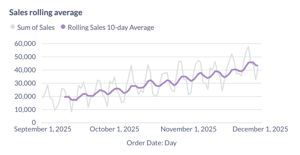
Rolling averages also avoid the sharp jumps you get when a new week or month starts, since the average slides forward one step at a time instead of resetting at calendar boundaries.
Here’s how it works: a rolling average looks back at a window of time (say ten days), averages the days in that window, and then slides that ten-day window up by one day. The time windows overlap, creating a sort of rolling window that moves over the data.
Sizing the window to fit the data
The size of the window determines how much smoothing you get:
- To reduce short-term spikes, use short windows (10 days). They respond quickly to changes, but still show some fluctuation.
- To clarify long-term trends, use long windows (30–90 days). They’re much smoother, but slower to show real changes.
Caveat: rolling windows create lag
Rolling averages help reveal the underlying direction, but they also lag behind reality. If something changes suddenly, it takes time for that shift to appear in the rolling average.
Trend lines are sensitive to the length of their period
A trend line is a line fitted across your data to show the general slope. Most tools fit a straight line to the data (linear regression), though some also offer curved fits for more complex patterns.
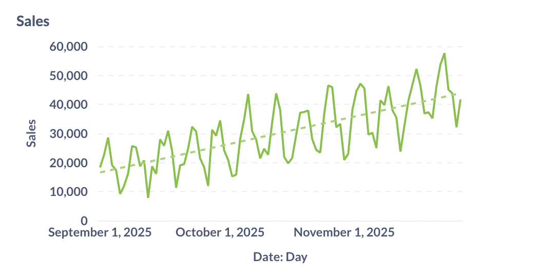
Trend lines are useful because they add longer-term context to noisy data that still has short-term bumps. Similar to rolling averages, you can see the overall direction at a glance without getting distracted by every peak and dip.
But trend lines are sensitive to the time window you select. A 30-day trend line might slope downward, while the same metric over 12 months might slope upward. Always match the window to the decision you’re making, and check a longer view for context.
Overlapping trends can tell a different story
Sometimes a single number looks good on its own, but tells a different story when combined with other data. For example, revenue might rise while the average price per unit falls.
Example: sales vs. units
Suppose total sales revenue is increasing. On its own, that looks positive (line in the chart below). But when you add units sold (bar chart), you see:
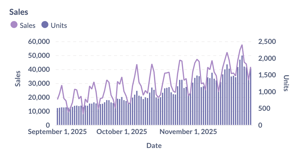
What’s the trend here? Revenue went up, but units went up even more. Sales are growing more slowly than units, which means the average unit price is decreasing. Growth came from selling more lower-priced items, not from stronger demand for higher-priced ones.
The trend becomes even clearer when we plot the unit prices for each week:
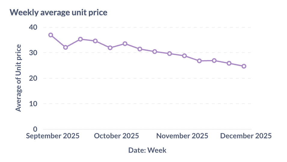
Whether weakening demand for the products at their original price is a concern depends on what we’re after. If we’re mostly concerned about total sales, this isn’t a problem. But if this means that our business is moving down-market, we might want to consider our sales and marketing strategies.
Overlapping trends can be confusing
- Totals can hide details. If revenue increases, you don’t know whether the increase is due to higher prices, more units, or both.
- Ratios (e.g., Revenue / Customers, Sales / Units, Leads / Visitors) show how one metric relates to another and reveals what’s driving the change.
- Segments (e.g., by region, product line, or customer group) can show whether growth in one area is covering up decline in another.
When reviewing totals, always ask: “What’s behind this number?” Look for related data and examine ratios, or break the data up into segments, to get a better sense of the complete story.
Incomplete data: avoid half-finished periods
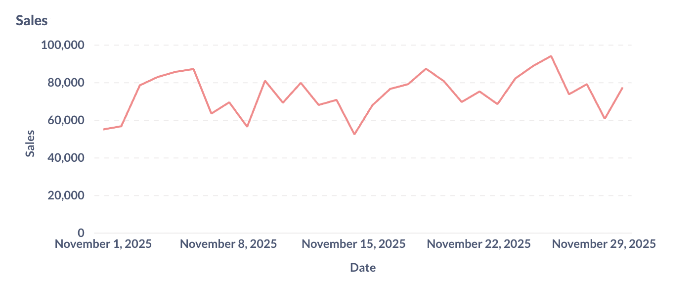
Another common pitfall is treating unfinished time periods as if they were complete. A chart might show a downward trend in your data, but in reality that period just isn’t finished yet. For example, you might be checking your monthly data on the 10th of December, which means you’re missing 2/3 of the month. Your chart might look like this.
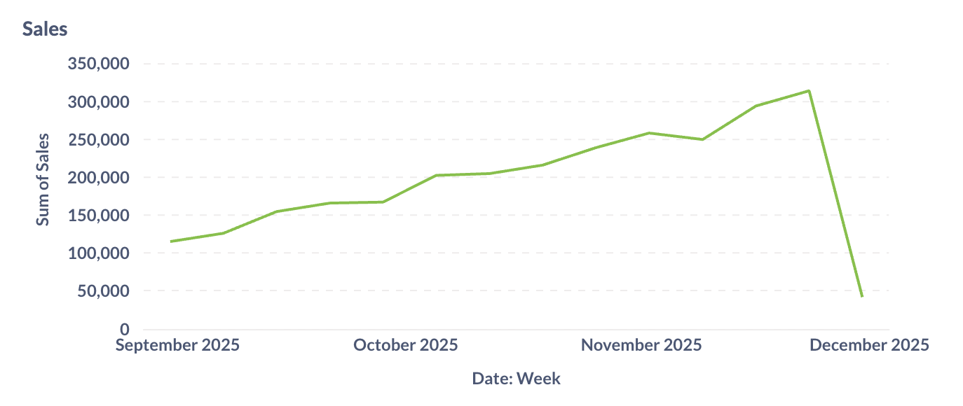
This example shows an obvious drop-off due to incomplete data, but in real-world analysis, people often mistake incomplete time periods for a recent downward trend. To avoid this pitfall, filter out the final, incomplete period, or include a warning about overemphasizing the final data point in a chart.