


How correlation works
When variables are correlated, one can be used to estimate the other. Correlation is useful in data analysis and forecasting.
In real-world datasets, we often find that two metrics, or variables, closely resemble each other. We refer to these variables as being correlated. Knowing that two metrics are correlated is useful, because it allows us to estimate one value based on the other.
If, say, we observe that our ice cream stores sell more ice cream on sunny days, that will allow us to take an educated guess at our sales based on the weather forecast. The actual reason might not be sunshine (maybe it’s really temperature?), but a strong correlation still means that our estimate will be right more often than not.
A common misconception is to assume that correlation between two variables means that there is a causal relationship. But correlation is simply an observation of a statistical relationship. The real reason for the higher ice cream sales in the summer might be the number of tourists, and those tourists tend to visit in the summer. Sunshine is still a useful proxy for estimating ice cream sales, but it’s not the underlying cause.
What is correlation?
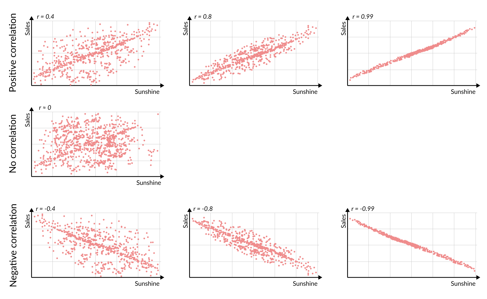
Correlation is defined as a mutual relationship between two variables or metrics. A direct correlation (also called a positive correlation) means that a larger value in one variable corresponds to a larger value in the other. An inverse, or negative correlation means that when one variable has a larger value, the other’s will be lower.
Direct and inverse correlations can have different strengths. The more closely tied the numbers are, the stronger the correlation, whether the relationship is direct or inverse.
When there is no correlation, there is no discernible connection between the variables. Perhaps instead of ice cream we’re selling toilet paper. Our sales change slightly day to day, but more sunshine does not seem to help us sell more, nor does sunshine decrease our sales.
How correlation is measured
We usually measure correlation with a single number called the Pearson correlation coefficient, Pearson’s r, or just r. Its value ranges from –1 to +1, indicating both the direction and strength of the correlation:
- r = +1: perfect positive relationship (higher value in one metric means higher value in the other)
- r between 0 and 1: positive correlation, stronger the closer it is to 1
- r = 0: no relationship
- r between 0 and -1: negative correlation, stronger the closer it is to -1
- r = –1: perfect inverse relationship (higher value in one metric means lower value in the other)
In our ice cream sales example, a strong positive correlation (say, r = +0.8) would mean warm days would usually come with higher sales. An r of about 0 would indicate no clear pattern, while a negative r would suggest hotter days coincide with fewer sales.
We can spot correlation visually in the scatterplots above: dots that form a clear upward line mean a strong positive correlation (high r), while dots that are more spread out mean a weaker or no correlation.
Explanatory power
When two variables A and B are correlated, we could just assume that the value of B is exactly that of A. If we know A, we also know B. Such perfect correlation (r = 1) is of course almost never the case in practice. But how much of B’s value is determined by A (and vice versa)?
The image below visualizes this predictive relationship. The straight line represents the expected values, while the individual dots show the actual data points deviating from that estimate.
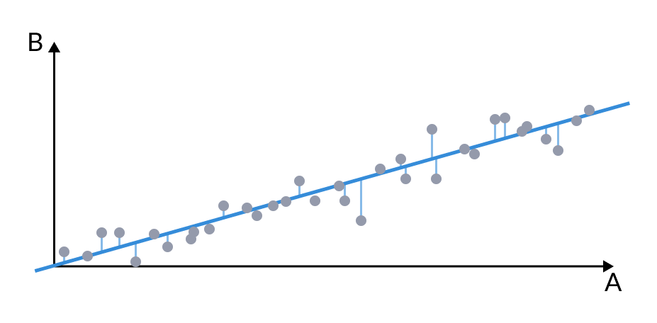
To quantify how much of B is predicted by A (and vice versa), we use r-squared (r²). By squaring the correlation coefficient r, and multiplying it by 100, we produce a percentage which reveals how much the input variable can explain the variance in the target variable.
If the correlation between sunshine and ice cream sales is 0.7, then r² is 0.49 (or 49%). We can explain about 49% of the ups and downs in sales by the temperature, the other 51% is due to other factors (such as holidays or equipment failures).
Simpson’s Paradox: subsets of data can have inverse correlation
So far, we’ve considered the entire dataset at once. But when we break the data down into subsets and compute correlation on each, we often find a surprising reversal of the overall correlation.
For example, consider the relationship between time spent studying and students’ test scores. At each school, we might find a positive correlation between study time and test scores, but if we look at all students across three different schools, the trend might appear to reverse. This reversal might be explained by more challenging schools that require considerably more study time, while still resulting in lower scores.
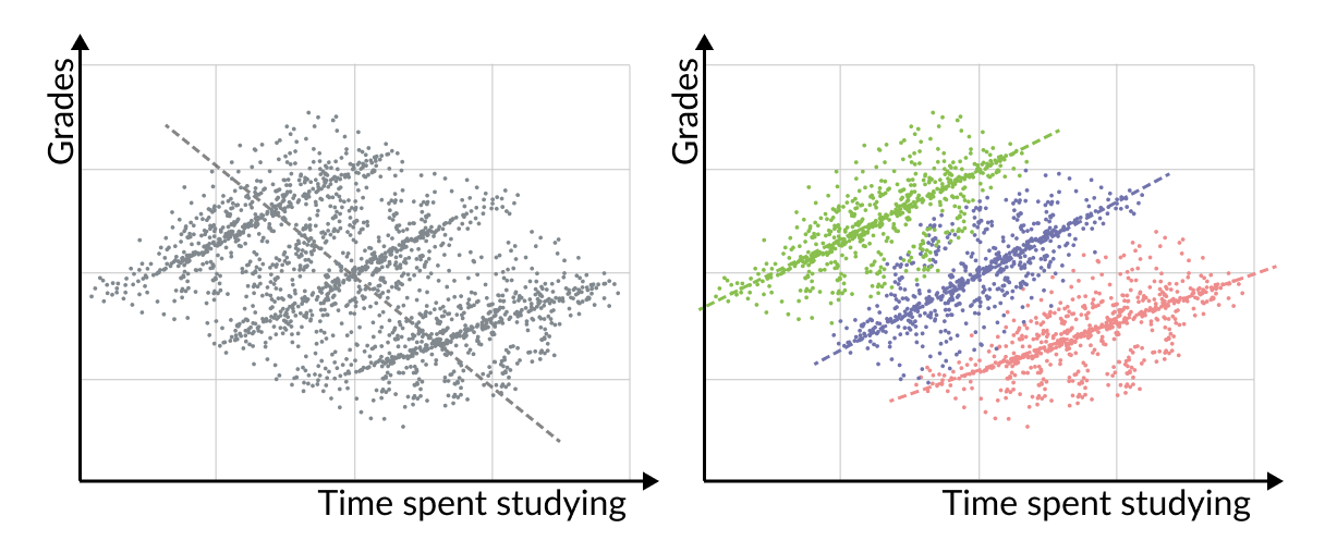
The correlations of subsets going against the entire dataset is often referred to as Simpson’s Paradox, which is an unfortunate name because it is quite a common phenomenon.
When we look at the entire dataset, it can show one correlation overall (e.g., negative), but when we divide the dataset into subgroups, some of those groups will often show the opposite correlation (e.g., positive). And it is not even uncommon for all of them to have the opposite relationship.
The crux of Simpson’s Paradox is that both the overall correlation, and the correlations within the subsets, are real and correct. In our students example, it is both true that when considering all students, more study time leads to lower grades, and that when we look at each individual school, more time spent studying means better grades.
For practical data analysis, the correlations within subsets of the data are usually more important, because they avoid the combination of different kinds of factors (like the different schools in our example).
Correlation is not causation
Just because two things move together doesn’t mean one is causing the other. This is a common pitfall because of the way correlation is often presented (including in our ice cream sales example above). When we say “A and B are correlated,” the implication might be that A causes the values of B to behave the way they do. This is not what correlation means, however. Ice cream sales have a correlation of 0.7 with sunshine is the same statement as Sunshine has a correlation of 0.7 with ice cream sales.
While a strong correlation often suggests an underlying relationship, it may be indirect or involve hidden variables. Correlation is a good starting point for asking questions, but it is not a final answer.