


Why documenting data is harder than it should be
When I joined MeisterLabs as a data engineer, one thing became immediately clear: our data was everywhere, and it was tough to keep track of what was what.
From hundreds of tables to undocumented metrics, getting up to speed was slow. And I wasn’t alone—every new analyst or engineer had the same challenge.
So we started working on a better system for data documentation across the analytics team.
What is data documentation (and why analytics teams need it)
Think of data documentation as the manual for your company’s data. It’s not just about listing tables or fields — it’s about:
- Explaining what a dataset is and why it exists
- Tracking relationships between tables
- Defining who owns what
- Keeping terms and metrics consistent
Without documentation, even simple questions can cause friction. Are we looking at new signups or total users? Is this “revenue” net or gross? Which version of the truth is the version?
The longer you wait, the harder it gets
Data documentation isn’t something you’ll feel the pain of right away. But as your company grows, and as your analytics stack gets more complex, the cost of not documenting adds up fast:
- Duplicate dashboards
- Conflicting KPIs
- Lost context when teammates leave
- Slower onboarding for every new analyst
It’s like going to the gym: you know it’s good for you, but the benefits aren’t always immediate. And the longer you delay, the harder it is to start.
Benefits of data documentation for analytics teams
Once we committed to documenting our data more thoroughly, we started to see the payoff in day-to-day workflows:
🔍 Faster onboarding New hires don’t need to ask around to find the right data—they can look it up.
📘 Shared definitions When everyone uses the same terms (like “active user” or “monthly revenue”), your dashboards tell a consistent story.
🔄 Clear data lineage By mapping how data moves from source to dashboard, it’s easier to debug errors and spot redundant work.
✅ Ownership and governance You can assign owners to datasets or dashboards, making responsibilities clearer across the team.
🧠 Transparency and trust Well-documented data builds trust—especially with non-technical stakeholders who rely on your charts to make decisions.
How we approached data documentation (without it becoming a second job)
We didn’t try to boil the ocean. Instead, we started small:
- Document high-impact datasets first (e.g. the ones used in recurring reports or company-wide dashboards)
- Use tools that integrate with our workflow, not ones that require constant context switching
- Link documentation to where people work — like adding definitions directly in Metabase or Notion
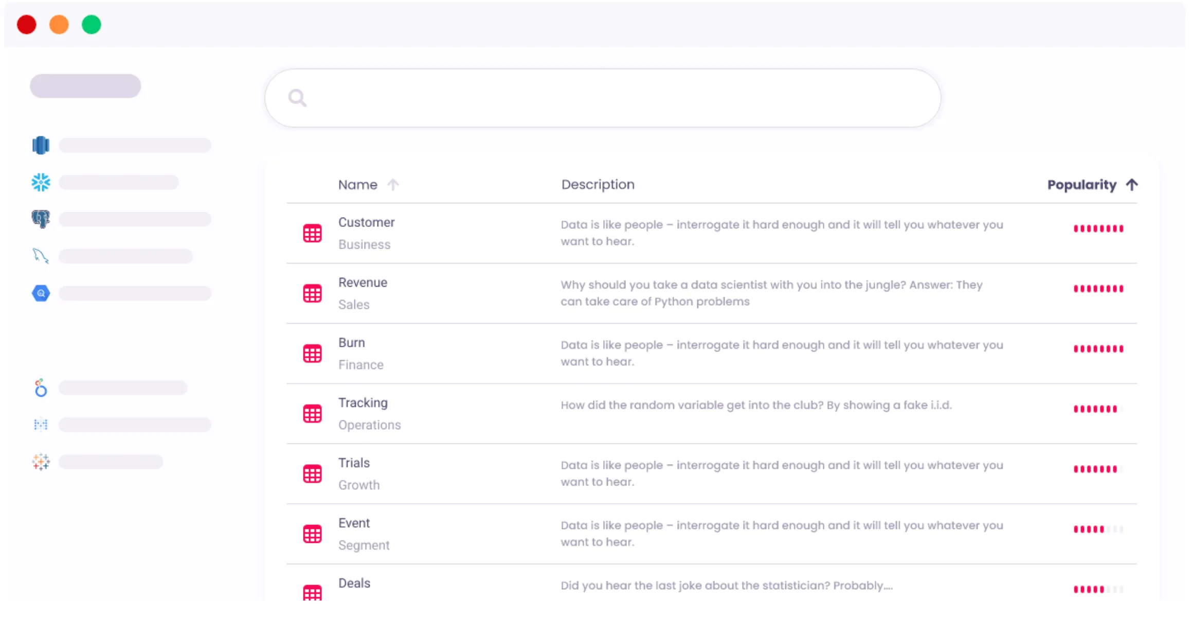
Eventually, we formalized this into a lightweight data catalog. But the key was treating documentation as a habit, not a project.
Choosing a tool for documenting your analytics stack
There are plenty of tools out there—whether you want a full data catalog or just something to improve internal clarity. Here are a few things we considered:
- Interoperability: Can it pull in usage stats from Metabase or other tools we already use?
- Ease of use: Will people actually use it?
- Version control or change tracking: Nice to have, especially when datasets evolve
- Cost and setup: We explored open source vs. managed options based on team bandwidth
Pro tip: Don’t underestimate how helpful it is to see what queries or dashboards depend on a dataset. That visibility makes documentation feel worth it.
Read more about how to keep your analytics organized in Metabase.