




What does an alert quality dashboard show in Metabase?
An alert quality dashboard shows whether monitors page for real problems or train responders to ignore them. It combines alert and monitor data from tools such as PagerDuty, Grafana, Datadog, and Prometheus in one governed view.
For: SRE leads, on-call rotation owners, and platform teams. Grain: one row per alert firing, flagged with whether it became an incident.
What does an alert quality dashboard look like?
Here’s the layout this guide builds, at the grain of a single alert firing: the load and conversion numbers at the top, then volume, timing and noise over the last 13 weeks, then the monitor-level tables that drive cleanup work. Read it before a rotation review, when you want to know which monitors to tune or delete.
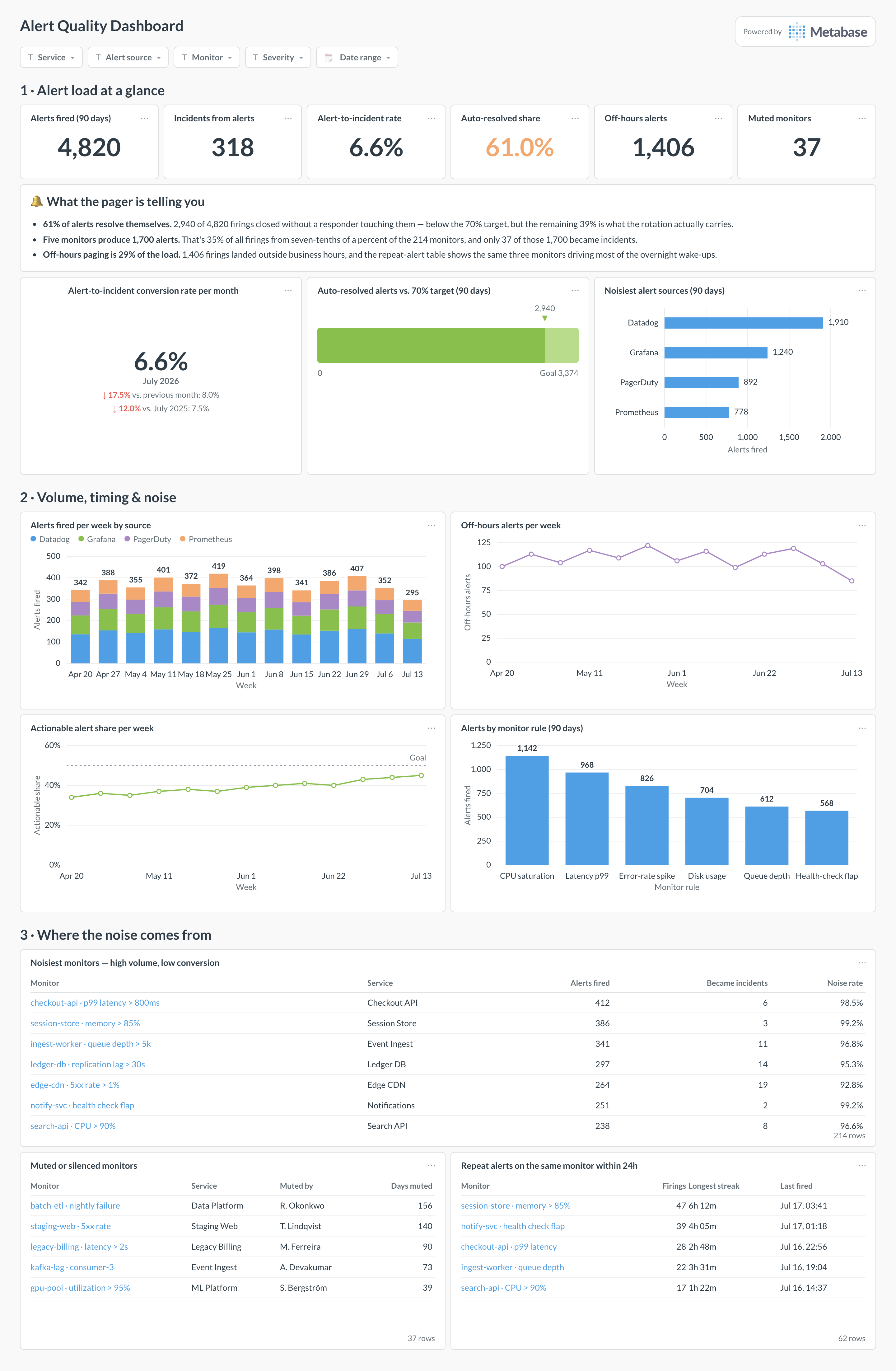
An example alert quality dashboard in Metabase, built from PagerDuty and Grafana alert data. Figures are illustrative.
Which cards belong on an alert quality dashboard?
- Alerts fired per week by source (stacked bar)
- Alert-to-incident conversion rate (number + trend)
- Noisiest monitors — high volume, low conversion (table)
- Auto-resolved alerts share (number)
- Off-hours alerts per week (line)
- Muted or silenced monitors inventory (table)
- Repeat alerts on the same monitor within 24h (table)
What data does the dashboard need?
alertswith monitor/rule ID, service, severity, fired and resolved timestamps.- A
became_incidentflag — from the incident tool’s alert-to-incident link, or a join on service and time window. monitors(or alert rules) with owner, paused/muted state, and thresholds.
How do you build it?
- Sync alert events and monitor metadata into a database or warehouse.
- Link alerts to incidents — most incident tools record the triggering alert; otherwise join on service and time proximity, and caveat it.
- Exclude maintenance windows and test monitors from the noise math.
- Build the noisy-monitor table first — it’s the card that drives cleanup work — then the volume and conversion trends.
Example card SQL
SELECT
monitor_name,
service_name,
COUNT(*) AS alerts_fired,
COUNT(*) FILTER (WHERE became_incident) AS incidents,
ROUND(
  100.0 * COUNT(*) FILTER (WHERE NOT became_incident)
  / NULLIF(COUNT(*), 0), 1
) AS noise_rate
FROM alerts
WHERE fired_at >= CURRENT_DATE - INTERVAL '90 days'
GROUP BY monitor_name, service_name
HAVING COUNT(*) >= 5
ORDER BY noise_rate DESC, alerts_fired DESC
LIMIT 25;
Related
Metrics
Integrations
Dashboards
FAQ
What is an alert quality dashboard?
What data sources feed an alert quality dashboard?
alerts table with a became_incident flag — from the incident tool's alert-to-incident link where it exists — plus a monitors table with owner and muted state.