




What goes in an Amazon Redshift monitoring dashboard in Metabase?
An Amazon Redshift monitoring dashboard tracks query throughput and duration percentiles, WLM queue wait, queries that spill to disk, planner alerts, and the tables whose skew or sort state is dragging everything down. Metabase connects to Redshift natively, so every card is plain SQL over the cluster's own SYS_, STL_, SVL_, and SVV_ views.
For: data platform engineers and whoever gets paged when the warehouse is slow. Grain: one row per query, rolled up hourly and daily.
Source:
SYS_QUERY_HISTORY plus the WLM, alert, and table-info views (7-day retention on SYS_*, 2–5 days on STL_* — snapshot nightly for more).
What does a Redshift monitoring dashboard look like?
Here’s the layout this guide builds. Cluster-level health sits at the top; the middle section covers how queries behave — volume, percentiles, queue wait, and the duration mix; the bottom section is the diagnosis half, where disk spill, planner alerts, table skew, and storage growth name the specific thing to fix.
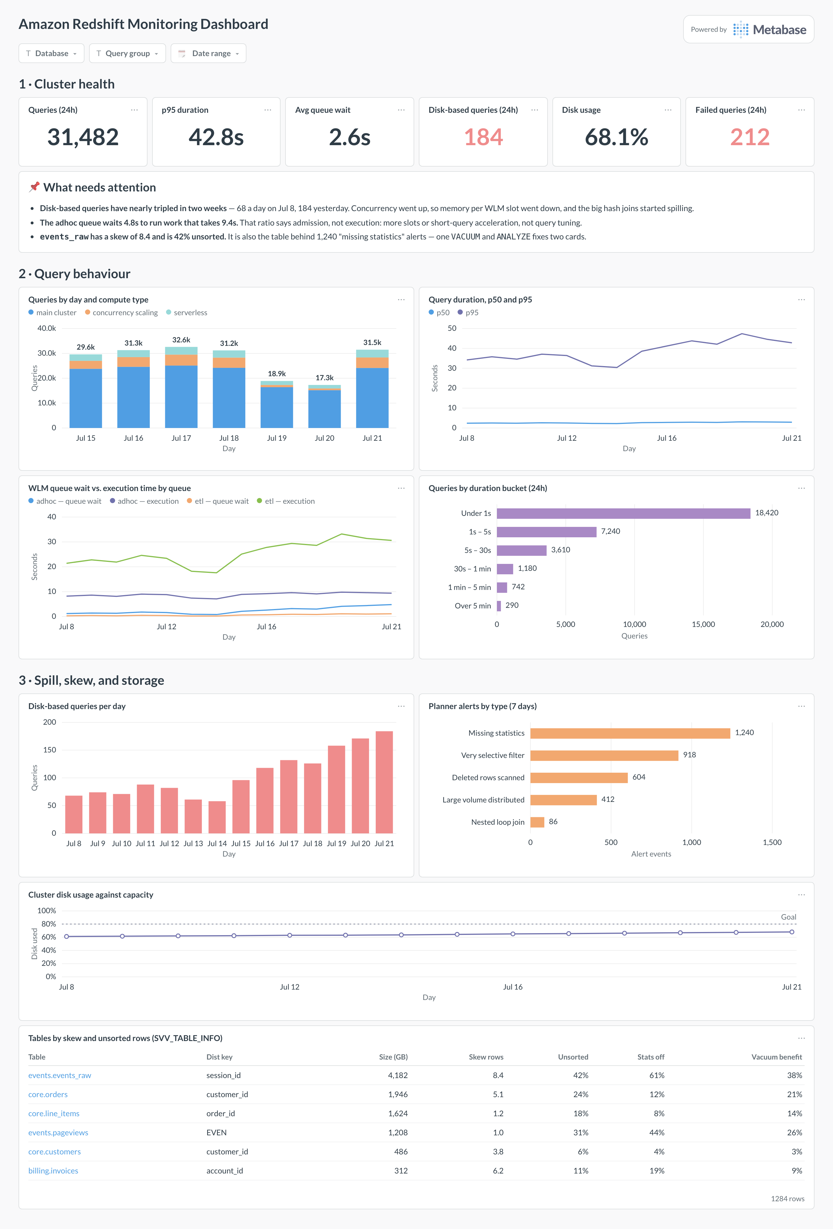
An example Amazon Redshift monitoring dashboard in Metabase, built from the cluster’s SYS_ and SVV_ views. Figures are illustrative.
Which cards belong on a Redshift monitoring dashboard?
Eight cards, updated from the classic list: percentiles instead of average duration, and the three Redshift-specific failure modes — spill, skew, and queueing — given cards of their own.
- Queries by day and compute type — main cluster, concurrency scaling, serverless (stacked bar)
- Query duration, p50 and p95 by day (line)
- WLM queue wait vs. execution time by queue (line)
- Queries by duration bucket — under 1s through over 5 min (row)
- Disk-based queries per day, from spilled steps (bar)
- Planner alerts by type — missing statistics, nested loop, large broadcast (row)
- Cluster disk usage against capacity (line)
- Tables by skew and unsorted rows, with size (table)
What data does the dashboard need?
SYS_QUERY_HISTORY— one row per query:status,elapsed_time,queue_time,execution_time,compute_type,error_message, and query text.STL_WLM_QUERYandSTV_WLM_QUERY_STATE— service class, slot count, queue and execution time, plus what is queued right now.SVL_QUERY_SUMMARY(is_diskbased) andSVL_QUERY_METRICS_SUMMARYfor spill, CPU time, blocks read, and rows scanned per query.STL_ALERT_EVENT_LOGfor planner alerts, andSVV_TABLE_INFOforskew_rows,unsorted,stats_off, and table size.STV_PARTITIONSfor disk usage, andSYS_SERVERLESS_USAGEif you run Redshift Serverless and want charged RPU-seconds on the same page.- A nightly snapshot table, because the system views roll off in days — the trend cards need weeks.
How do you build it?
- Connect Redshift to Metabase with a dedicated read-only user, granted
SYSLOG ACCESS UNRESTRICTEDso it sees every user’s queries rather than just its own. - Schedule a nightly job that appends yesterday’s rows from
SYS_QUERY_HISTORY, the WLM views, andSVV_TABLE_INFOinto snapshot tables — this is the only way to keep history past the retention window. - Model the snapshot once: microseconds to seconds, duration buckets, and a disk-based flag joined in from
SVL_QUERY_SUMMARY, so every card agrees on the definitions. - Build the percentile and queue-wait cards first — they tell you whether the cluster is execution-bound or admission-bound — then the spill, alert, and skew cards that name the fix.
- Add filters for database, user or query group, and date range, and alert the platform channel when disk usage or the disk-based query count crosses its threshold.
Example card SQL
SELECT
DATE_TRUNC('day', start_time)                          AS day,
COUNT(*)                                               AS queries,
SUM(CASE WHEN status = 'failed' THEN 1 ELSE 0 END)     AS failed,
ROUND(PERCENTILE_CONT(0.50) WITHIN GROUP (
  ORDER BY elapsed_time) / 1000000.0, 1)               AS p50_s,
ROUND(PERCENTILE_CONT(0.95) WITHIN GROUP (
  ORDER BY elapsed_time) / 1000000.0, 1)               AS p95_s,
ROUND(AVG(queue_time) / 1000000.0, 2)                  AS avg_queue_s,
SUM(CASE WHEN compute_type = 'concurrency scaling'
         THEN 1 ELSE 0 END)                            AS on_burst_clusters
FROM sys_query_history
WHERE start_time >= DATEADD(day, -14, GETDATE())
AND query_type = 'SELECT'
GROUP BY 1
ORDER BY 1;
Related
Metrics
Integrations
Dashboards
FAQ
What is an Amazon Redshift monitoring dashboard?
Which system views should the cards read?
SYS_QUERY_HISTORY — the modern unified view, one row per query with status, elapsed_time, queue_time, execution_time, compute_type, and the query text. Add SVL_QUERY_METRICS_SUMMARY for per-query CPU, blocks read, and rows scanned; STL_WLM_QUERY for queue and slot behaviour; STL_ALERT_EVENT_LOG for planner alerts; SVV_TABLE_INFO for skew, unsorted percentage, and stale statistics; and STV_PARTITIONS for disk usage. Two gotchas: SYS_* views retain about seven days and the older STL_*/SVL_* views only two to five, and by default a user sees only their own rows — the dashboard's connection needs SYSLOG ACCESS UNRESTRICTED to see the whole cluster.How do I find disk-based queries?
SVL_QUERY_SUMMARY flags them per step with is_diskbased = 't'; count distinct query values per day and you have the card. A rising line means either the workload grew or memory per slot shrank because concurrency went up. The fixes are the usual three: give the queue fewer, larger slots, cut the rows the step has to hold (better filters, better join order), or fix the distribution key so the join stops broadcasting.What does WLM queue wait time actually tell me?
queue_time with short execution_time means queries are fast once they start but there are not enough slots — a scheduling problem, fixed with queue priorities, short-query acceleration, or concurrency scaling. The reverse means the queries themselves are slow and no amount of slot tuning will help. Chart both side by side per queue, because the ratio is what tells you which lever to pull, and automatic WLM will happily hide a bad ratio behind an acceptable average.What is table skew, and why does it slow everything down?
SVV_TABLE_INFO reports it directly as skew_rows (ratio of the largest slice to the smallest), alongside unsorted, stats_off, and vacuum_sort_benefit. Anything above roughly 4 is worth a look; the same table usually shows up in STL_ALERT_EVENT_LOG as "distributed a large volume".How do I track Redshift cost on the same dashboard?
SYS_SERVERLESS_USAGE gives charged RPU-seconds per period, which turns directly into a spend-by-day chart, and idle workgroups become visible immediately. Either way, reconcile against the invoice with a billing export — see AWS billing — and keep the workload cards here for the "which query caused it" half of the question.