



What goes in an application monitoring dashboard in Metabase?
An application monitoring dashboard puts throughput, errors, latency, and availability for every application on one page, so engineering and the business read the same numbers. It's built from hourly or daily rollups exported from Datadog, New Relic, Sentry, or Prometheus — not from raw traces.
For: application owners, SREs, and engineering leadership. Grain: one row per application per environment per hour or day. Refresh: hourly.
What does an application monitoring dashboard look like?
Here’s the layout this guide builds. The top row answers “is anything outside its target right now?”; the middle section carries the traffic, error, and latency trends you read together; the bottom section is where you go once you know something is wrong.
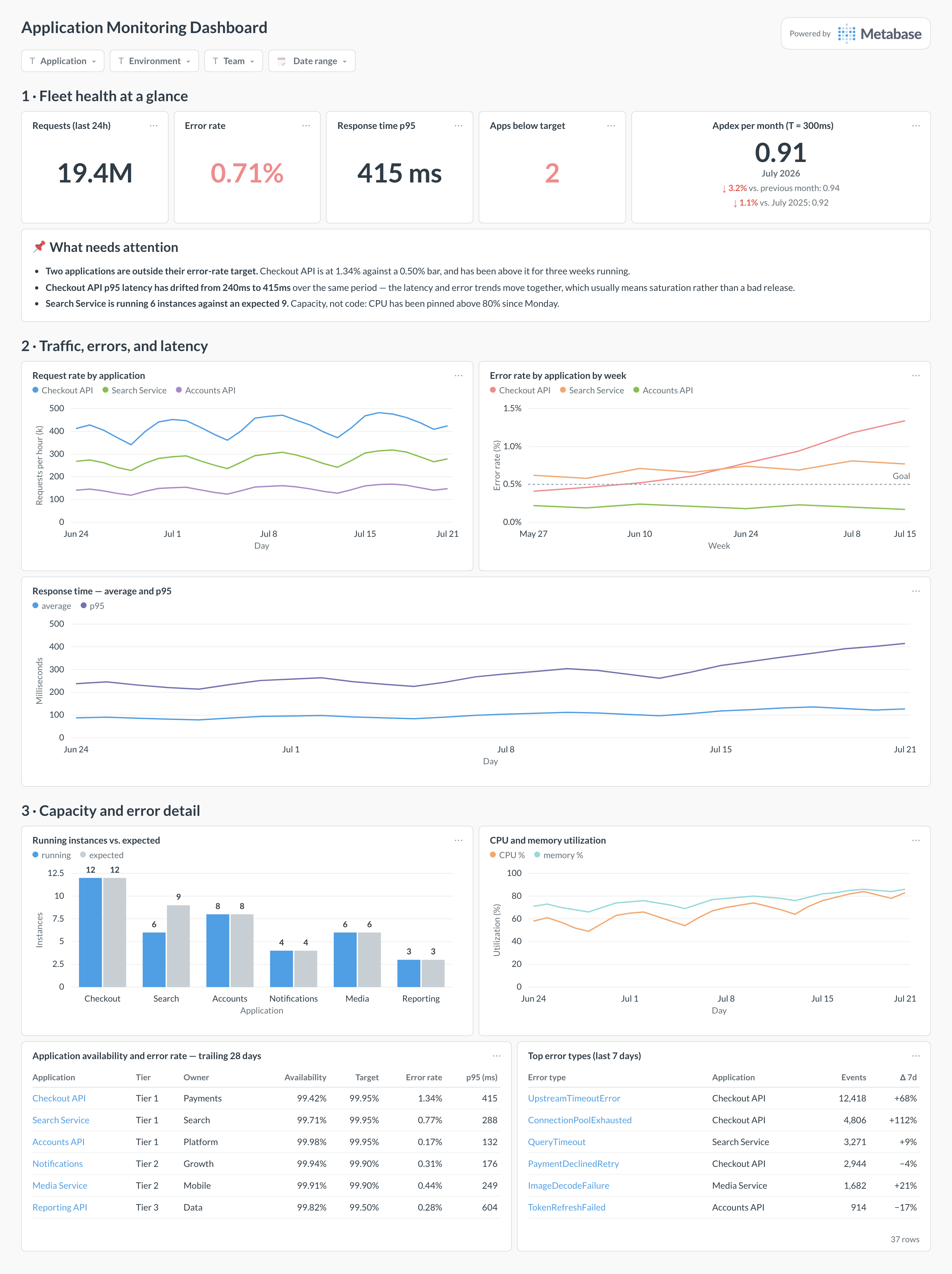
An example application monitoring dashboard in Metabase, built from Datadog, Sentry, and Prometheus rollups. Figures are illustrative.
Which cards belong on an application monitoring dashboard?
The eight below are the classic set — the first four answer “is it healthy right now?”, the rest give the context that makes the answer actionable.
- Request rate by application and environment (line)
- Error rate by application, against target (table + line)
- Average and p95 response time by application (line)
- Apdex against a published target response time (trend)
- Application availability over the trailing 28 days (table)
- Running instance count per application, versus expected (bar)
- CPU and memory utilization for application hosts and containers (line)
- Top error types and their volume trend, from Sentry issues (table)
What data does the dashboard need?
app_health_rollups— per application, environment, and window: total requests, failed requests, pre-aggregated latency percentiles, and Apdex bucket counts.applicationswith owner, team, tier, and target response time, so a tier-1 API isn’t judged against the same bar as an internal tool.instancesor container counts per application, if you want the capacity cards.- Optional
deploymentsandincidentsto annotate the trends with what changed.
How do you build it?
- Define “failed” once — HTTP status 5xx, or 5xx plus timeouts — and apply it in the rollup job so no two cards disagree.
- Export aggregates on a schedule from your APM tool into a database Metabase can query (see the Datadog and Prometheus guides for routes).
- Pre-aggregate latency percentiles and Apdex buckets at the source — neither can be reconstructed from averages later.
- Build the per-application table against targets first, then add trends and drill-throughs to the noisiest applications.
- Add dashboard filters for application, environment, team, and date range, and show the last refresh time on the page.
Example card SQL
WITH windows AS (
SELECT
  a.app_name,
  a.environment,
  date_trunc('hour', r.window_start) AS hour,
  SUM(r.total_requests)                       AS requests,
  SUM(r.failed_requests)                      AS failures,
  MAX(r.latency_p95_ms)                       AS latency_p95_ms,
  SUM(r.satisfied_requests)                   AS satisfied,
  SUM(r.tolerated_requests)                   AS tolerated
FROM app_health_rollups r
JOIN applications a ON a.app_id = r.app_id
WHERE r.window_start >= now() - interval '30 days'
GROUP BY 1, 2, 3
)
SELECT
app_name,
environment,
hour,
requests,
ROUND(100.0 * failures / NULLIF(requests, 0), 3)          AS error_rate_pct,
latency_p95_ms,
ROUND((satisfied + tolerated / 2.0) / NULLIF(requests, 0), 3) AS apdex
FROM windows
ORDER BY app_name, hour;
Related
Metrics
Integrations
Dashboards
FAQ
What is an application monitoring dashboard?
How is this different from a service availability dashboard?
What data sources feed an application monitoring dashboard?
app_health_rollups table — one row per application, environment, and time window — plus an applications table with owner, tier, and platform. See the observability and infrastructure pillar for the connection routes.How do I compute Apdex in SQL?
(satisfied + tolerated / 2) / total. Bucket the counts in the rollup job rather than at query time — once you have averaged response times, you can no longer recover the buckets. Pick one T per application tier and publish it next to the card, because an Apdex without its T is uninterpretable.Why do my averaged latency percentiles look wrong?
Which application should be at the top of the dashboard?
How do I connect degradations to releases?
deployments table — service, environment, timestamp, version — onto the same time axis and annotate the trend charts with it. Most regressions are release-shaped, and having the deploy markers on the error-rate chart turns "something broke on Tuesday" into a version number. The same table feeds change failure rate on your DORA dashboard.