




What goes in a DevOps dashboard in Metabase?
A DevOps dashboard is the daily instrument panel for delivery ops: pipeline success rate, deploys per day by environment, rollbacks, environment health, incident load, and the toil that eats the team's week. It sits between the research-benchmark DORA dashboard and the CI-internals view in CI pipeline health, and links to both.
For: platform and DevOps engineers, SREs, and team leads. Grain: daily for pipelines and deploys, weekly for rollbacks and toil. Refresh: hourly — real-time paging stays in the on-call stack.
What does a DevOps dashboard look like?
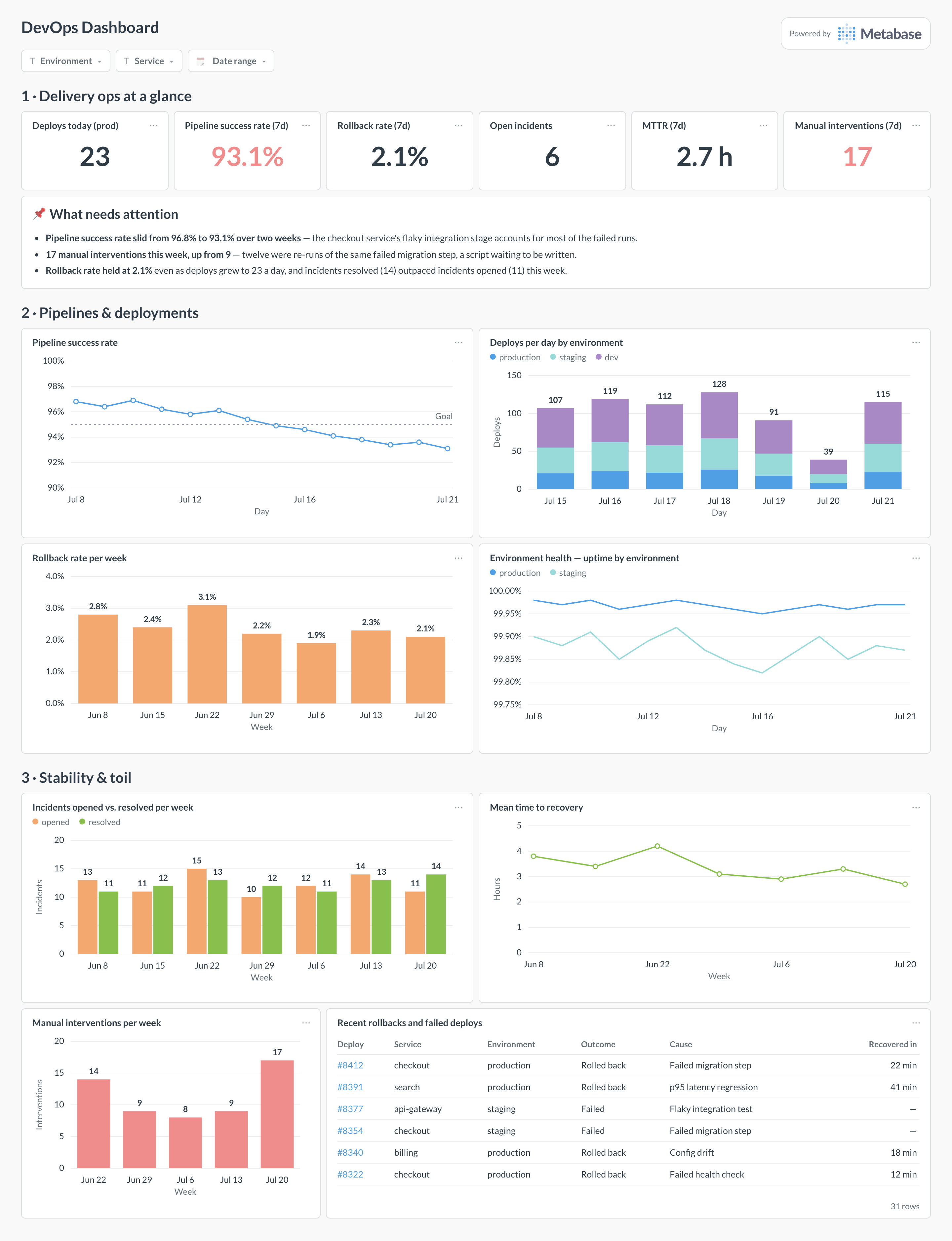
Here’s the layout this guide builds. The KPI row and attention card give the morning-standup read; pipelines and deployments come next because that’s where a bad day announces itself; stability and toil sit at the bottom, ending in a table of recent rollbacks with their causes — the card people actually argue about.
Which cards belong on a DevOps dashboard?
The eight below cover the three questions delivery ops asks daily: is the pipeline healthy, are deploys landing safely, and what is quietly burning the team’s time.
- Pipeline success rate, daily, with a goal line (line)
- Deploys per day by environment — production, staging, dev (stacked bar)
- Rollback rate per week, as a share of production deploys (bar)
- Environment health — uptime by environment (line)
- Incidents opened vs. resolved per week (bar)
- Mean time to recovery, weekly (line)
- Manual interventions per week — the toil indicator (bar)
- Recent rollbacks and failed deploys, with cause and recovery time (table)
What data does the dashboard need?
- A
pipeline_runstable —started_at,status,environment,triggered_deploy,rolled_back— from your CI/CD tool’s API or webhooks. - A
deploymentstable with service, environment, version, and outcome, including a rollback flag and cause written at rollback time. - An
incidentstable withopened_at,resolved_at, and severity, from PagerDuty or your incident tool. - Per-environment uptime rollups from your monitoring stack, snapshotted into the warehouse.
- A toil log — manual re-runs, hands-on deploy steps, runbook executions — countable from CI events and on-call annotations.
How do you build it?
- Ship pipeline and deploy events from GitHub Actions, GitLab, or CircleCI into your warehouse — webhooks into a raw events table is enough to start.
- Define the rollback rule in a shared model — a
rolled_backflag set at rollback time, with a cause — so the rate is computed one way everywhere. - Join incident data from PagerDuty on service and time, and snapshot per-environment uptime from your monitoring stack.
- Build the KPI scalars production-only, then the daily and weekly charts against the shared models, keeping staging and dev visible only in the stacked deploy chart.
- Add filters for environment, service, and date range — defaulting the environment filter to production — and set the dashboard to hourly refresh.
Example card SQL
SELECT
date_trunc('day', r.started_at)                       AS day,
r.environment,
COUNT(*)                                              AS pipeline_runs,
ROUND(
  100.0 * COUNT(*) FILTER (WHERE r.status = 'success')
    / NULLIF(COUNT(*), 0), 1
)                                                     AS success_rate_pct,
COUNT(*) FILTER (WHERE r.triggered_deploy)            AS deploys,
COUNT(*) FILTER (WHERE r.rolled_back)                 AS rollbacks,
ROUND(
  100.0 * COUNT(*) FILTER (WHERE r.rolled_back)
    / NULLIF(COUNT(*) FILTER (WHERE r.triggered_deploy), 0), 1
)                                                     AS rollback_rate_pct
FROM pipeline_runs r
WHERE r.started_at >= now() - interval '14 days'
GROUP BY 1, 2
ORDER BY 1, 2;
Related
Metrics
Integrations
Dashboards
FAQ
What is a DevOps dashboard?
How is this different from a DORA dashboard?
How is this different from a CI pipeline health dashboard?
What counts as a rollback, and how do I track it?
rolled_back flag plus a cause) rather than reconstructing it later from Git archaeology. The rate that matters is rollbacks per production deploy, weekly — a raw count just grows with deploy volume.