



What goes in an ETL dashboard in Metabase?
An ETL dashboard is the portfolio view of your pipelines: status across the fleet, data volume moved, freshness SLAs per destination table, run-duration trends, and cost per pipeline. It's built from the orchestrator's run metadata — Airflow's metadata DB, dbt artifacts, or vendor sync logs — landed in the warehouse (see build a data pipeline) and queried with plain SQL. For the on-call failure view, see the ETL monitoring dashboard.
For: data engineering leads and platform managers.
Grain: one row per pipeline run. Source: apipeline_runs table synced from the orchestrator, plus atable_slas reference table for deadlines.
What does an ETL dashboard look like?
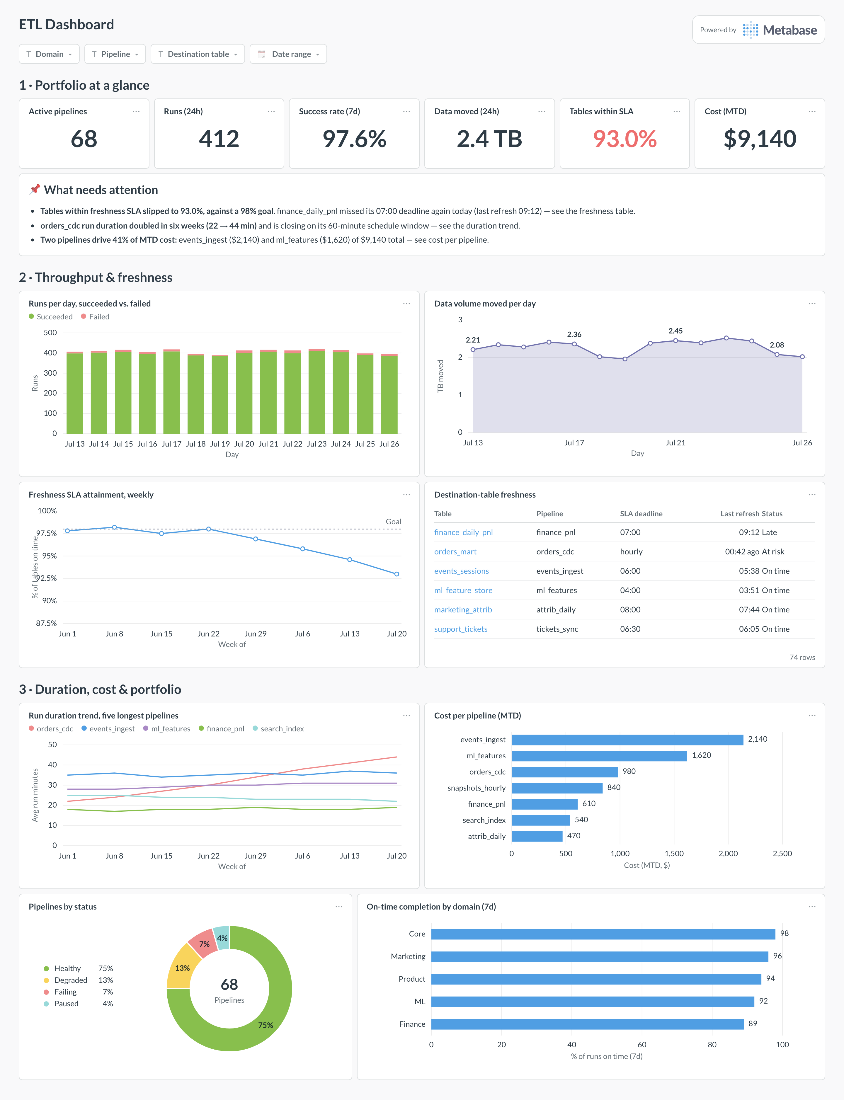
Here’s the layout this guide builds. Fleet-level counts and the SLA figure sit at the top so a lead can open it and answer “are we on time” in one glance; throughput and freshness detail follow, because that’s where commitments live; duration trends, cost ranking, and portfolio status sit at the bottom for the weekly review.
Which cards belong on an ETL dashboard?
The eight below cover reliability, throughput, freshness, and cost — the portfolio questions, with incident detail deliberately left to the monitoring dashboard.
- Runs per day, succeeded versus failed (stacked bar)
- Data volume moved per day (area)
- Freshness SLA attainment, weekly, against goal (line)
- Destination-table freshness — deadline, last refresh, status (table)
- Run duration trend for the five longest pipelines (line)
- Cost per pipeline, month to date (row)
- Pipelines by status — healthy, degraded, failing, paused (donut)
- On-time completion by domain (row)
What data does the dashboard need?
- A
pipeline_runstable — pipeline, run id, status, started and completed timestamps, rows and bytes moved — synced from Airflow’sdag_run, Dagster/Prefect APIs, or dbt’srun_results.json. - A
table_slasreference table — destination table, expected-by deadline, owning domain — so SLA cards are joins, not hardcoded rules. - Per-pipeline cost: warehouse query cost attributed by service account or query tag, plus orchestrator infrastructure allocated by runtime.
- A pipeline dimension — pipeline, domain, owner, schedule window — for grouping and for duration-versus-window math.
- Optionally, last-refresh timestamps read directly from destination tables as a cross-check on the orchestrator’s claims.
How do you build it?
- Sync orchestrator run history into
reporting.pipeline_runson a schedule — for Airflow, export from the metadata database rather than pointing Metabase at it directly. - Create
table_slaswith an expected-by deadline in local business time for every table a consumer depends on — and resist adding tables nobody waits for. - Attribute cost: join warehouse query history on the pipeline’s service account or query tag, add apportioned worker cost, and store a monthly figure per pipeline.
- Build the eight cards from those three tables; derive pipeline status (healthy, degraded, failing) from the last N runs in SQL so the donut and the KPI row can’t disagree.
- Add filters for domain, pipeline, destination table, and date range, then schedule a Monday-morning subscription for the weekly review.
Example card SQL
SELECT
s.destination_table,
s.pipeline,
s.sla_deadline_local,
MAX(r.completed_at)                                   AS last_refresh,
ROUND(EXTRACT(EPOCH FROM (now() - MAX(r.completed_at))) / 3600.0, 1)
                                                      AS hours_since_refresh,
CASE
  WHEN MAX(r.completed_at) >= s.expected_by THEN 'On time'
  WHEN now() < s.expected_by THEN 'Pending'
  ELSE 'Late'
END                                                   AS sla_status
FROM reporting.table_slas s
LEFT JOIN reporting.pipeline_runs r
ON r.destination_table = s.destination_table
AND r.status = 'success'
GROUP BY 1, 2, 3, s.expected_by
ORDER BY sla_status DESC, hours_since_refresh DESC;
Related
Metrics
Integrations
Dashboards
FAQ
What is an ETL dashboard?
How is this different from an ETL monitoring dashboard?
Where does the data come from?
dag_run and task_instance; Dagster and Prefect expose run history via their APIs; dbt writes run_results.json per invocation; managed EL vendors expose sync logs through their APIs. The pattern is the same for all of them: sync run-level records into a pipeline_runs table in the warehouse — one row per run with pipeline, status, started, completed, rows and bytes moved — and build every card from that table rather than pointing Metabase at the orchestrator's production database.How should I define freshness SLAs per table?
table_slas reference table (destination, deadline, owner) so the SLA card is a join, not hardcoded logic. Express deadlines in local business time — a UTC deadline quietly shifts an hour at daylight-saving changes. Then track attainment as a weekly percentage against an explicit goal, and treat a data freshness metric page as the definition of record.