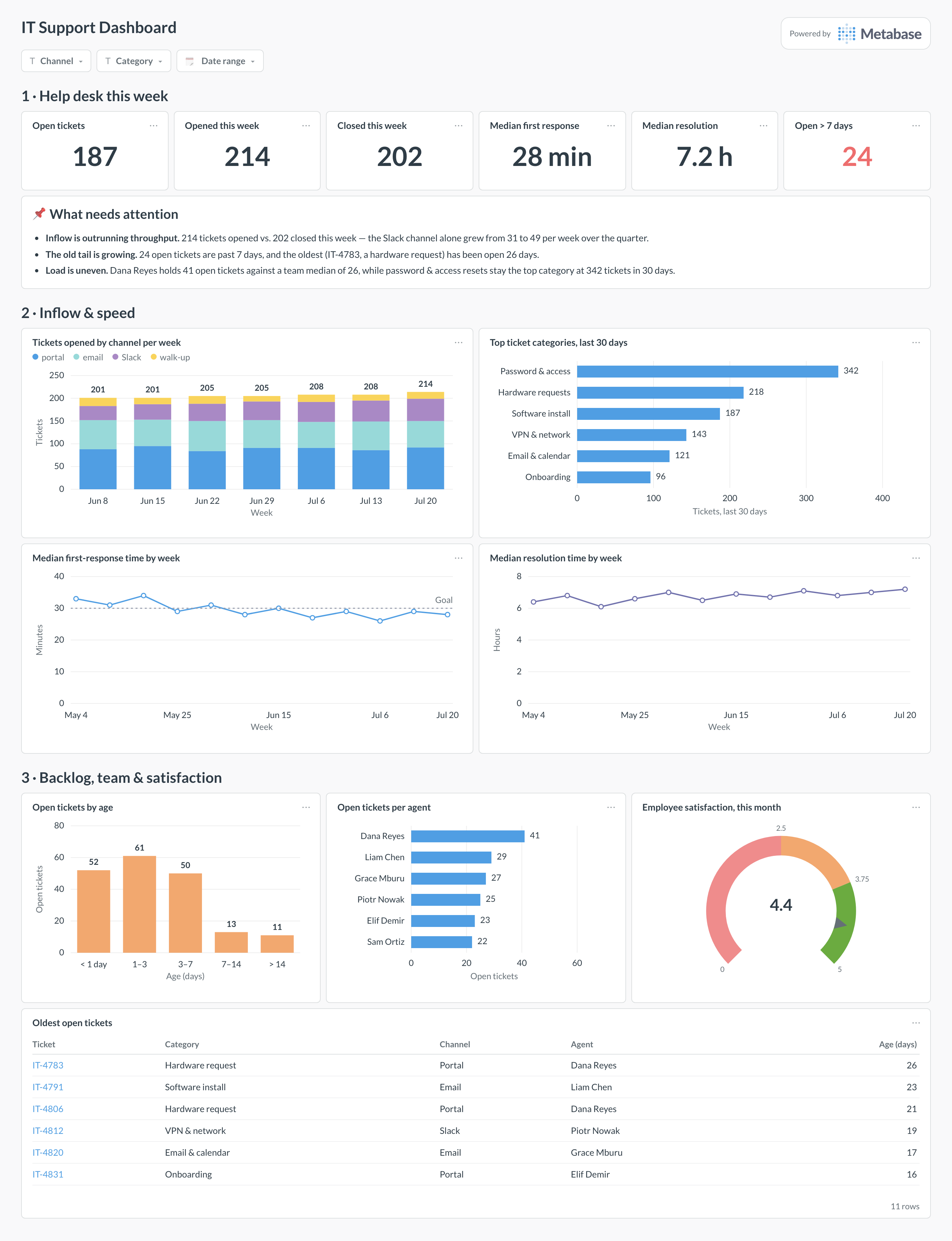
An IT support dashboard runs the internal help desk: how tickets arrive, how fast employees get a first response and a fix, where the backlog is aging, and who on the team is carrying the load. Metabase builds it from the desk you already run — Jira Service Management, Zendesk, or Freshdesk — with tickets synced to a warehouse so channels, categories, and agents can all be sliced in one place.
For: IT support and help-desk leads. Grain: one row per ticket, with first-response and resolution timestamps. Refresh: hourly during support hours; weekly for the team review.
What does an IT support dashboard look like?
Here’s the layout this guide builds. The week’s headline numbers sit at the top — open tickets, inflow versus closed, response and resolution medians. Inflow and speed come next: where tickets arrive and how quickly they get answered. Backlog aging, agent workload, satisfaction, and the oldest open tickets close the page, because those are the queue-health questions a lead works through weekly.
An example IT support dashboard in Metabase, built from help desk ticket data. Figures are illustrative.
Which cards belong on an IT support dashboard?
The eight below answer the help-desk lead’s standing questions: is the queue under control, are employees getting answered, and is the load spread fairly?
Tickets opened by channel per week — portal, email, Slack, walk-up (stacked bar)
Top ticket categories, past 30 days (row)
Median first-response time by week against its goal (line)
Median resolution time by week (line)
Backlog aging — open tickets by age bucket (bar)
Open tickets per agent (row)
Employee satisfaction on closed tickets (gauge)
Oldest open tickets, with category and agent (table)
A satisfaction_responses table: ticket_id, score, submitted_at — separate from tickets so response rate stays computable.
An agents dimension with names and team, so workload rolls up cleanly and leavers drop out of current views.
A category mapping that folds the desk’s free-form request types into 10–15 stable categories worth charting.
Support-hours definitions (timezone, business hours) if response SLAs pause outside working time — keep the desk’s own SLA fields when syncing.
How do you build it?
Sync the help desk’s tickets and satisfaction responses into your warehouse on a schedule, keeping the desk’s own timestamp and SLA fields rather than recomputing them.
Build one Metabase model over tickets that adds derived columns — first response minutes, resolution hours, age bucket for open tickets — so all cards share definitions.
Create the speed cards as weekly medians (not averages) of first-response and resolution time, with a goal line at your internal target.
Build the workload row from currently open tickets grouped by agent, and the aging bar from the same model’s age buckets.
Add filters for channel, category, and date range, and subscribe the team to the filtered view each Monday morning.
Example card SQL
Median first-response and resolution time by weekPostgreSQL
SELECT
date_trunc('week', t.opened_at)::date       AS week,
COUNT(*)                                    AS tickets_opened,
ROUND(
  (percentile_cont(0.5) WITHIN GROUP (
    ORDER BY EXTRACT(EPOCH FROM t.first_response_at - t.opened_at) / 60
  ))::numeric, 0
)                                           AS median_first_response_min,
ROUND(
  (percentile_cont(0.5) WITHIN GROUP (
    ORDER BY EXTRACT(EPOCH FROM t.resolved_at - t.opened_at) / 3600
  ))::numeric, 1
)                                           AS median_resolution_hours
FROM tickets t
WHERE t.opened_at >= CURRENT_DATE - 84
AND t.status <> 'spam'
GROUP BY 1
ORDER BY 1;
How is an IT support dashboard different from a customer support dashboard?
The customers are your own employees, and that changes the metrics. There is no churn risk and no revenue tier, so prioritization runs on business impact — a locked-out sales team beats a printer. Volume is bounded by headcount, which makes per-employee ratios meaningful, and "walk-up" and chat channels matter far more than they do externally. The mechanics, though, are the same as a customer-facing support overview: inflow, response time, backlog, satisfaction. If you run both desks, build them from the same warehouse patterns and compare shapes, not numbers.
How does this differ from an ITSM dashboard?
This is the help desk's own view — one team, its queue, its response times, its workload. An ITSM dashboard covers the whole practice that queue sits inside: SLA attainment per catalog service, problem records, change governance. A help-desk lead looks at this page daily to run the team; a service delivery manager looks at the ITSM page monthly to run the catalog. The give-away for which you need: if "problem record" and "change calendar" are words your team uses, you want both pages; if not, start here.
Should response and resolution times be medians or averages?
Medians on the dashboard, distributions in the review. Ticket durations are heavily right-skewed — one hardware order stuck with a vendor for three weeks will drag an average resolution time far above what employees actually experience. The median tracks the typical ticket; pair it with a p90 if you want the tail visible on the same card. The same goes for first response time, with one extra rule: stop the clock outside support hours, or Monday morning will look like a crisis every week.
How do I measure backlog aging without fooling myself?
Bucket the currently open tickets by age — under a day, 1–3 days, 3–7, 7–14, over 14 — and watch the old buckets, not the average age. The mean is dominated by the fresh majority, so a queue can rot quietly while the average looks fine; the backlog chart above shows 24 tickets past seven days inside an otherwise healthy 187. Two disciplines keep the number honest: pause tickets genuinely waiting on the employee or a vendor into their own status, and never let "resolved, unconfirmed" tickets sit in the open count.
What about Slack DMs and walk-ups that never become tickets?
They are the biggest hole in most help-desk numbers — work that consumes agents but never appears in inflow, making the team look slower per recorded ticket. The fix is capture, not policing: a Slack workflow that turns an emoji or a form into a ticket in Jira or Freshdesk lowers the cost of filing to near zero, and a "walk-up" channel value takes thirty seconds to log after the fact. Then put inflow-by-channel on the dashboard — if the walk-up share is implausibly low, you are still leaking work.
How should I survey employee satisfaction on closed tickets?
One question at close — a 1–5 rating or thumbs up/down — and read it as a trend, the same way you would read CSAT. Internal response rates run higher than external ones (30–50% is common) but the bias is friendlier too: colleagues hesitate to rate a person they will see at lunch, so scores cluster high and the signal lives in the dips. Chart the monthly average next to its response count, and route every rating of 1–2 to the lead as a case review rather than a statistic — at internal volumes, the anecdotes are the data.
Is open-ticket count per agent a fair workload measure?
It is a starting point, not a verdict. Ticket counts weigh a password reset the same as a two-week hardware procurement, so an agent who owns the gnarly categories will always look "behind." Better: pair open count with touches per day and with category mix, or weight categories by their median resolution time — all cheap to compute once tickets are in the warehouse. The row chart earns its place by exposing outliers worth a conversation, like one agent holding 41 tickets against a team median of 26; an workload balance metric can then track whether rebalancing actually happened.