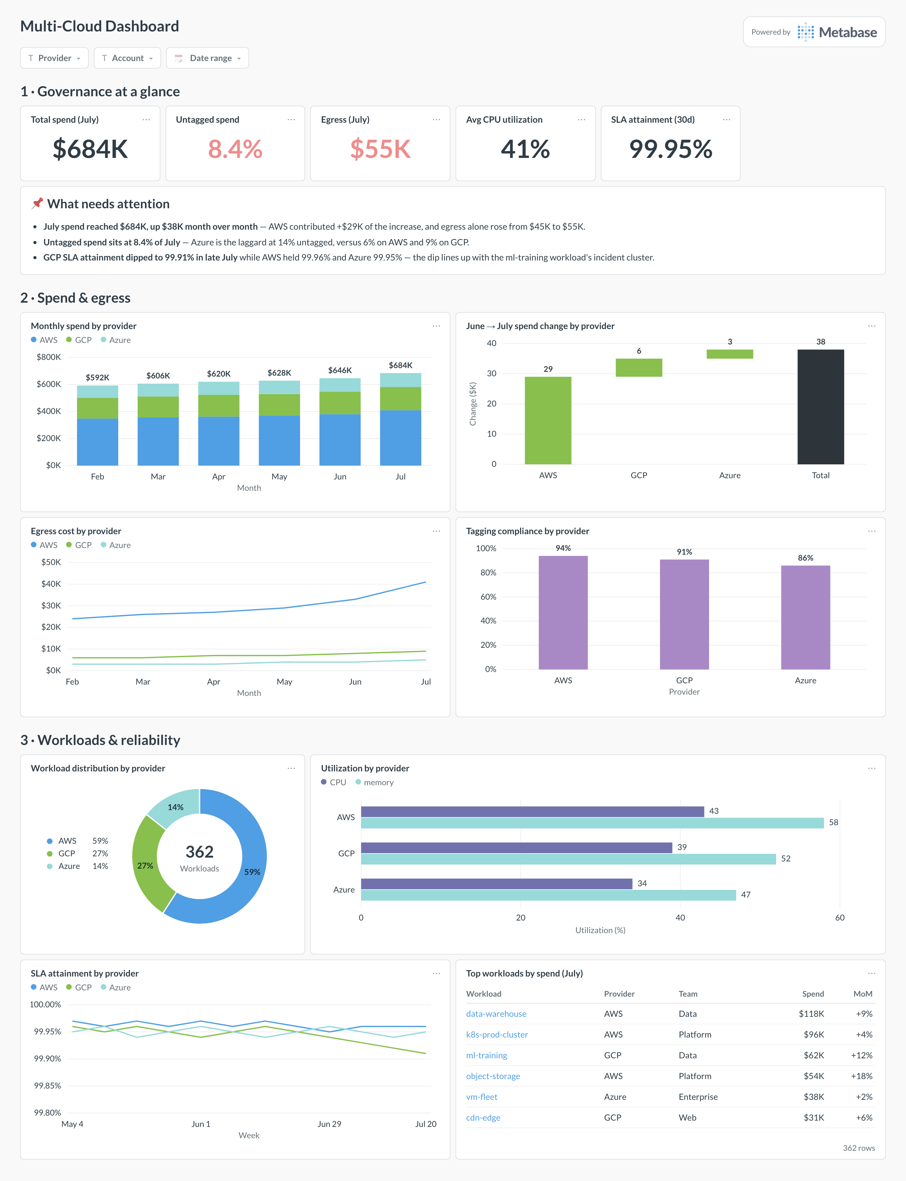
A multi-cloud dashboard governs AWS, GCP, and Azure in one view: spend by provider and its month-over-month movement, workload distribution, utilization, SLA comparison, tagging compliance, and egress costs. It is the breadth view that the cost-focused cloud spend overview and the provider-deep AWS monitoring dashboard drill out of.
For: platform leads, FinOps, and infrastructure governance.
Grain: monthly for spend, weekly for reliability. Source: each provider’s billing export, normalized into one table.
What does a multi-cloud dashboard look like?
Here’s the layout this guide builds. Governance scalars and the attention card lead with the numbers a review meeting opens on; spend and egress come next, including a waterfall that names which provider drove the month’s change; workloads and reliability close the page — where things run, how hard they work, and which provider kept its SLA.
An example multi-cloud dashboard in Metabase, built from normalized billing exports. Figures are illustrative.
Which cards belong on a multi-cloud dashboard?
The eight below keep the three providers comparable in the four dimensions governance cares about: money, placement, efficiency, and reliability.
Monthly spend by provider (stacked bar)
Month-over-month spend change by provider (waterfall)
Egress cost by provider, monthly (line)
Tagging compliance by provider — share of spend tagged (bar)
Workload distribution by provider (donut)
Utilization by provider — CPU and memory (row)
SLA attainment by provider, weekly, from your own monitoring (line)
Top workloads by spend, with provider, team, and month-over-month movement (table)
What data does the dashboard need?
A normalized_billing table — invoice_month, provider, account, service, usage_category, team_tag, cost — built from the AWS CUR, the GCP billing export, and the Azure cost export.
An egress flag or usage category on billing rows, so transfer costs can be separated per provider.
A workload inventory — service, provider, team — from your infrastructure catalog or Terraform state.
Utilization rollups (CPU, memory) per provider from your monitoring stack, snapshotted weekly.
Uptime probes measured identically across providers, for the SLA comparison.
How do you build it?
Land all three billing exports in the warehouse — see the AWS billing and Google Cloud billing guides — and normalize them into one table with shared columns and tag keys.
Classify egress rows per provider from each export’s usage categories, so the egress line is computed rather than estimated.
Join the workload inventory and weekly utilization snapshots on provider and service, keeping one row per workload per week.
Compute SLA attainment from your own probes with one downtime definition across providers — never from the providers’ published numbers.
Add filters for provider, account, and date range, and review the waterfall and untagged-share cards in the monthly cost meeting.
Example card SQL
Monthly spend, egress, and untagged share by providerPostgreSQL
SELECT
b.invoice_month,
b.provider,                                           -- 'aws' | 'gcp' | 'azure'
ROUND(SUM(b.cost), 0)                                 AS total_cost,
ROUND(SUM(b.cost) FILTER (
  WHERE b.usage_category = 'egress'
), 0)                                                 AS egress_cost,
ROUND(
  100.0 * SUM(b.cost) FILTER (WHERE b.team_tag IS NULL)
    / NULLIF(SUM(b.cost), 0), 1
)                                                     AS untagged_pct,
ROUND(
  SUM(b.cost) - LAG(SUM(b.cost)) OVER (
    PARTITION BY b.provider ORDER BY b.invoice_month
  ), 0
)                                                     AS mom_change
FROM normalized_billing b
WHERE b.invoice_month >= date_trunc('month', now()) - interval '6 months'
GROUP BY 1, 2
ORDER BY 1, 2;
A multi-cloud dashboard puts AWS, GCP, and Azure side by side in the units that governance decisions need: spend and its month-over-month movement, where workloads run, how utilized each provider's fleet is, which provider is meeting its SLAs, how disciplined tagging is, and what egress costs. Each provider's own console answers these questions for itself; the point of this page is the comparison, which no single console will ever show you. For depth on one provider, drill into AWS monitoring or the cost-focused cloud spend overview.
How is this different from a cloud spend overview dashboard?
The cloud spend overview is a FinOps page: spend by service, team, and tag, anomalies, and savings-plan coverage, usually within one billing family. This dashboard trades that depth for breadth — spend is one section among three, next to workload placement, utilization, reliability, and tagging discipline across providers. Run both: when this page shows AWS driving the month-over-month increase, the spend overview (and Kubernetes cost, if the driver is a cluster) is where the investigation continues.
How do I normalize billing data across AWS, GCP, and Azure?
Land each provider's export — AWS Cost and Usage Report, GCP billing export to BigQuery, Azure cost export — and map them into one table with shared columns: invoice month, provider, account or project, service, usage category, team tag, and cost. The FinOps Foundation's FOCUS specification is the emerging standard for exactly this mapping, and provider support for it keeps improving. Expect the ugly parts to be tag normalization (each provider cases and namespaces labels differently) and credits, which some exports report as negative line items and some as separate rows.
Can I compare SLAs across providers fairly?
Only if you measure all three yourself, the same way. Published SLAs differ in definitions, exclusions, and credit thresholds, so comparing AWS's published number to GCP's is comparing contracts, not reliability. Instead, compute attainment from your own monitoring — the same probes, the same downtime definition, per provider — and chart that. Weight the comparison by what you run on each provider: a 99.91% month on the provider hosting your training jobs is a different fact from the same number under your checkout path.
Why do egress costs deserve their own card?
Because egress is the cost that multi-cloud architectures create. Running workloads on the provider that suits them is cheap; moving data between those workloads is not, and cross-cloud transfer is billed on the way out of each provider. A rising egress line with flat compute is the classic signature of a chatty cross-cloud data path — a replication job, an analytics pipeline reading another cloud's bucket. Charting egress by provider monthly makes the architectural cost visible before it compounds, and it is the first thing to check when the waterfall shows one provider driving the month's increase.
What does tagging compliance mean across providers, and what is a good target?
The share of spend carrying your required tags — typically team, environment, and cost center — computed per provider after normalizing tag keys. Above 90% is a realistic steady state for mature accounts; 100% is not, because some shared costs (support plans, marketplace fees) cannot carry a team tag. The per-provider split matters more than the average: an 8% overall untagged rate hiding a 14% provider is an allocation problem on that provider, and untagged spend is spend nobody defends in a budget review.
Should workload placement decisions come from this dashboard?
It should inform them, not make them. The donut and utilization cards tell you where workloads run and how hard each fleet works — enough to flag an underutilized fleet or a provider concentration risk. But a placement decision also weighs data gravity (see the egress card), contract commitments, team expertise, and service dependencies that no dashboard captures. The honest use of this page in that conversation is as the shared factual baseline: everyone argues from the same spend, utilization, and reliability numbers instead of from each provider's own marketing console.