





What does a service availability dashboard show in Metabase?
A service availability dashboard shows whether each service meets its reliability bar — availability, error rate, and latency, per service, against explicit targets. It's built from hourly or daily rollups synced from tools such as Prometheus, Datadog, Cloudflare, and Elasticsearch.
For: SREs, service owners, and leadership. Grain: one row per service per hour or day — rollups, never raw telemetry.
What does a service availability dashboard look like?
Here’s the layout this guide builds, at the grain of one service per hour: the fleet number and who’s missing target at the top, then availability, error-rate and latency trends, then downtime and incidents next to the per-service table. Read it in the weekly reliability review and whenever a target is at risk.
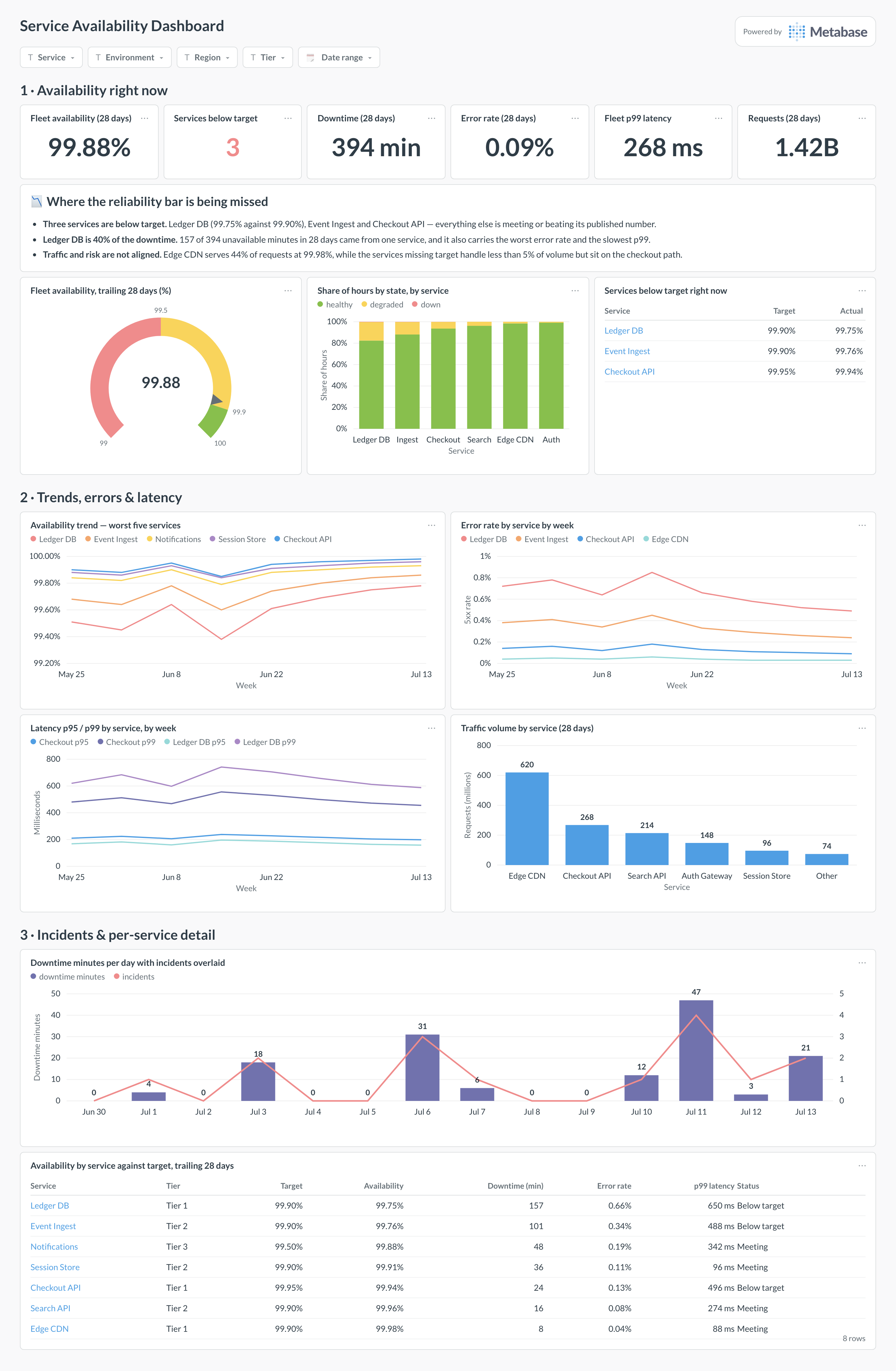
An example service availability dashboard in Metabase, built from Prometheus and Datadog rollups. Figures are illustrative.
Which cards belong on a service availability dashboard?
- Availability by service, trailing 28 days (table)
- Error rate by service by week (line)
- Latency p95/p99 by service (line)
- Services below target right now (number + table)
- Availability trend for the worst five services (line)
- Traffic volume by service for context (bar)
- Incidents overlaid on availability dips (timeline)
What data does the dashboard need?
service_health_rollups— per service and environment: window start, total requests, successful requests, and pre-aggregated latency percentiles.serviceswith owner, team, and tier, so targets differ by criticality.- Optional
incidentsto annotate dips with what happened.
How do you build it?
- Define success once — status < 500, or probe-based — and apply it in the rollup job, not per chart.
- Export hourly or daily aggregates per service from your telemetry stack into a database (see the Prometheus guide for routes).
- Pre-aggregate latency percentiles in the source — percentiles can’t be re-averaged from rollups later.
- Build the per-service table against targets first, then trends and drill-throughs.
Example card SQL
SELECT
service_name,
date_trunc('week', window_start) AS week,
ROUND(
  100.0 * SUM(successful_requests) / NULLIF(SUM(total_requests), 0), 3
) AS availability_pct,
ROUND(
  100.0 * SUM(total_requests - successful_requests)
  / NULLIF(SUM(total_requests), 0), 3
) AS error_rate_pct
FROM service_health_rollups
WHERE environment = 'production'
GROUP BY 1, 2
ORDER BY 1, 2;
Related
Metrics
Integrations
Dashboards
FAQ
What is a service availability dashboard?
What data sources feed a service availability dashboard?
service_health_rollups table — per service and window: total requests, successful requests, and pre-aggregated latency percentiles — plus a services table with owner and tier. Never sync raw telemetry; the rollup grain is the whole trick.