




What goes in an ETL monitoring dashboard in Metabase?
An ETL monitoring dashboard is the operational failure-watching view: failed runs and their error taxonomy, retry outcomes, runtime anomalies, late-arriving data, and the on-call queue. Where the ETL dashboard reviews the portfolio weekly, this one is read by whoever is on call, today — built from the same orchestrator run records, sliced for the last 24 hours.
For: on-call data engineers. Grain: one row per run attempt, including retries. Refresh: every few minutes — this dashboard is a queue, not a report.
What does an ETL monitoring dashboard look like?
Here’s the layout this guide builds. The open-failure counts sit at the top because they are the work queue; failure volume, taxonomy, and retry behaviour come next to answer “what kind of failures are these”; anomalies, late data, and the queue table sit at the bottom, where diagnosis happens.
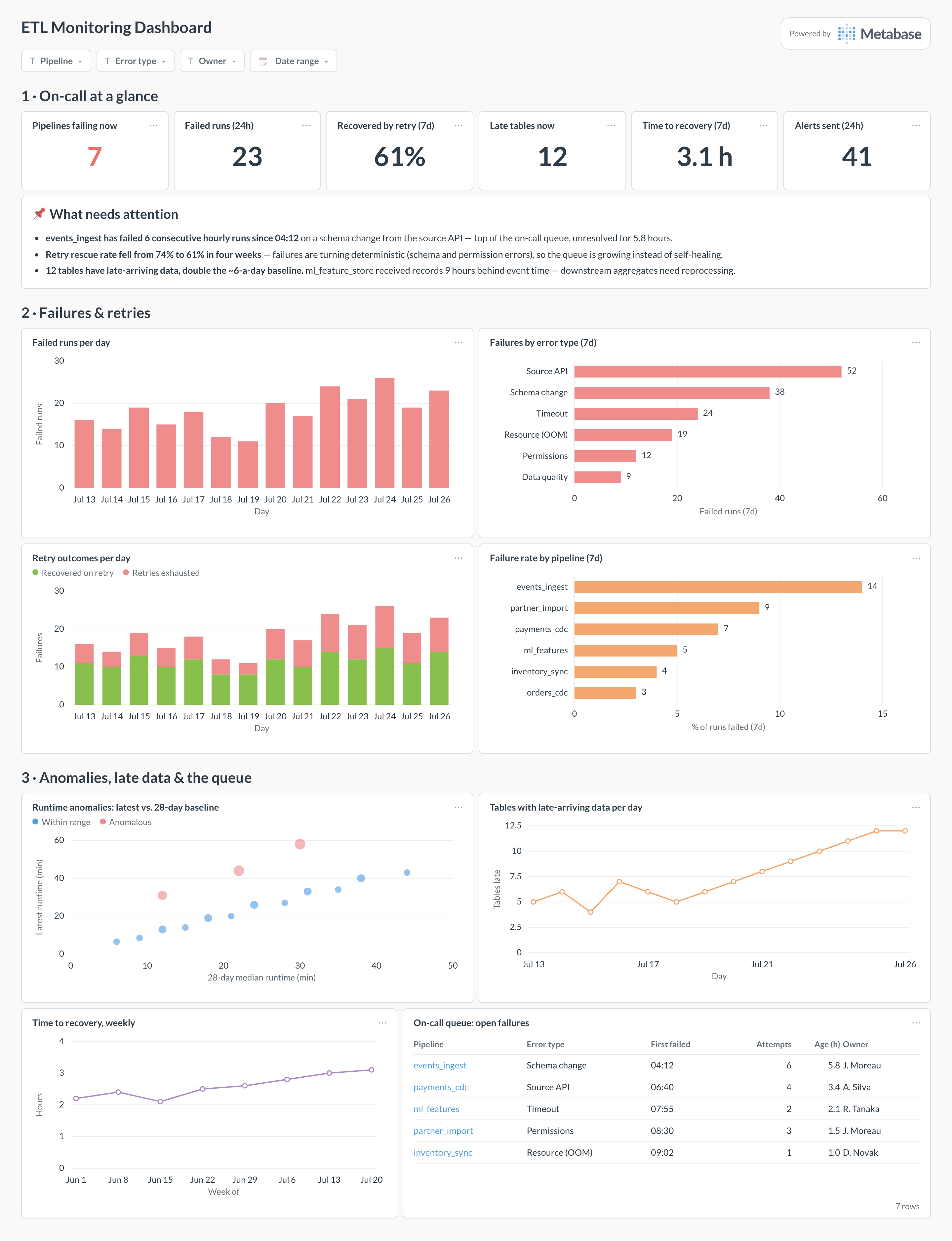
Which cards belong on an ETL monitoring dashboard?
The eight below cover detection, classification, and recovery — what broke, what kind of broken it is, and whether it is healing.
- Failed runs per day (bar)
- Failures by error type, last 7 days (row)
- Retry outcomes per day — recovered versus exhausted (stacked bar)
- Failure rate by pipeline, last 7 days (row)
- Runtime anomalies — latest runtime against 28-day baseline (scatter)
- Tables with late-arriving data per day (line)
- Time to recovery, weekly (line)
- On-call queue — open failures with attempts, age, and owner (table)
What data does the dashboard need?
- Per-attempt run records — pipeline, attempt number, status,
failed_at,resolved_at, runtime, and the rawerror_classstring. - An error-taxonomy mapping table —
class_pattern → bucket— so classification is data, not card logic. - A rolling runtime baseline per pipeline (28-day median), for the anomaly scatter.
- Event-time watermarks per destination table — max event timestamp versus load timestamp — for the late-data card.
- A pipeline dimension with owner and escalation target, so the queue table can say whose problem each row is.
How do you build it?
- Sync run attempts (not just final outcomes) from the orchestrator into
reporting.pipeline_runs— retry analysis needs every attempt, with error class and timestamps. - Create the
error_taxonomypattern table and join it in a shared model, keeping an Unclassified bucket you review weekly. - Materialize a per-pipeline 28-day median runtime, and compute each run’s deviation from it for the anomaly scatter.
- Add watermark tracking — max event time per load — and flag tables whose event-to-load gap exceeds their threshold.
- Add filters for pipeline, error type, and owner, set the dashboard to auto-refresh, and wire threshold alerts to the team channel — paging stays in PagerDuty.
Example card SQL
SELECT
r.pipeline,
COALESCE(t.bucket, 'Unclassified')                    AS error_type,
MIN(r.failed_at)                                      AS first_failed_at,
COUNT(*)                                              AS attempts,
ROUND(EXTRACT(EPOCH FROM (now() - MIN(r.failed_at))) / 3600.0, 1)
                                                      AS age_hours,
p.owner
FROM reporting.pipeline_runs r
JOIN reporting.pipelines p ON p.pipeline = r.pipeline
LEFT JOIN reporting.error_taxonomy t
ON r.error_class LIKE t.class_pattern
WHERE r.status = 'failed'
AND r.resolved_at IS NULL
GROUP BY r.pipeline, t.bucket, p.owner
ORDER BY age_hours DESC;
Related
Metrics
Integrations
Dashboards
FAQ
What is an ETL monitoring dashboard?
How is this different from the ETL dashboard?
pipeline_runs table so the two views can never disagree about what happened.How do I build a useful error taxonomy?
error_class LIKE pattern → bucket — and keep it under about eight buckets: source API errors, schema changes, timeouts, permissions, resource exhaustion, data-quality rejections, unclassified. The taxonomy exists to answer "what kind of week are we having": a spike in schema changes points at an upstream release, a spike in timeouts points at warehouse contention. Review the Unclassified bucket weekly and promote recurring patterns — an error rate that is 40% Unclassified isn't a taxonomy yet.