



What goes in a data warehouse dashboard in Metabase?
A data warehouse dashboard tracks query volume, latency percentiles, failure rate, storage growth, spend by workload, and user adoption for the warehouse itself. Every engine exposes this as queryable metadata, and Metabase connects to Snowflake, BigQuery, and Redshift natively — so the cards here are engine-agnostic, built from a normalized rollup of each engine's query history.
For: data platform leads, analytics engineers, and whoever owns the warehouse bill. Grain: one row per query, rolled up daily by workload. Source: the engine’s query-history views (QUERY_HISTORY, INFORMATION_SCHEMA.JOBS,SYS_QUERY_HISTORY), snapshotted nightly — retention on the raw views is limited.
What does a data warehouse dashboard look like?
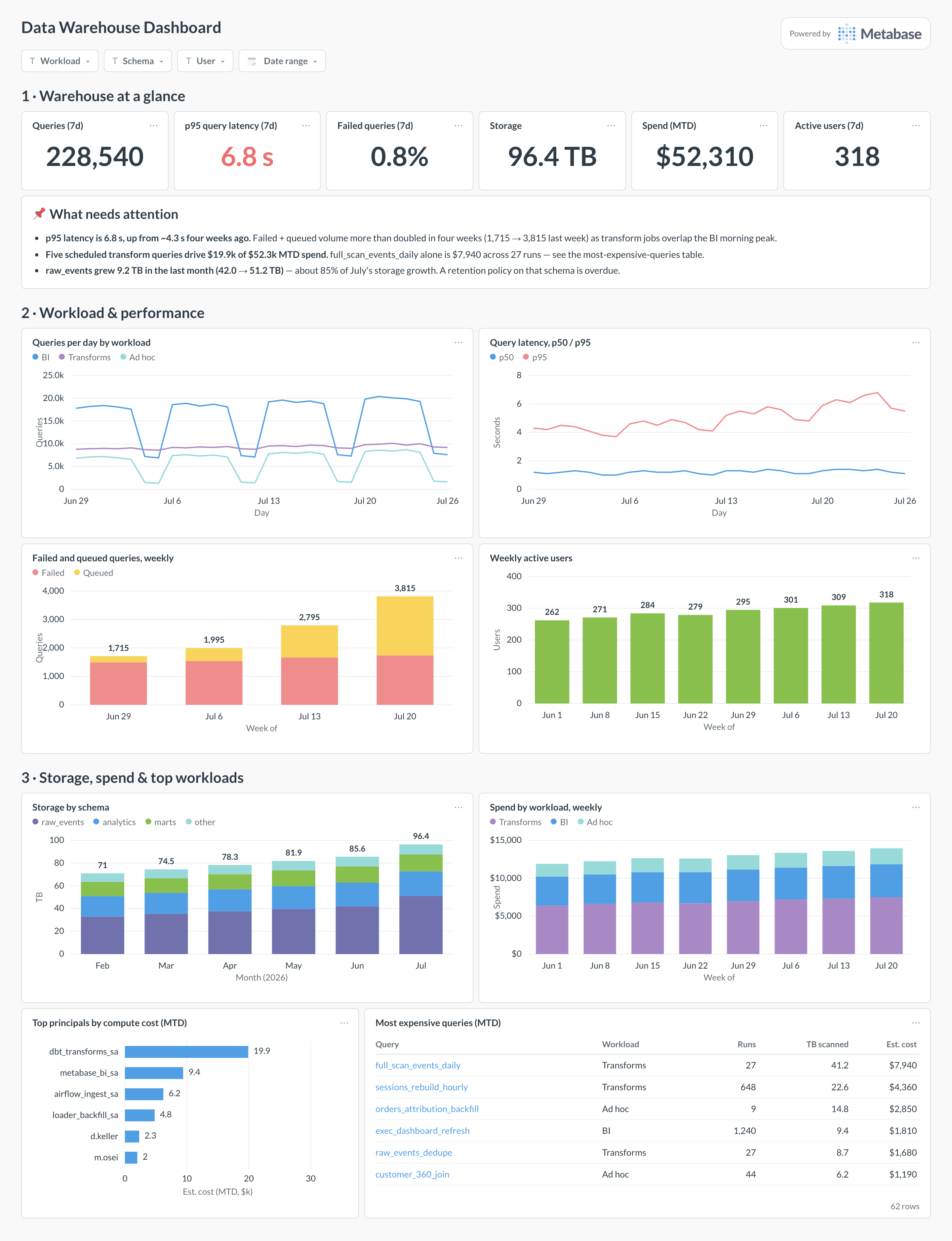
Here’s the layout this guide builds. Headline load, latency, and spend figures sit at the top so a glance answers “is the warehouse healthy and what is it costing”; workload and performance trends come next because contention shows up there first; storage, spend attribution, and the most expensive queries sit at the bottom for when you’re optimizing rather than checking.
Which cards belong on a data warehouse dashboard?
The eight below cover load, performance, cost, and adoption — the four questions a platform team gets asked about the warehouse.
- Queries per day by workload — BI, transforms, ad hoc (line)
- Query latency, p50 and p95, daily (line)
- Failed and queued queries per week (stacked bar)
- Weekly active users of the warehouse (bar)
- Storage by schema, monthly growth (stacked bar)
- Spend by workload, weekly (stacked bar)
- Top principals by compute cost, month to date (row)
- Most expensive queries, month to date (table)
What data does the dashboard need?
- Query history — one row per query with user, start and end time, bytes scanned, and status:
SNOWFLAKE.ACCOUNT_USAGE.QUERY_HISTORY, BigQuery’sINFORMATION_SCHEMA.JOBS, or Redshift’sSYS_QUERY_HISTORY. - Storage metadata per schema and table —
TABLE_STORAGE_METRICS,INFORMATION_SCHEMA.TABLE_STORAGE, orSVV_TABLE_INFO— snapshotted so growth is chartable. - A cost figure per query: bytes billed on on-demand pricing, or credits / slot-time apportioned by your contract rate on capacity pricing.
- A principal-to-workload mapping table — service accounts and roles tagged as BI, transforms, or ad hoc.
- A nightly rollup table of your own, since raw view retention is roughly 180 days on BigQuery and a year on Snowflake.
How do you build it?
- Schedule a nightly job that appends query history into a
reporting.warehouse_query_historyrollup — one row per query with user, workload, duration, bytes, status, and estimated cost. - Build the principal-to-workload dimension: map the dbt service account to transforms, the BI tool’s account to BI, humans to ad hoc — and join it in during the rollup.
- Connect the warehouse to Metabase (see the Snowflake, BigQuery, or Redshift guides) and model the rollup once as a shared model, so every card agrees on what a query costs.
- Build the eight cards against the model — latency cards use your engine’s percentile function (
PERCENTILE_CONT,APPROX_QUANTILES), and the expensive-queries table ranks by summed cost, not run count. - Add filters for workload, schema, user, and date range, then subscribe the platform channel to a weekly snapshot.
Example card SQL
SELECT
DATE_TRUNC('day', q.start_time)                       AS day,
q.workload,                                           -- 'BI', 'Transforms', 'Ad hoc'
COUNT(*)                                              AS queries,
PERCENTILE_CONT(0.50) WITHIN GROUP (ORDER BY q.duration_s)
                                                      AS p50_s,
PERCENTILE_CONT(0.95) WITHIN GROUP (ORDER BY q.duration_s)
                                                      AS p95_s,
ROUND(100.0 * COUNT(*) FILTER (WHERE q.status = 'FAILED')
      / COUNT(*), 2)                                  AS failed_pct,
ROUND(SUM(q.bytes_scanned) / POWER(1024, 4), 2)       AS tb_scanned,
ROUND(SUM(q.est_cost_usd), 0)                         AS est_cost_usd,
COUNT(DISTINCT q.user_name)                           AS active_users
FROM reporting.warehouse_query_history q
WHERE q.start_time >= CURRENT_DATE - INTERVAL '28 days'
GROUP BY 1, 2
ORDER BY 1, 2;
Related
Metrics
Integrations
Dashboards
FAQ
What is a data warehouse dashboard?
Does this work the same on Snowflake, BigQuery, and Redshift?
SNOWFLAKE.ACCOUNT_USAGE.QUERY_HISTORY (plus WAREHOUSE_METERING_HISTORY for credits), BigQuery has INFORMATION_SCHEMA.JOBS, and Redshift has SYS_QUERY_HISTORY. Each gives you one row per query with user, duration, bytes, and status. Normalize them into one rollup table with a workload column and the dashboard stops caring which engine is underneath — useful when you run more than one. For a BigQuery-specific build, see the BigQuery monitoring dashboard.Why build a nightly rollup instead of querying the system views directly?
INFORMATION_SCHEMA.JOBS keeps roughly 180 days and Snowflake's ACCOUNT_USAGE a year — a rollup keeps history forever. Latency and cost: ACCOUNT_USAGE views lag up to 45 minutes and re-scanning millions of raw job rows on every dashboard refresh is exactly the wasteful query pattern this dashboard exists to catch. A nightly aggregate touched once per refresh costs cents. Point every card at the rollup and keep one raw-history card for drill-down.