What goes in a QA automation dashboard in Metabase?
A QA automation dashboard treats the test suite as a product: pass rate by suite, flaky-test count and its worst offenders, runtime trend, coverage by module, and the defects that escaped anyway. It pairs with the bug quality view of defects as work items and the release quality view of outcomes per release.
For: QA engineers, test-infra owners, and team leads. Grain: per test run, rolled up weekly. Source: CI test reports (JUnit XML or your runner’s API) landed in the warehouse with commit and branch.
What does a QA automation dashboard look like?
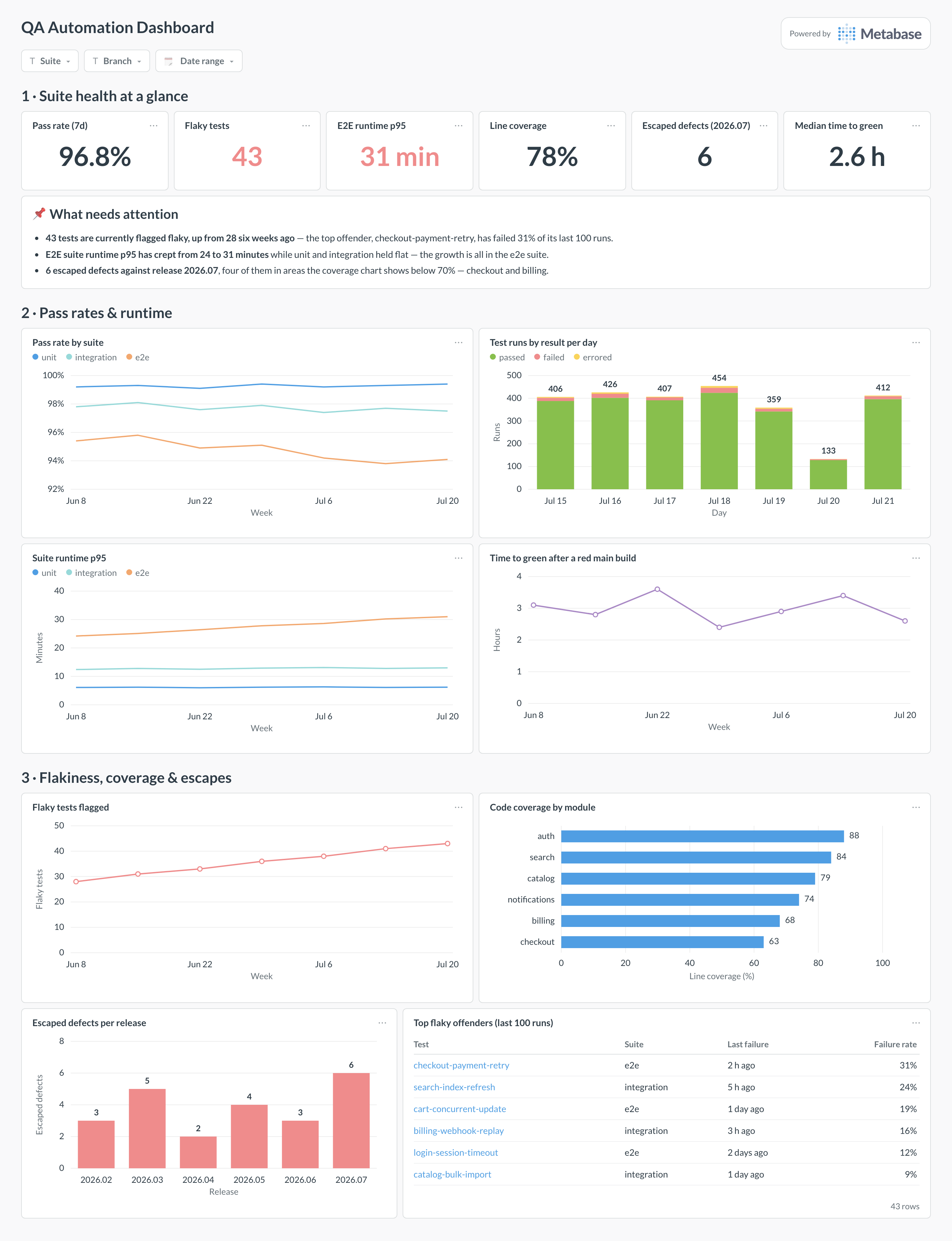
Here’s the layout this guide builds. Suite-health scalars and the attention card lead; pass rates and runtime come next because they are what CI feels like day to day; flakiness, coverage, and escaped defects close the page — the section that tells you whether the suite is actually protecting releases, ending in the flaky-offender table with names.
An example QA automation dashboard in Metabase, built from CI test-run data. Figures are illustrative.
Which cards belong on a QA automation dashboard?
The eight below cover the three things a suite owner has to know: is it passing, is it fast, and is it catching what matters.
Pass rate by suite — unit, integration, e2e, weekly (line)
Test runs by result per day — passed, failed, errored (stacked bar)
Suite runtime p95 by suite, weekly (line)
Time to green after a red main build (line)
Flaky tests flagged, trailing count (line)
Code coverage by module (row)
Escaped defects per release (bar)
Top flaky offenders, with failure rate over the last 100 runs (table)
What data does the dashboard need?
A test_runs table — test_name, suite, status, duration_ms, commit_sha, branch, finished_at — parsed from JUnit XML or your runner’s API.
Pipeline-level results with run duration and outcome, for runtime p95 and time-to-green.
Coverage reports per module from your CI coverage step, snapshotted weekly.
A defects table with a found_in_production flag and the release that introduced the fault, for the escapes card.
A quarantine list — test, owner, flagged date — if you auto-quarantine flakes.
How do you build it?
Emit structured test results from CI — GitHub Actions, CircleCI, or Buildkite — into the warehouse, one row per test per run, keyed by commit and branch.
Build the flakiness model: tests with mixed outcomes on the same commit over a trailing window, with a flag that expires after clean weeks.
Roll up pass rate and runtime p95 per suite per week in a shared model, so the scalars and charts can never disagree.
Join escaped defects to the release that introduced them, and land weekly module-level coverage snapshots next to them.
Add filters for suite, branch, and date range — defaulting branch to main — and alert on the flaky count crossing its cap.
Example card SQL
Top flaky offenders with failure ratePostgreSQL
WITH per_test AS (
SELECT
  r.test_name,
  r.suite,
  COUNT(*)                                            AS runs,
  COUNT(*) FILTER (WHERE r.status = 'failed')         AS failures,
  MAX(r.finished_at) FILTER (WHERE r.status = 'failed')
                                                      AS last_failure_at,
  -- flaky = both outcomes on the same commit
  COUNT(DISTINCT r.commit_sha) FILTER (WHERE r.status = 'failed')
    + COUNT(DISTINCT r.commit_sha) FILTER (WHERE r.status = 'passed')
    - COUNT(DISTINCT r.commit_sha)                    AS mixed_commits
FROM test_runs r
WHERE r.finished_at >= now() - interval '14 days'
  AND r.branch = 'main'
GROUP BY 1, 2
)
SELECT
test_name,
suite,
runs,
ROUND(100.0 * failures / NULLIF(runs, 0), 1)          AS failure_rate_pct,
last_failure_at
FROM per_test
WHERE mixed_commits > 0
ORDER BY failure_rate_pct DESC
LIMIT 20;
A QA automation dashboard measures the test suite as a product of its own: pass rates by suite, how many tests are flaky and which ones, how long the suites take, what the code coverage looks like, and how many defects escaped to production anyway. Its audience is the team that owns the tests. It deliberately does not track bugs as work items — that is the bug quality dashboard — or release outcomes, which belong to release quality.
How do I detect flaky tests from test-run data?
The standard signal is mixed outcomes on identical code: a test that both passed and failed on the same commit SHA (typically via a retry) cannot be reacting to a code change. Store every run with its commit, branch, and outcome, then flag tests with mixed outcomes per commit over a trailing window. Two refinements keep the list honest: require the pattern on more than one commit before flagging, and expire the flag after a few clean weeks so the count can actually go down.
Should flaky tests be quarantined or fixed immediately?
Quarantine plus a visible list beats both extremes. Letting flakes run poisons trust — engineers start re-running failures without reading them, which is how real regressions slip through. Stopping everything to fix each flake immediately doesn't survive contact with a deadline. So: auto-quarantine on detection, keep the quarantined list on this dashboard with an owner and an age column, and cap its size. When the cap is hit, the team fixes before it quarantines more — the dashboard is what makes that cap enforceable.
Why is my pass rate high while escaped defects keep rising?
Because pass rate measures whether existing tests pass, not whether the right things are tested. A 97% pass rate over tests that avoid your riskiest code coexists happily with a rising escape count — which is why this dashboard puts pass rate, coverage by module, and escaped defects on the same page. The diagnostic move is joining escapes to the coverage chart: when most escapes come from modules under 70% coverage, you have a targeting problem, not a discipline problem.
What counts as an escaped defect, and how do I attribute it to a release?
Any production bug whose root cause was present in a release and detectable by automated tests — found by users or monitoring rather than by the suite. Attribute it to the release that introduced the faulty change (from the fix's linked commits), not the release during which someone noticed, otherwise a slow-burning bug lands on the wrong release. Track the count per release on this page; the deeper severity and root-cause view lives on release quality.
How should I track suite runtime — average or p95?
p95, per suite, weekly. Developers experience the slow runs, not the average, and a creeping p95 with a flat median is the classic signature of a few bloated specs rather than uniform growth. Chart each suite separately: an aggregate hides the usual pattern where unit and integration hold flat while e2e absorbs every new feature as another browser flow. When e2e p95 crosses your CI budget, the fix is usually splitting, parallelizing, or demoting flows to integration tests — and the per-suite trend tells you which.
Is code coverage worth putting on the dashboard at all?
Yes, as a map rather than a target. A coverage percentage as a goal invites assertion-free tests that inflate the number without catching anything. Broken down by module and read next to escaped defects, coverage becomes diagnostic: the modules where escapes cluster are almost always the ones at the bottom of the chart. Keep it at module grain, refresh it from your CI coverage reports, and resist the temptation to put a single org-wide coverage goal next to it.