

What is a bin?
Also known as
Binning
Bucketing
A bin is a single range of continuous values used to group values in a chart. Binning data helps simplify data visualizations, so people can get a sense of their data’s distribution and easily spot outliers. You most often see bins used with histograms, but they aren’t exclusive to histograms and can be useful with other visualizations like line charts or pie charts.
If a measure in your dataset contains a lot of unique values, plotting each individual data point on a chart can look cluttered and may not be the best representation of your data. When you bin that data, those values get grouped into equal-sized intervals (like 1–10, 11–20, 21–30, and so on), and your resulting chart will show a count of values within each bin.
Data binning example
Figure 1 shows the price of products in Metabase’s Sample Database, displayed as a histogram.
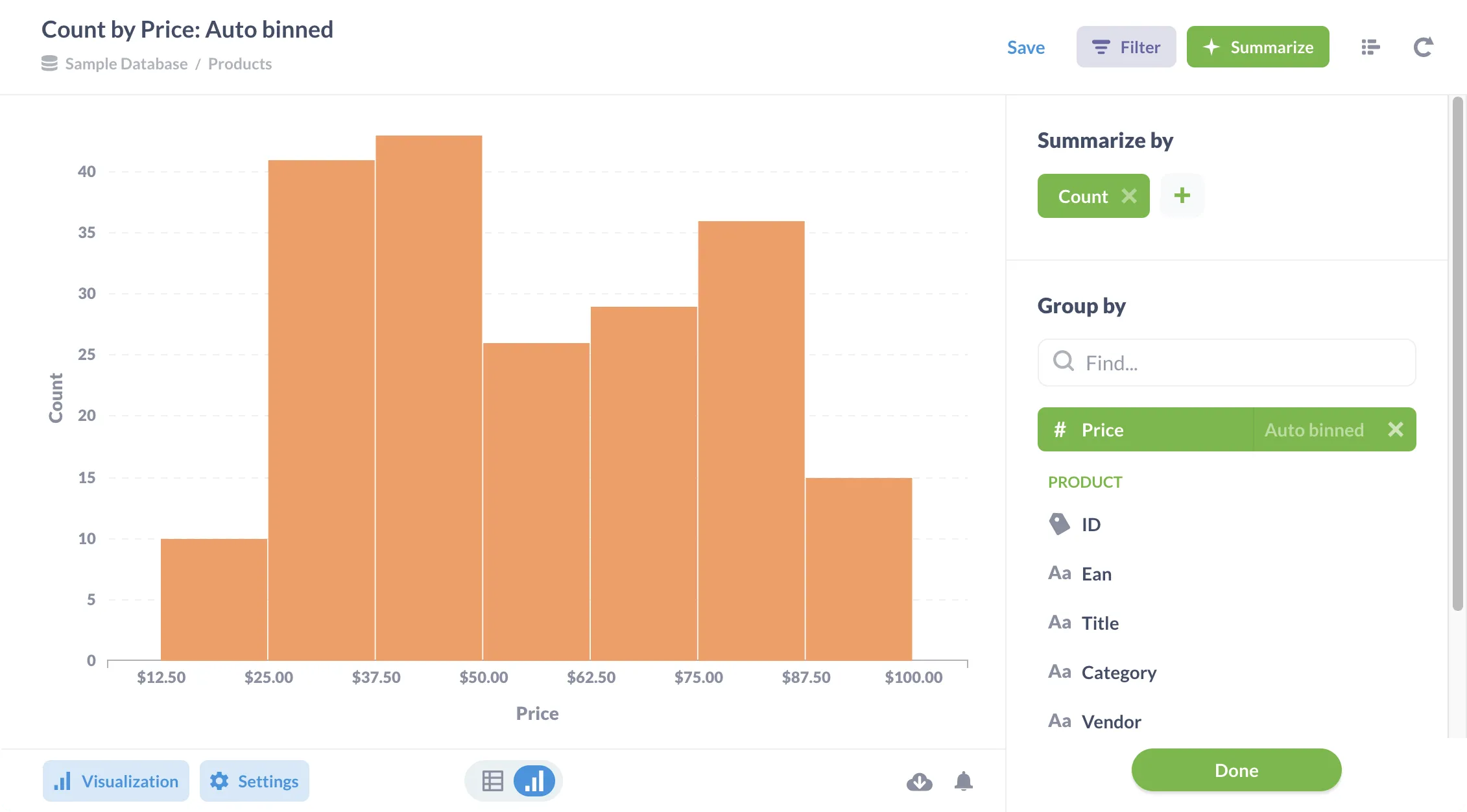
The bins here are the price ranges; we can see that we have more products in the $37.50–50.00 price range than any other.
Metabase auto-binned these values, but we can also select the number of bins we wanted (either 10, 50, or 100) to tweak this chart further. If your bin size is too small, you’ll have too many and likely end up with a visualization that’s hard to interpret. However, too few bins will give you an incomplete or overly-compressed picture of your data’s distribution, so play around and figure out what works best for your data.
Related term
Put it to work
- LLM latency and errors dashboard — Dashboard
- P95 LLM latency — Metric