

What is a cumulative value chart?
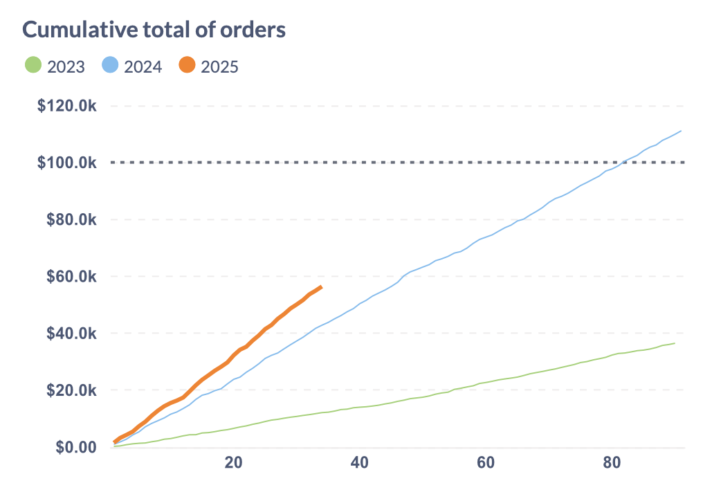
It’s common to track values that add up over time, like sales, miles traveled, etc. In contrast to a regular line chart, a cumulative value chart shows the total for each point in time, such as the day during the quarter. When more is added, that line will be steeper, when little (or nothing) is added, it will be closer to horizontal.
Cumulative value charts also lend themselves to period-over-period comparison (like the same quarter year-over-year), as well as showing a goal that the data line should cross.