




What goes in an IT service management dashboard in Metabase?
An IT service management (ITSM) dashboard looks at IT through the service catalog: which services generate requests and incidents, whether each one is meeting its SLA, what users think when tickets close, and what the problem and change pipelines hold. Metabase builds it from the ticket tables your desk already keeps in Jira Service Management, Zendesk, or Freshdesk — synced to a warehouse and mapped to your catalog once.
For: service delivery managers, service owners, and ITSM process leads. Grain: one row per ticket — incident, service request, problem, or change. Refresh: daily; reviewed weekly per service and monthly for governance.
What does an ITSM dashboard look like?
Here’s the layout this guide builds. The catalog’s headline numbers sit at the top; demand comes next — requests and incidents split by service, and the weekly mix of ticket types; service levels and quality close the page, where SLA attainment, CSAT, problem records, and the change calendar give the service review its agenda.
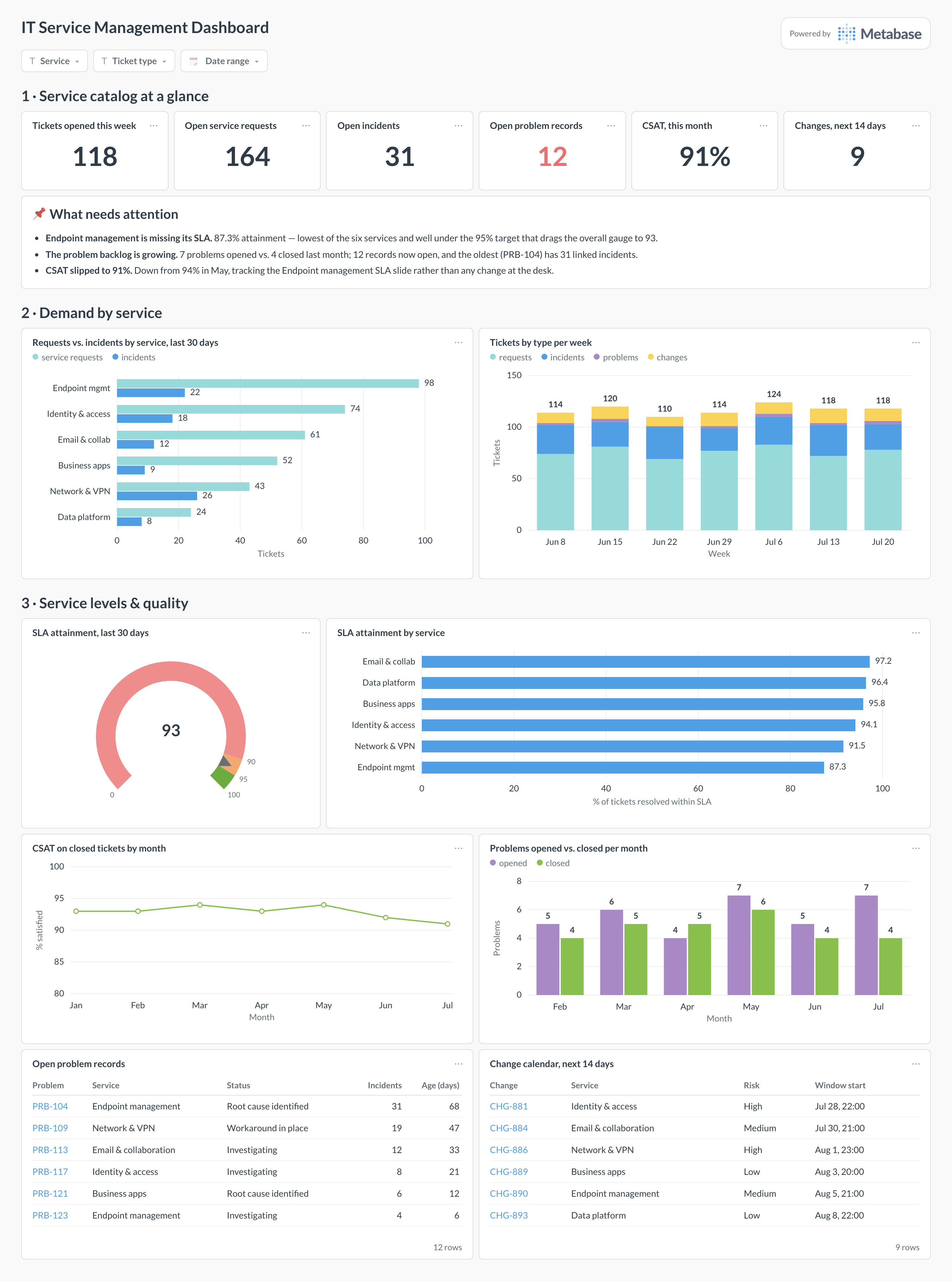
Which cards belong on an ITSM dashboard?
The eight below cover demand, service levels, and the two ITIL practices — problem and change — that a help-desk view leaves out.
- Requests vs. incidents by service, past 30 days (row)
- Tickets by type per week — requests, incidents, problems, changes (stacked bar)
- SLA attainment, past 30 days against target bands (gauge)
- SLA attainment by service (row)
- CSAT on closed tickets by month (line)
- Problems opened vs. closed per month (bar)
- Open problem records, with age and linked incidents (table)
- Change calendar — upcoming changes with window and risk (table)
What data does the dashboard need?
- A
ticketstable:ticket_id,ticket_type,service_id,priority,opened_at,resolved_at, and the tool’s ownsla_due_ator breach flag. - A
servicesdimension mapping desk categories and request forms to catalog services, with each service’s SLA target. - A
problemstable:problem_id,service_id,opened_at,closed_at,status, plus a link table to related incidents. - A
changestable:change_id,service_id,change_type,window_start,risk,status. - A
csat_responsestable:ticket_id,score,submitted_at— kept separate from tickets so response rate is computable.
How do you build it?
- Sync tickets, problems, changes, and CSAT responses from your service desk into the warehouse, keeping the desk’s SLA fields — recomputing SLA math from raw timestamps loses pause states and business hours.
- Build the service mapping once: a Metabase model that joins tickets to the
servicesdimension, so every card slices by the same catalog names. - Create the attainment cards from resolved tickets in the window — the gauge from the overall share within SLA, the row chart from the same measure grouped by service against each service’s own target.
- Add the problem cards: opened vs. closed per month for the trend, and a table of open records with age and linked-incident counts sorted oldest first.
- Add filters for service, ticket type, and date range, then subscribe the service owners to a weekly digest of their filtered view.
Example card SQL
SELECT
s.service_name,
COUNT(*)                                          AS tickets_closed,
COUNT(*) FILTER (
  WHERE t.resolved_at <= t.sla_due_at
)                                                 AS within_sla,
ROUND(
  100.0 * COUNT(*) FILTER (WHERE t.resolved_at <= t.sla_due_at)
        / COUNT(*), 1
)                                                 AS sla_attainment_pct,
ROUND(AVG(c.score) FILTER (WHERE c.score IS NOT NULL), 2)
                                                  AS avg_csat
FROM tickets t
JOIN services s   ON s.service_id = t.service_id
LEFT JOIN csat_responses c ON c.ticket_id = t.ticket_id
WHERE t.resolved_at >= CURRENT_DATE - 30
AND t.ticket_type IN ('incident', 'service_request')
GROUP BY 1
ORDER BY sla_attainment_pct ASC;
Related
Metrics
Integrations
Dashboards
FAQ
How is an ITSM dashboard different from an IT operations dashboard?
How does this differ from an IT support dashboard?
How do I calculate SLA attainment correctly?
sla_due_at or breach flag rather than re-deriving it from timestamps. Then report attainment per service and per priority, not one blended number: a 95% overall figure can hide an SLA breach rate three times higher on P1s, which is exactly what the service review needs to see.What is a problem record, and how do I show problem management is working?
How should I read CSAT on closed tickets?
How do I get service desk data into Metabase?
services dimension that rolls those up to the catalog entries your SLAs are written against. Do that mapping once in a shared model, not per card.