




What is a release burndown, and how do you build one in Metabase?
A release burndown plots remaining scope — story points or item count — against time, toward a release date. It's the chart that turns "are we on track?" from a feeling into a projection, and the honest version has two lines: work burning down, and scope being added. Build it in Metabase from issue history synced from Jira, Linear, or Azure DevOps.
What does a release burndown look like in Metabase?
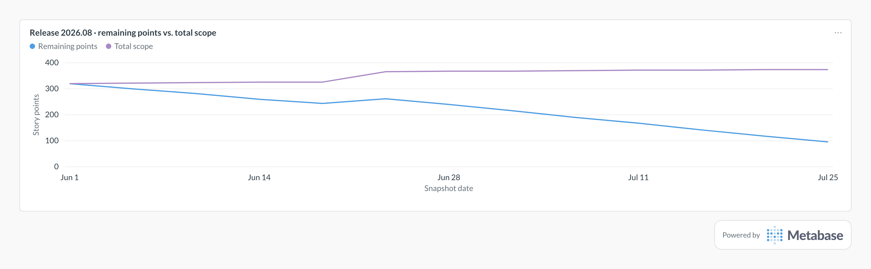
Read the two lines together: remaining points falling toward zero, and total scope creeping up above them. The burn line's slope projects the finish date, while the bump in late June — remaining work rising as the scope line steps up — is mid-flight scope addition, the pattern a single-line burndown would disguise as a stall.
What does a release burndown measure?
Distance to done, and the rate you're closing it. Extend the burn line at its recent slope and it crosses zero on some date — that date versus the release date is the entire conversation. But the single-line version hides the most common failure mode:
- The burn line — remaining points per day. Its slope is the team's effective pace against this release, which should roughly match velocity — when it doesn't, work is leaking out of the release or estimates are drifting.
- The scope line — total points in the release per day. A flat burn line with a rising scope line means the team is delivering and the release is growing underneath them. On a one-line burndown that renders as "no progress," which is both demoralizing and wrong.
- Burndown vs. burnup — a burnup plots completed and total scope as two rising lines, making the gap (and its widening) explicit. Same data, better at attributing blame between pace and scope creep.
When the projection misses the date, the chart forces the cut-line decision early: which items drop below the line. Read weekly alongside task completion rate, it makes scope trade-offs a routine planning act instead of a launch-week scramble.
What data does it need?
-
An
issue_snapshotsmodel: one row per issue per day withsnapshot_date,release,story_points, andstatus_category. - History is non-negotiable. A plain current-state sync overwrites the past on every refresh and cannot reconstruct the burn. Either replay the changelog (status changes, estimate changes, release membership changes) into daily rows, or run a scheduled job that snapshots current state each day going forward.
-
Timestamps for scope events:
added_to_release_atandcompleted_atper issue, for the scope-added vs. completed view. - A consistent unit — points or item count. Item count is coarser but immune to estimate churn; pick one per chart and label it.
SQL patterns
SELECT
  snapshot_date,
  SUM(story_points) FILTER (WHERE status_category <> 'done')
    AS remaining_points,
  SUM(story_points) AS total_scope_points
FROM issue_snapshots
WHERE release = '2026.08'
GROUP BY snapshot_date
ORDER BY snapshot_date;WITH events AS (
SELECT added_to_release_at AS event_at,
story_points, 'added' AS kind
FROM issues
WHERE release = '2026.08'
UNION ALL
SELECT completed_at, story_points, 'completed'
FROM issues
WHERE release = '2026.08' AND completed_at IS NOT NULL
)
SELECT
date_trunc('week', event_at) AS week,
SUM(story_points) FILTER (WHERE kind = 'added') AS points_added,
SUM(story_points) FILTER (WHERE kind = 'completed') AS points_completed
FROM events
GROUP BY 1
ORDER BY 1;Pitfalls
Where this metric applies
- Jira + Metabase — fix-version scope replayed from the issue changelog
- Linear + Metabase — project scope and estimates from issue history
- Azure DevOps + Metabase — iteration and work-item history
- Shortcut + Metabase — milestone scope and story states
Related
Metrics
Dashboards
FAQ
Burndown or burnup — which should I use?
Why does a release burndown need snapshot history?
How does velocity relate to the burndown?
What is a cut line, and when do you use it?
How do you build a release burndown in Metabase?
issue_snapshots model — either from the tool's changelog or from a scheduled job that copies current state each day. Chart remaining points and total scope by snapshot date, add the weekly scope-added vs. completed view, and pin both to a release burndown dashboard next to velocity.