



What goes in a data science dashboard in Metabase?
A data science dashboard is the program view of an ML practice: model performance and drift over time, experiment velocity, prediction volume, feature freshness, and the model inventory by stage. It's built from the model registry, prediction logs, and experiment trackers like Weights & Biases or Braintrust, landed in the warehouse and queried with plain SQL.
For: data science leads and the teams depending on model output. Grain: one row per prediction, per experiment run, and per registry entry. Source: model registry, prediction logs joined to outcomes, and experiment-tracker exports.
What does a data science dashboard look like?
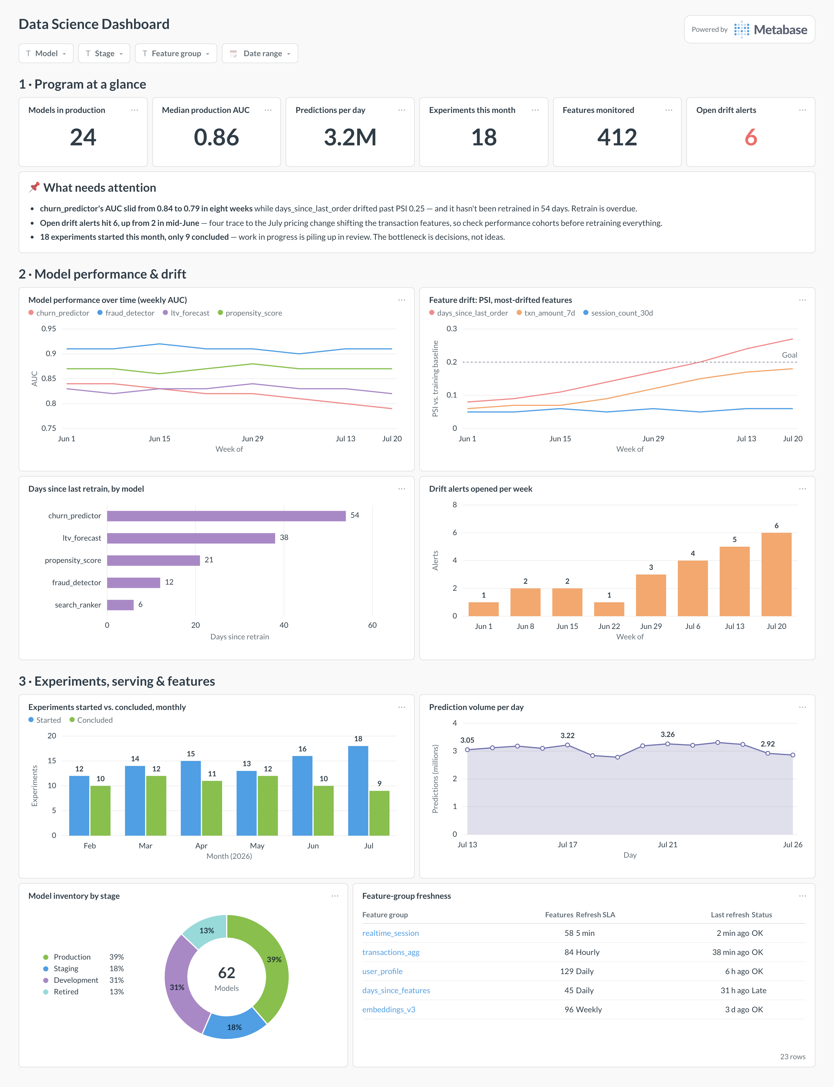
Here’s the layout this guide builds. Program-level counts sit at the top — models in production, prediction volume, open drift alerts; performance and drift trends come next because they are the cards that page someone; experiment throughput, serving volume, and the feature-freshness table sit at the bottom for the weekly program review.
Which cards belong on a data science dashboard?
The eight below cover model health, input health, and program throughput — performing models, fresh features, and experiments that actually conclude.
- Model performance over time — weekly AUC per production model (line)
- Feature drift — PSI for the most-drifted features, against the 0.2 threshold (line)
- Days since last retrain, by model (row)
- Drift alerts opened per week (bar)
- Experiments started versus concluded, monthly (bar)
- Prediction volume per day (area)
- Model inventory by stage — production, staging, development, retired (donut)
- Feature-group freshness — refresh SLA versus last refresh (table)
What data does the dashboard need?
- A prediction log —
prediction_id, model, stage, predicted label, confidence, and timestamp — joined to an outcomes table as ground truth arrives. - The model registry: model, version, lifecycle stage, and
last_trained_at, synced from an MLflow-style store. - Per-feature drift scores (PSI against the training baseline), computed on a schedule by a monitoring job.
- Experiment-tracker exports — run, start and conclusion dates, and outcome (shipped, negative, inconclusive).
- A feature-group reference table with refresh SLAs, plus each group’s actual last-refresh timestamp.
How do you build it?
- Log every production prediction to the warehouse with model, version, confidence, and features hash — and backfill outcomes into
ml.outcomesas labels arrive. - Sync the registry and experiment tracker nightly, so stage changes, retrain dates, and experiment conclusions are queryable tables.
- Schedule the drift job: compute PSI per feature against each model’s training baseline and write one row per feature per day.
- Build the eight cards, cohorting accuracy by prediction date with an awaiting-labels count so young cohorts aren’t misread.
- Add filters for model, stage, and feature group, then subscribe the DS channel to a weekly snapshot for the program review.
Example card SQL
SELECT
DATE_TRUNC('week', p.predicted_at)                    AS week,
p.model_name,
COUNT(*)                                              AS predictions,
ROUND(AVG(CASE WHEN o.actual_label = p.predicted_label
          THEN 1.0 ELSE 0.0 END), 3)                  AS accuracy,
ROUND(AVG(p.confidence), 3)                           AS avg_confidence,
COUNT(*) FILTER (WHERE o.actual_label IS NULL)        AS awaiting_labels
FROM ml.predictions p
LEFT JOIN ml.outcomes o USING (prediction_id)
WHERE p.predicted_at >= CURRENT_DATE - INTERVAL '12 weeks'
AND p.model_stage = 'production'
GROUP BY 1, 2
ORDER BY 1, 2;
Related
Metrics
Integrations
Dashboards
FAQ
What is a data science dashboard?
Where does the data come from?
How do I track production model performance when labels arrive late?
awaiting_labels count so nobody misreads a young cohort's early numbers as a crash. In between, watch leading indicators that need no labels at all: score-distribution shifts, confidence drops, and feature drift. A model whose inputs moved is usually a model whose accuracy is about to move — that ordering is why the drift card sits next to the performance card.What drift metric should I use, and what threshold?
Why track experiments started and concluded separately?
Why does feature freshness get its own card?
days_since_last_order stops updating, the scoring service keeps serving — same latency, no errors — while every prediction quietly uses yesterday's world. That is training-serving skew in its most common form, and no accuracy card will catch it until labels arrive weeks later. Give every feature group a refresh SLA in a reference table and chart last-refresh against it, exactly like a data freshness check for ETL — because that is what it is, with a model instead of a dashboard downstream.