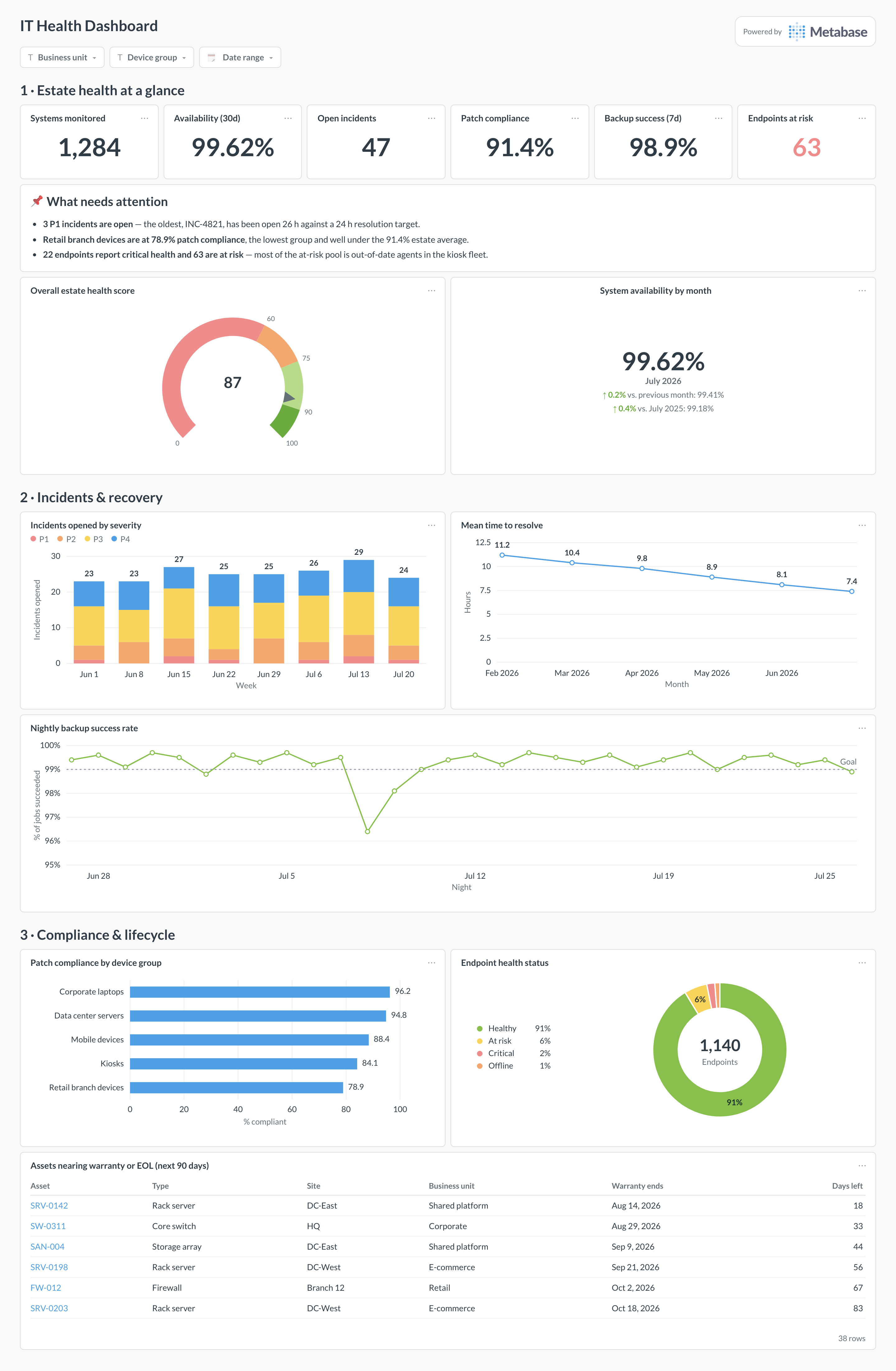
An IT health dashboard gives IT leadership one pane for the estate's overall condition: availability, open incidents, patch compliance, backup success, endpoint health, and warranty/EOL exposure. It is the rolled-up scorecard — the minute-by-minute view lives on an IT monitoring dashboard — and Metabase builds it from daily rollups of your monitoring, patching, backup, and asset systems in the warehouse.
For: IT directors and heads of infrastructure. Grain: one row per device per day, rolled up from monitoring, patch, backup, and CMDB exports. Refresh: nightly batch; incident counts hourly.
What does an IT health dashboard look like?
Here’s the layout this guide builds. The health score and estate-level KPIs sit at the top so a director gets the verdict first; incidents and recovery come next because they explain most bad weeks; patching, endpoints, and lifecycle exposure sit at the bottom — the slow-moving debt that never pages anyone but decides how bad the next incident is.
An example IT health dashboard in Metabase, built from daily rollups of monitoring, patching, backup, and CMDB data. Figures are illustrative.
Which cards belong on an IT health dashboard?
The eight below cover the question a director actually asks — “are we healthy, and if not, which discipline is slipping?” — without dropping into per-host telemetry.
Overall estate health score, a weighted composite of the pillars below (gauge)
System availability by month, with month-over-month comparison (trend)
Incidents opened by severity, weekly (stacked bar)
Mean time to resolve by month (line)
Backup success rate, nightly, against a 99% goal (line)
Patch compliance by device group (row)
Endpoint health status mix — healthy, at risk, critical, offline (donut)
Assets nearing warranty or EOL, next 90 days (table)
What data does the dashboard need?
uptime_checks — device ID, timestamp, and status from your monitoring stack, for availability rollups.
incidents — ID, severity, opened and resolved timestamps, and category, from ticketing or PagerDuty.
patch_status — one row per device per day with missing-patch counts and an explicit is_compliant boolean.
backup_jobs — job ID, device, start time, and success/failure status from your backup tool.
assets — CMDB export with device type, business unit, purchase date, warranty_end, and eol_date.
How do you build it?
Land nightly exports from monitoring, patch management, backup, and the CMDB into the warehouse, keyed on one shared device ID — the joins are the hard part, so fix ID mismatches here, not in cards.
Define the health score once as a Metabase model (for example 40% availability, 35% patching, 25% backups) so the gauge, the KPI row, and any per-unit breakdown share the same formula.
Build the availability trend from uptime_checks grouped by month, and the incident cards from your ticketing sync — see the PagerDuty integration guide for getting incident data into the warehouse.
Add the lifecycle table filtered to warranty_end or eol_date within 90 days, sorted soonest-first, with already-expired assets flagged.
Add filters for business unit, device group, and date range, then set up a weekly dashboard subscription for the leadership review.
Example card SQL
Estate health score by business unitPostgreSQL
WITH availability AS (
SELECT
  d.business_unit,
  ROUND(100.0 * COUNT(*) FILTER (WHERE c.status = 'up')
    / NULLIF(COUNT(*), 0), 2)                    AS availability_pct
FROM uptime_checks c
JOIN devices d ON d.device_id = c.device_id
WHERE c.checked_at >= CURRENT_DATE - 30
GROUP BY d.business_unit
),
patching AS (
SELECT
  d.business_unit,
  ROUND(100.0 * COUNT(*) FILTER (WHERE p.is_compliant)
    / NULLIF(COUNT(*), 0), 1)                    AS patch_pct
FROM patch_status p
JOIN devices d ON d.device_id = p.device_id
WHERE p.snapshot_date = CURRENT_DATE
GROUP BY d.business_unit
),
backups AS (
SELECT
  d.business_unit,
  ROUND(100.0 * COUNT(*) FILTER (WHERE b.status = 'success')
    / NULLIF(COUNT(*), 0), 1)                    AS backup_pct
FROM backup_jobs b
JOIN devices d ON d.device_id = b.device_id
WHERE b.started_at >= CURRENT_DATE - 7
GROUP BY d.business_unit
)
SELECT
a.business_unit,
a.availability_pct,
p.patch_pct,
b.backup_pct,
ROUND(0.40 * a.availability_pct
    + 0.35 * p.patch_pct
    + 0.25 * b.backup_pct, 1)                    AS health_score
FROM availability a
JOIN patching p USING (business_unit)
JOIN backups  b USING (business_unit)
ORDER BY health_score;
An IT health dashboard rolls the whole estate up into one scorecard for IT leadership: is everything available, patched, backed up, and inside its supported lifecycle? Instead of raw telemetry it shows daily rollups — availability percentage, open incidents by severity, patch compliance, backup success, endpoint health, and assets approaching warranty or end-of-life. The point is that a director can answer "are we in good shape?" in thirty seconds, and see which of the five or six underlying disciplines is dragging the score down when the answer is no.
How is an IT health dashboard different from an IT monitoring dashboard?
Health is the rolled-up scorecard; monitoring is the operational watch. An IT monitoring dashboard shows what is up or down right now, alert volume, and latency — the things an on-call engineer acts on within minutes. A health dashboard aggregates those same signals to a daily or weekly grain and adds slower-moving dimensions monitoring tools never see: patch compliance, backup success, and warranty/EOL exposure. If a card would make someone open a terminal, it belongs on the monitoring page, not here.
How do you calculate an overall IT health score?
As a weighted average of the pillar percentages — for example 40% availability, 35% patch compliance, 25% backup success — computed in one shared Metabase model so every card agrees on the formula. The weights are a judgment call: pick them to reflect what actually hurts your organization, write them down next to the gauge, and resist tuning them to make the number look better. A composite score is only useful if it moves when something real degrades, so test it against last quarter's incidents before anyone starts reporting it upward.
What should count as "patch compliant"?
Decide before you build the card, because the definition moves the number by 10 points or more. Common choices: all critical patches applied within 14 days of release, or no missing patch older than 30 days regardless of severity. Whatever you choose, compute it per device in the warehouse as an explicit boolean, not in each card's filter — otherwise the row chart by device group and the KPI scalar quietly disagree. And exclude devices that are retired-but-not-yet-removed from the CMDB, or your compliance rate decays as inventory hygiene does.
Why does my availability number disagree with the monitoring tool's?
Usually denominators. Your monitoring tool computes availability per check over whatever it watches; your dashboard computes it over whatever made it into the warehouse, and the two device lists drift. Other classics: maintenance windows counted as downtime in one system but excluded in the other, different check intervals (a 5-minute prober misses a 2-minute blip that a 30-second one catches), and timezone misalignment on the daily rollup. Pick one canonical uptime definition, document the exclusions, and reconcile monthly rather than letting both numbers circulate.
How often should an IT health dashboard refresh?
Daily for most of it, hourly for incidents. Patch compliance, backup success, and lifecycle data barely change intraday, so a nightly batch is fine and keeps queries cheap. Incident counts are worth an hourly sync from your ticketing or PagerDuty data so a bad morning is visible by the afternoon review. What this dashboard should never do is page anyone — alerting stays in the monitoring stack, and the health page is where you look after the pager goes off, not instead of it.
How far ahead should the warranty and EOL card look?
Ninety days for the operational table, four quarters for planning. The table on the dashboard should list what expires in the next 90 days, because that is the window where someone can still act — renew support, schedule a replacement, or consciously accept the risk. Keep a second, longer view (a bar chart of assets aging out per quarter) for budget season. The failure mode to avoid is a single "past EOL" count that grows quietly for a year: split out already-expired assets in red so they read as debt, not as pipeline.