




What goes in a content marketing dashboard in Metabase?
A content marketing dashboard measures the whole content program in one place: which clusters earn traffic, how much of that traffic becomes signups, how fast the team ships and refreshes pieces, and which pages are quietly decaying. It sits a level above the page-by-page view in a content performance dashboard — this is the program review, that is the URL-level diagnosis.
For: content leads, demand gen, and marketing ops. Grain: one row per page per day, rolled up to week or month. Source: web analytics export, CMS metadata, and a conversion events table.
What does a content marketing dashboard look like?
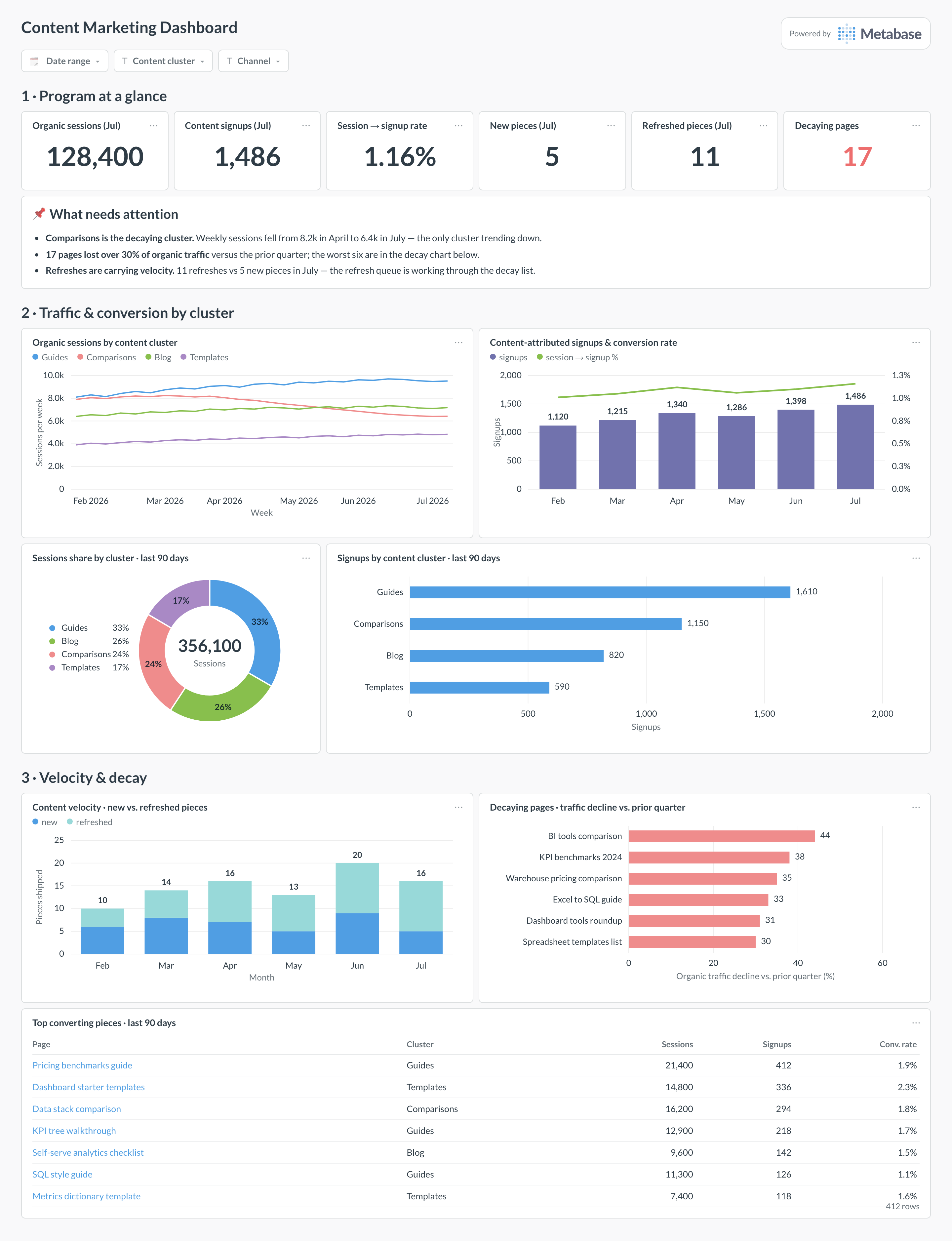
Here’s the layout this guide builds. Program-level numbers sit at the top — sessions, signups, and this month’s publishing output — so the weekly review starts with whether the program is growing. Traffic and conversion by cluster come next, because the cluster is the unit you make decisions about; velocity and decay sit at the bottom, where the “what should we work on” conversation happens.
Explore a live example
Click around a real Metabase dashboard below — filter it, hover the charts, and drill into the underlying questions to see how the cards are put together.
Which cards belong on a content marketing dashboard?
The eight below cover the three questions a content program answers for: is traffic growing, does it convert, and is the library being maintained.
- Organic sessions and signups this month, with session-to-signup rate and this month’s publishing counts (numbers)
- Organic sessions by content cluster, weekly (line)
- Content-attributed signups and conversion rate per month (combo)
- Sessions share by cluster, last 90 days (donut)
- Signups by content cluster, last 90 days (row)
- Content velocity — new versus refreshed pieces per month (stacked bar)
- Decaying pages — largest organic traffic decline versus the prior quarter (row)
- Top converting pieces — sessions, signups, and conversion rate per page (table)
What data does the dashboard need?
- A sessions table from your analytics export — GA4’s BigQuery export or a warehouse-native tool — with
session_id,landing_page_path, channel, and timestamp. - A conversion events table (
signup_completed, demo requests) carrying thesession_idso signups join back to the content session. - CMS metadata per piece:
published_at,updated_at, author, and cluster — this is what powers the velocity chart. - A
content_clustersmapping table of path pattern to cluster name, with an explicit “Unmatched” bucket. - Optionally, Search Console impressions and CTR per URL to separate “fewer clicks” from “fewer rankings” when a page decays.
How do you build it?
- Land sessions, conversions, and CMS metadata in one warehouse — the Google Analytics guide covers the GA4 BigQuery export, and most CMSs sync via their API or an ETL tool.
- Build the
content_clustersmapping table and a shared Metabase model that tags every organic session with its cluster. - Join conversions to sessions in that same model using your chosen attribution rule (session-scoped last touch is the usual start), so every card inherits one definition of “content-attributed.”
- Add the decay question: trailing 90 days of organic sessions per page versus the prior 90, filtered to pages above a minimum traffic floor and down more than 30%.
- Add filters for date range, content cluster, and channel, and schedule a monthly subscription to the content team’s channel.
Example card SQL
WITH organic_sessions AS (
SELECT
  s.session_id,
  DATE_TRUNC('month', s.started_at)      AS month,
  c.cluster
FROM web_sessions s
JOIN content_clusters c
  ON s.landing_page_path LIKE c.path_pattern
WHERE s.channel = 'organic'
  AND s.started_at >= NOW() - INTERVAL '6 months'
),
signups AS (
SELECT DISTINCT session_id
FROM conversion_events
WHERE event_name = 'signup_completed'
)
SELECT
os.month,
os.cluster,
COUNT(*)                                  AS sessions,
COUNT(su.session_id)                      AS signups,
ROUND(
  100.0 * COUNT(su.session_id) / COUNT(*), 2
)                                         AS session_to_signup_pct
FROM organic_sessions os
LEFT JOIN signups su USING (session_id)
GROUP BY 1, 2
ORDER BY 1, 2;
Related
Metrics
Integrations
Dashboards
FAQ
How is this different from a content performance or organic search dashboard?
How do I attribute signups to content?
How should I group pages into content clusters?
content_clusters table (or Metabase model) with a path pattern and a cluster name per row — /guides/% → Guides, /blog/% → Blog — and join sessions to it. When URLs don't encode the cluster, add a cluster field in the CMS and sync it instead. Keep an explicit “Unmatched” bucket and put it on the dashboard: if it grows, your mapping has drifted, and a silent catch-all is how a cluster chart quietly stops meaning anything.How do I detect content decay without false alarms?
Why don't my numbers match the GA4 interface?
Should content velocity count updates or only new posts?
updated_at change, a changed word count, an editor flag), not a typo fix. If refreshes suddenly dwarf new posts, check the definition before praising the strategy.