What goes in a sales activity dashboard in Metabase?
A sales activity dashboard tracks the inputs of the sales motion: calls, emails, and meetings per rep, how efficiently that effort converts to booked meetings, how fast inbound leads get a response, and which sequences earn replies. It's the effort-side companion to a sales pipeline dashboard — activity here, outcomes there.
For: sales managers, SDR leads, and RevOps. Grain: one row per activity per rep, rolled up to week. Source: engagement platform events (Outreach, Salesloft, Gong) joined to CRM leads and opportunities.
What does a sales activity dashboard look like?
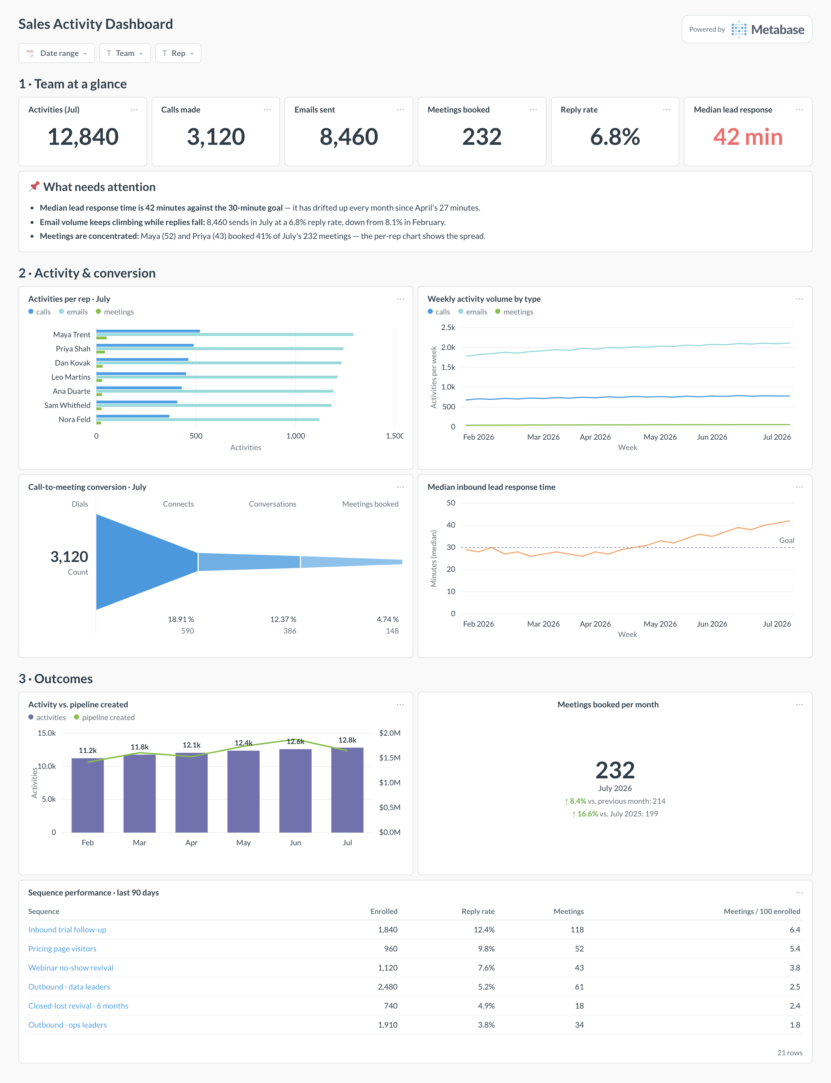
Here’s the layout this guide builds. Team totals and the response-time number sit at the top, because coverage problems need catching daily. Per-rep volume and conversion come next — always paired, so volume is never read without its quality check. Outcomes close it out: activity against pipeline created, the monthly meetings trend, and the sequence table that decides what gets retired.
An example sales activity dashboard in Metabase, built from engagement platform and CRM data. Figures are illustrative.
Which cards belong on a sales activity dashboard?
The eight below pair every volume measure with a conversion or outcome check, so effort and effectiveness get read together.
Team totals — activities, calls, emails, meetings booked, reply rate, median lead response time (numbers)
Activities per rep by type — calls, emails, meetings (row)
Median inbound lead response time, against the goal (line)
Meetings booked per month (trend)
Activity versus pipeline created per month (combo)
Sequence performance — enrolled, reply rate, meetings per sequence (table)
What data does the dashboard need?
An activities table with one row per touch — type (call, email, meeting), rep_name, occurred_at, and outcome fields like call disposition.
Email engagement events (delivered, replied) with sequence_id, from the engagement platform’s export.
A meetings table with booked_at, source activity or sequence, and held/no-show status.
A leads table with created_at and first-touch timestamp, for response-time math in business hours.
Opportunities with created_at and amount, to put pipeline created next to the activity that preceded it.
How do you build it?
Sync engagement platform events to the warehouse — the Outreach, Salesloft, and Gong guides cover the export options — and land CRM leads and opportunities beside them.
Build one activities model that unions calls, emails, and meetings with a shared type column, excluding auto-generated sequence steps from “human touch” counts.
Compute lead response time as median business-hours minutes from lead creation to first human touch, excluding auto-responders.
Join meetings back to their source activity and sequence, so the funnel and the sequence table use the same attribution rule.
Add filters for date range, team, and rep, and schedule the dashboard into the Monday pipeline meeting — paired with the pipeline dashboard, not instead of it.
Example card SQL
Calls, emails, meetings, and conversion per rep this monthPostgreSQL
SELECT
a.rep_name,
COUNT(*) FILTER (WHERE a.type = 'call')     AS calls,
COUNT(*) FILTER (WHERE a.type = 'email')    AS emails,
COUNT(*) FILTER (WHERE a.type = 'meeting')  AS meetings_held,
COUNT(DISTINCT m.meeting_id)                AS meetings_booked,
ROUND(
  100.0 * COUNT(DISTINCT e.reply_id)
  / NULLIF(COUNT(*) FILTER (WHERE a.type = 'email'), 0), 1
)                                           AS reply_rate_pct,
ROUND(
  100.0 * COUNT(DISTINCT m.meeting_id)
  / NULLIF(COUNT(*) FILTER (WHERE a.type = 'call'), 0), 1
)                                           AS call_to_meeting_pct
FROM activities a
LEFT JOIN email_replies e
ON e.activity_id = a.activity_id
LEFT JOIN meetings m
ON m.booked_from_activity_id = a.activity_id
WHERE a.occurred_at >= DATE_TRUNC('month', NOW())
GROUP BY a.rep_name
ORDER BY meetings_booked DESC;
How is this different from a sales pipeline dashboard?
Inputs versus outcomes. This dashboard measures what the team does — calls, emails, meetings, response times, sequences — while a sales pipeline dashboard measures what that effort produces: pipeline by stage, coverage, and slippage. They belong side by side because each explains the other. Thin pipeline with healthy activity points to conversion or targeting problems; thin pipeline with collapsing activity is an effort problem, which is a different conversation. The activity-versus-pipeline card on this dashboard is the hinge between the two views.
Which activities should actually count?
Only what's captured automatically. If calls come from the dialer, emails from Outreach or Salesloft, and meetings from calendar sync via Gong or the CRM, the numbers reflect behavior. The moment manually logged activities carry weight, the dashboard measures logging discipline instead — and reps under activity scrutiny log accordingly. Exclude auto-generated noise too: sequence-step auto-emails counted the same as a hand-written note to a director inflate volume while saying nothing about effort. Count touches a human initiated, tracked by systems that don't rely on humans remembering.
Is more activity always better?
No, and the dashboard should make that visible rather than hide it. Past a point, added volume degrades quality: reply rates fall as emails get more templated, and connect rates fall as calls chase colder lists. That's why this layout pairs every volume card with a conversion card — activity per rep beside call-to-meeting conversion, email volume beside reply rate. The pattern to catch is volume up while conversion falls faster, which means net output is shrinking as effort grows. Treat activity as a diagnostic floor, not a target to maximize.
How do I measure lead response time honestly?
Median, in business hours, from lead creation to first human touch. Averages get wrecked by the one lead that sat over a weekend, and wall-clock time punishes whoever covers Friday afternoon — a lead arriving at 6pm answered at 8am is fourteen hours on the wall clock and one business hour in reality. Exclude auto-responders; an instant templated email is not a response. Speed matters enormously in the first hour for inbound conversion, but the fix for a slow median is usually routing and coverage windows, not individual rep pressure — the dashboard tells you which by showing the trend against the goal line.
Why don't sequence stats match between Outreach and the CRM?
Because they count different things at different times. Sequence tools attribute a meeting to the sequence that was running when it was booked; the CRM attributes it to whatever the rep or the routing rules set as the source, and syncs can double-write or drop the field. Replies diverge too — a prospect replying from a different address may thread in the engagement tool but not match a CRM contact. Pick the engagement platform's event export as the source of truth for sequence performance, sync it to the warehouse, and treat CRM source fields as a cross-check, not a second scoreboard.
Should reps see this dashboard, or just managers?
Show it to everyone, but be deliberate about what the leaderboard ranks. Ranking raw activity invites gaming — short calls, thin emails, meetings that shouldn't exist — because any measure made a target stops measuring. Rank outcomes with activity as context: meetings held, qualified opportunities created, response-time attainment. And watch concentration, which the per-rep chart exposes: if two reps generate 41% of the team's meetings, the team number is fragile in a way the total hides. Transparency also keeps the data honest — reps correct sync gaps quickly when they can see their own numbers.
How much activity history do trends need?
A quarter of weekly data is the useful minimum, and rep-level comparisons need care with tenure: a rep who joined mid-quarter will trail every total through no fault of their own, so normalize per active day or annotate start dates. Weekly grain beats daily for trends — daily activity is spiky with meetings-heavy days and admin days, and the noise swamps the signal. Keep one full year if you can, because activity has seasonality (December collapses, January rebounds) that a quarter of history will misread as a trend. Meetings booked follows the same seasonality, which is worth remembering at annual planning.