





What goes in a commitment coverage dashboard?
A commitment coverage dashboard tracks the two failure modes of Savings Plans, Reserved Instances, and committed use discounts: paying on-demand rates for steady workloads (low coverage) and paying for commitments you don't use (low utilization). Coverage and utilization must be shown together.
For: FinOps, platform engineering, and finance. Refresh: daily. Source: modeled billing and cost tables in a Metabase-connected database.
What does this dashboard look like?
The layout pairs coverage with utilization, then shows the savings rate, the uncovered on-demand remainder, and what expires next — read it before buying or renewing a commitment.
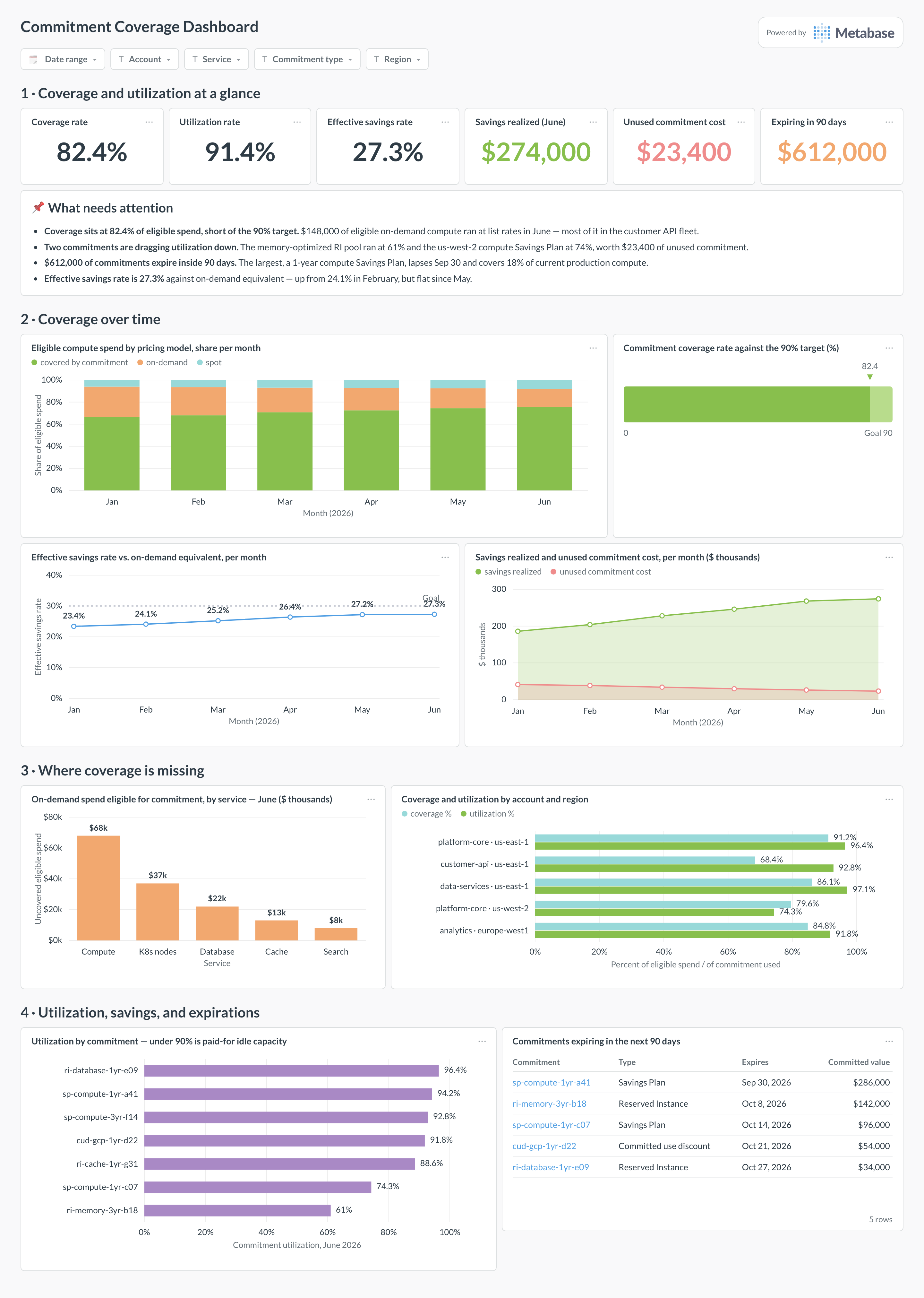
Which cards belong on this dashboard?
- Commitment coverage rate: covered share of eligible spend
- Commitment utilization rate by commitment
- Effective savings rate vs. on-demand equivalent
- On-demand spend eligible for commitment, by service
- Upcoming expirations in the next 90 days
- Coverage by account and region
- Savings realized per month from commitments
- Unused commitment cost (the waste line)
What data does this dashboard need?
- Billing line items with pricing model (on-demand, Savings Plan, Reserved)
- Commitment inventory: term, rate, scope, start and end dates
- Amortized cost including upfront prepayments
- On-demand-equivalent rates for savings math
- Eligibility flags (some usage can’t be covered by commitments)
How do you build it?
- Land billing exports or cost-platform data in a database and keep raw line items, tags, timestamps, and pricing models.
- Build rollup models at the grain this dashboard needs, with cost conventions (amortized, unblended, net) as explicit columns.
- Create one saved question per card and certify the shared models and definitions.
- Add dashboard filters for Date range, account, service, commitment type, region.
- Show data freshness — billing exports lag, and every viewer should see by how much.
Example card SQL
Coverage and utilization side by side by month PostgreSQL
SELECT
  date_trunc('month', usage_date) AS month,
  ROUND(
    100.0 * SUM(cost_usd) FILTER (WHERE pricing_model IN
      ('SavingsPlan', 'Reserved'))
    / NULLIF(SUM(cost_usd) FILTER (WHERE is_commitment_eligible), 0), 1
  ) AS coverage_pct,
  ROUND(
    100.0 * SUM(commitment_used_usd)
    / NULLIF(SUM(commitment_purchased_usd), 0), 1
  ) AS utilization_pct
FROM billing_line_items
GROUP BY 1
ORDER BY 1;
Related
Dashboards
Integrations
Metrics
Analytics
FAQ
What coverage rate should we target?
High enough to capture savings on steady-state load, low enough to keep flexibility — many teams land between 70% and 90% of eligible compute. The right number depends on workload volatility; the dashboard's job is showing the on-demand remainder so the decision is deliberate.
Why show utilization when coverage looks great?
Because over-commitment looks identical to success in a coverage-only view. A 95% coverage rate with 70% utilization means you're paying for capacity nobody uses — track the unused commitment dollars explicitly.