





What goes in a cost anomaly dashboard?
A cost anomaly dashboard turns 3 a.m. spend spikes into an operational queue: what fired, how far off expected it was, who acknowledged it, and which scopes keep re-offending. It combines detector events (from AWS Cost Anomaly Detection, CloudZero, or your own z-score SQL) with the daily spend curve for context.
For: FinOps, platform on-call, and engineering leads. Refresh: daily, or hourly where the billing feed supports it. Source: modeled billing and cost tables in a Metabase-connected database.
What does this dashboard look like?
The layout opens with the queue, sets daily spend against the expected baseline, then covers detection volume, repeat offenders, and every open anomaly — read it as an on-call triage list.
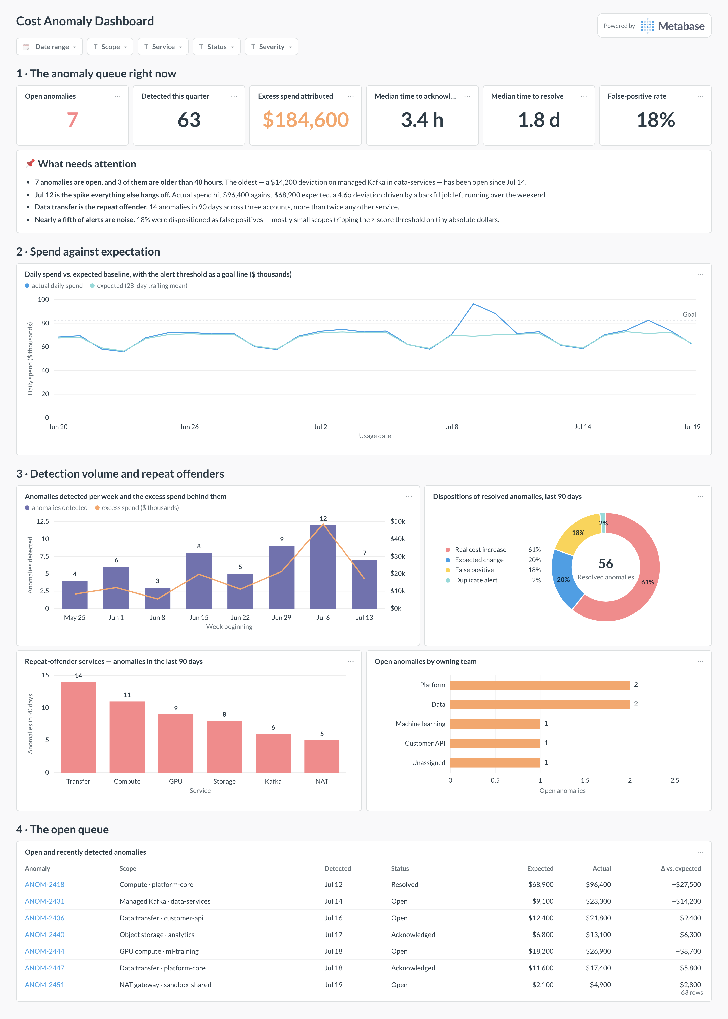
Which cards belong on this dashboard?
- Open anomalies right now
- Anomalies detected per week
- Deviation vs. expected cost per anomaly
- Daily spend with anomaly markers overlaid
- Median time to acknowledge and resolve anomalies
- Repeat-offender services and accounts
- Anomaly-attributed excess spend this quarter
- False-positive rate where dispositions are recorded
What data does this dashboard need?
- Anomaly events with detected-at, scope, expected and actual cost
- Acknowledge and resolve timestamps for response metrics
- Daily cost rollups for the context curve
- Scope metadata (service, account, team) for attribution
- Disposition labels (real, expected change, false positive)
How do you build it?
- Land billing exports or cost-platform data in a database and keep raw line items, tags, timestamps, and pricing models.
- Build rollup models at the grain this dashboard needs, with cost conventions (amortized, unblended, net) as explicit columns.
- Create one saved question per card and certify the shared models and definitions.
- Add dashboard filters for Date range, scope, service, status, severity.
- Show data freshness — billing exports lag, and every viewer should see by how much.
Example card SQL
A simple z-score anomaly detector in SQL PostgreSQL
WITH daily AS (
  SELECT
    usage_date,
    service,
    SUM(amortized_cost_usd) AS cost
  FROM cost_daily_rollups
  GROUP BY 1, 2
), stats AS (
  SELECT
    usage_date,
    service,
    cost,
    AVG(cost) OVER w AS avg_28d,
    STDDEV_SAMP(cost) OVER w AS stddev_28d
  FROM daily
  WINDOW w AS (
    PARTITION BY service ORDER BY usage_date
    ROWS BETWEEN 28 PRECEDING AND 1 PRECEDING
  )
)
SELECT
  usage_date,
  service,
  ROUND(cost, 2) AS cost,
  ROUND(avg_28d, 2) AS expected,
  ROUND((cost - avg_28d) / NULLIF(stddev_28d, 0), 1) AS z_score
FROM stats
WHERE (cost - avg_28d) / NULLIF(stddev_28d, 0) > 3
ORDER BY usage_date DESC, z_score DESC;
Related
Dashboards
Integrations
Metrics
Analytics
FAQ
Should I build detection in SQL or use the vendor's detector?
Use both. Vendor detectors (AWS Cost Anomaly Detection, CloudZero) catch spikes quickly with tuned models; a SQL z-score over your rollups is transparent, tunable, and works across providers. The dashboard unifies events from either source.
How do I keep anomaly noise down?
Detect at a meaningful grain (service per account, not the whole bill), require a minimum dollar impact as well as a statistical threshold, and record dispositions — a detector nobody trusts is worse than none.