




What goes in a CTO dashboard in Metabase?
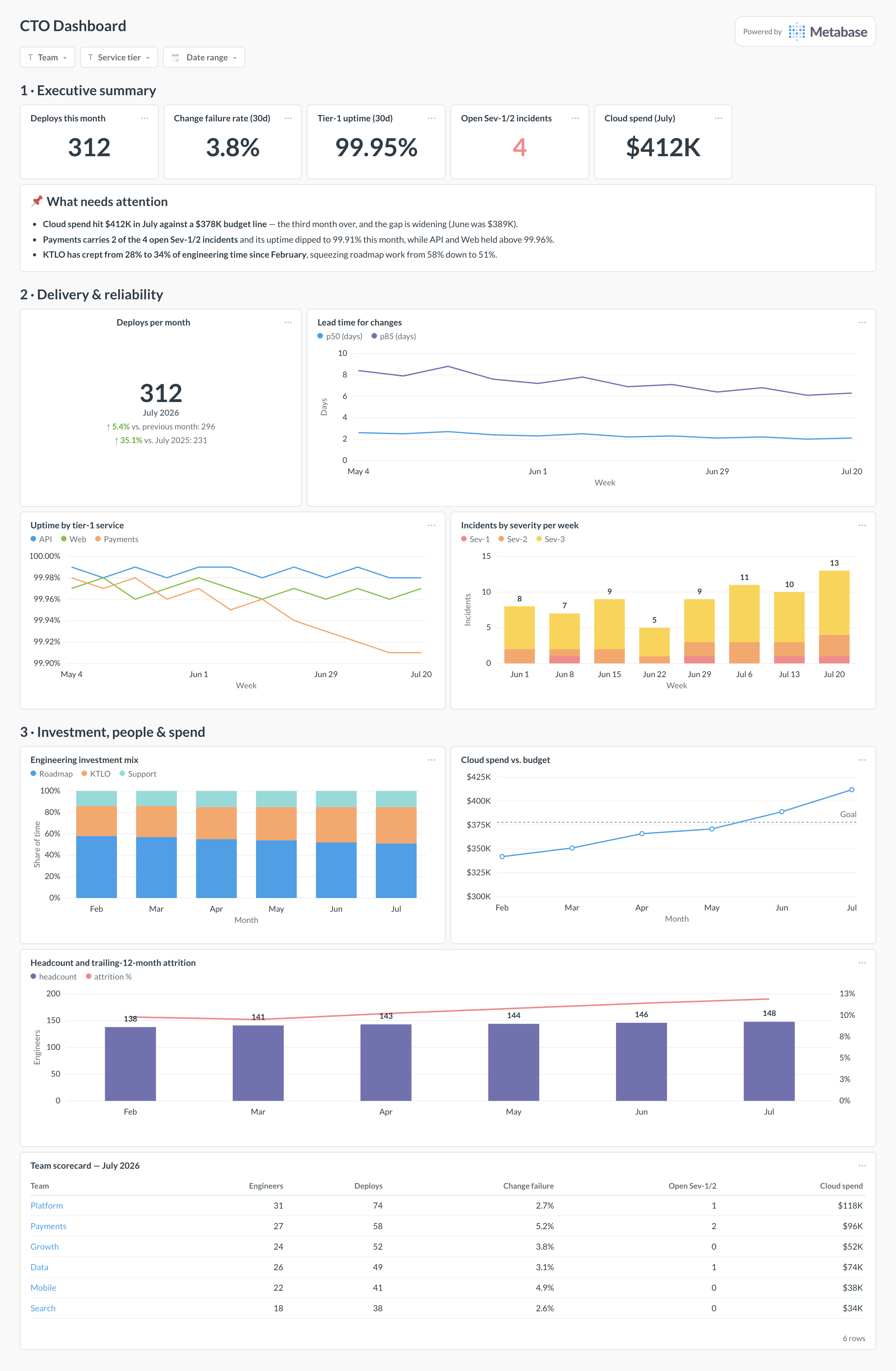
A CTO dashboard rolls engineering up to one page: delivery throughput, reliability, where engineering time actually goes, headcount and attrition, and cloud spend against budget. It is the board-meeting view — every card here summarizes a deeper operational dashboard like DORA or software delivery, and links down to it.
For: CTOs, VPs of engineering, and the exec team. Grain: monthly, with a live count for open incidents. Refresh: nightly is plenty — this page drives conversations, not pages.
What does a CTO dashboard look like?
Here’s the layout this guide builds. The executive summary and attention card sit at the top so the whole story fits in the first screen; delivery and reliability come next because they are the questions a board asks first; investment mix, people, and spend fill the bottom half, ending in a per-team scorecard that names where each number comes from.
Which cards belong on a CTO dashboard?
The eight below answer the four questions an exec review always asks: are we shipping, is it staying up, where is the time going, and what does it cost.
- Deploys per month, with month-over-month and year-over-year comparison (trend)
- Lead time for changes, p50 and p85 in days (line)
- Uptime by tier-1 service, weekly (line)
- Incidents by severity per week (stacked bar)
- Engineering investment mix — roadmap vs. KTLO vs. support share of time (stacked percent bar)
- Cloud spend vs. budget by month, with the budget as a goal line (line)
- Headcount and trailing-12-month attrition (combo)
- Team scorecard — engineers, deploys, change failure rate, open incidents, and spend per team (table)
What data does the dashboard need?
- A
deploymentstable withdeployed_at,team,environment, and acaused_incidentflag, from your CI/CD or Git host. - An
incidentstable withseverity,opened_at,resolved_at, andservice, plus per-service uptime rollups from your monitoring stack. - Issue-tracker data with an investment-bucket tag (roadmap / KTLO / support) at the epic or project level.
- An HRIS export with monthly
headcountand terminations per department, for the attrition line. - Normalized billing rows —
invoice_month,teamtag,cost— from your cloud billing exports.
How do you build it?
- Land the five sources in one warehouse — deploys and incidents from your delivery tooling, investment tags from the issue tracker, headcount from the HRIS, and billing exports from each cloud account.
- Build a monthly rollup model per domain (delivery, reliability, investment, people, spend) so every card reads a pre-aggregated table instead of raw events.
- Create the summary cards first — deploys trend, change failure rate, uptime, open Sev-1/2 count — and check them against the operational dashboards they summarize, so the exec page never disagrees with DORA.
- Add the investment mix, headcount, and spend cards, and set the budget goal line on the spend chart from finance’s number, not an average.
- Add filters for team, service tier, and date range, then wire each team scorecard row to the team-filtered operational dashboard so drill-down is one click.
Example card SQL
SELECT
date_trunc('month', d.deployed_at)                    AS month,
COUNT(*)                                              AS deploys,
ROUND(
  100.0 * COUNT(*) FILTER (WHERE d.caused_incident)
    / NULLIF(COUNT(*), 0), 1
)                                                     AS change_failure_pct,
PERCENTILE_CONT(0.5) WITHIN GROUP (
  ORDER BY EXTRACT(EPOCH FROM d.deployed_at - d.first_commit_at) / 86400
)                                                     AS lead_time_p50_days,
PERCENTILE_CONT(0.85) WITHIN GROUP (
  ORDER BY EXTRACT(EPOCH FROM d.deployed_at - d.first_commit_at) / 86400
)                                                     AS lead_time_p85_days
FROM deployments d
WHERE d.environment = 'production'
AND d.deployed_at >= date_trunc('month', now()) - interval '6 months'
GROUP BY 1
ORDER BY 1;