




What goes in a Confluent Cloud monitoring dashboard in Metabase?
A Confluent Cloud monitoring dashboard tracks consumer lag by group and by partition, throughput by topic, how evenly the load is spread across partitions, cluster load against its ceiling, and the requests that fail. Metabase has no Kafka driver — and does not need one: you land the Confluent Metrics API export in a warehouse on a schedule, and every card is ordinary SQL over that table.
For: streaming and platform teams who own the Kafka cluster and its consumers. Grain: one row per metric, per minute, per topic or consumer group.
Source:
the Confluent Cloud Metrics API (/v2/metrics/cloud/export or /query), landed in Postgres, Snowflake, BigQuery, or ClickHouse — or the JMX exporter if you run Kafka yourself.
What does a Confluent monitoring dashboard look like?
Here’s the layout this guide builds. Cluster-level counters sit at the top; the middle section is flow — bytes and records moving through each topic, and whether the consumers are keeping up with them; the bottom section is pressure, where partition skew, cluster load, and request errors explain why the flow cards look the way they do.
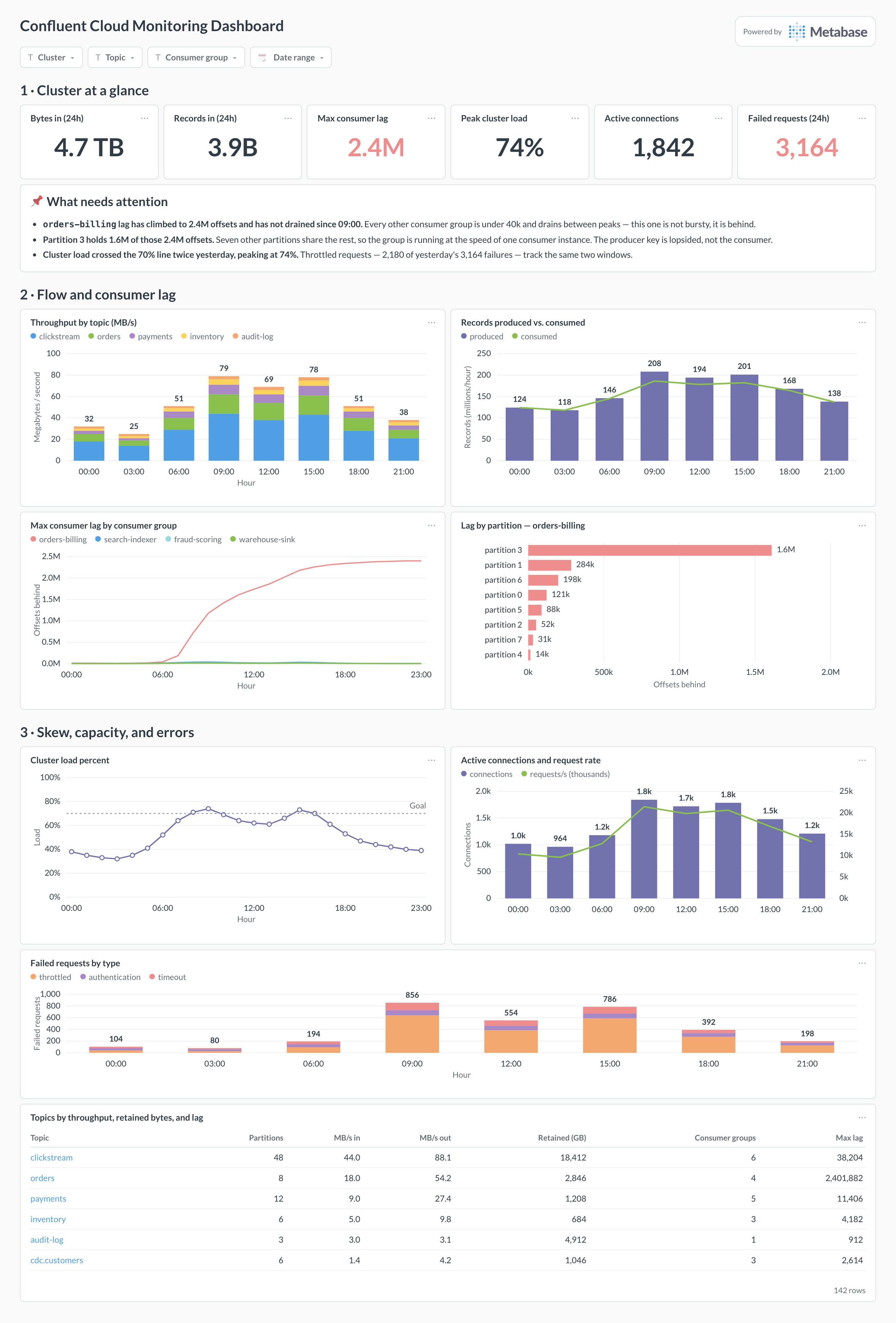
Which cards belong on a Confluent monitoring dashboard?
Eight cards. The first four say how much is moving and whether anyone is behind; the last four say why — skew, capacity, and errors.
- Throughput by topic — bytes in per second (stacked area)
- Records produced vs. consumed per hour (combo)
- Max consumer lag by consumer group over time (line)
- Lag by partition for the worst consumer group (row)
- Cluster load percent against the 70% ceiling (line)
- Active connections and request rate (combo)
- Failed requests by type — throttled, authentication, timeout (stacked bar)
- Topics by throughput, retained bytes, and lag (table)
What data does the dashboard need?
io.confluent.kafka.server/received_bytesandsent_bytes, broken out bytopic— the throughput cards.received_recordsandsent_recordsfor the produced-versus-consumed comparison, which is the one that catches a stalled consumer before lag has visibly grown.consumer_lag_offsets, labelled withconsumer_group_id,topic, andpartition— the same metric powers both the group card and the partition card.cluster_load_percent,partition_count,active_connection_count, andrequest_countfor the capacity half, plushot_partition_ingressif you want Confluent’s own skew flag.retained_bytesper topic for the storage column in the table, and the request-error counters for the failure card.- Self-managed Kafka instead? The same cards come from the JMX exporter —
BrokerTopicMetrics.BytesInPerSec,UnderReplicatedPartitions,OfflinePartitionsCount— plus consumer offsets for lag.
How do you build it?
- Create a Confluent Cloud API key scoped to the Metrics API, and schedule a job — every minute for the export endpoint, or every few minutes for
/query— that appends the response to one long table. - Store it long: metric name, timestamp, value, and the labels (cluster, topic, consumer group, partition) as separate columns or one JSON column. Confluent’s own retention is short, so this table is your history.
- Model it once in Metabase — a per-minute view with topic and consumer group resolved, plus a lag-in-seconds column (
lag ÷ recent consumption rate), so cards can talk about time instead of offsets. - Build the lag cards first. They are the ones people check at 3 a.m., and the group-plus-partition pair is what turns “we are behind” into “this one partition is behind”.
- Add filters for cluster, topic, and consumer group, then alert on lag that fails to drain and on cluster load crossing its threshold — well before it reaches 100%.
Example card SQL
SELECT
date_trunc('hour', ts)                                  AS hour,
labels ->> 'topic'                                      AS topic,
labels ->> 'consumer_group_id'                          AS consumer_group,
ROUND(SUM(value) FILTER (
  WHERE metric = 'io.confluent.kafka.server/received_bytes')
  / 1048576.0, 1)                                       AS mb_in,
ROUND(SUM(value) FILTER (
  WHERE metric = 'io.confluent.kafka.server/sent_bytes')
  / 1048576.0, 1)                                       AS mb_out,
SUM(value) FILTER (
  WHERE metric = 'io.confluent.kafka.server/received_records')
                                                        AS records_in,
MAX(value) FILTER (
  WHERE metric = 'io.confluent.kafka.server/consumer_lag_offsets')
                                                        AS max_lag_offsets
FROM kafka_metrics.confluent_export
WHERE ts >= now() - interval '24 hours'
GROUP BY 1, 2, 3
ORDER BY max_lag_offsets DESC NULLS LAST;
Related
Metrics
Integrations
Dashboards
FAQ
What is a Confluent or Kafka monitoring dashboard?
Can Metabase connect to Kafka directly?
Which Metrics API endpoints should I pull?
POST /v2/metrics/cloud/query returns JSON for a named metric, granularity, and set of filters — the simplest thing to schedule if you only want a handful of series. GET /v2/metrics/cloud/export returns everything for a cluster in Prometheus exposition format, which is what you want if you would rather land the whole surface once and decide what to chart later. The metric names to start with are io.confluent.kafka.server/received_bytes, sent_bytes, received_records, retained_bytes, consumer_lag_offsets, partition_count, active_connection_count, request_count, and cluster_load_percent. Note the granularity floor: most metrics resolve to one-minute points at best, and the export endpoint returns only the most recent interval, so the scheduled pull is what builds your history.What is a healthy consumer lag?
consumer_lag_offsets counts messages, and a message means something different on every topic. What matters is the shape: lag that rises during a traffic peak and drains back to near zero afterwards is a healthy consumer that is merely bursty; lag that rises and never drains is a consumer that cannot keep up, and it will keep growing until retention silently drops the data. So set the alert on the trend and the drain, not on an absolute count — and if you need a business-legible number, divide lag by the group's recent consumption rate to get an estimated time-to-catch-up in seconds.Why does partition skew matter more than it looks?
hot_partition_ingress and hot_partition_egress metrics. The dashboard's job is to make the ordinary case visible too, which is why the lag-by-partition card is worth a whole card rather than a footnote.What does cluster load percent actually measure?
cluster_load_percent is a composite estimate of how much of a Standard or Dedicated cluster's capacity is in use — throughput, connections, requests, and partitions combined into one number. Confluent's own guidance is to keep it comfortably below roughly 70% and expand before it saturates, because past that point request latency rises well ahead of the number reaching 100. Chart it with the threshold drawn on the card so the trend, not the current value, is what people read. Basic clusters do not expose it; there the equivalent early warning is request latency plus partition_count against the cluster limit.