What goes in a data center operations dashboard in Metabase?
A data center operations dashboard watches the facility itself: rack space, power draw and PUE, cooling and temperature, facility incidents, change windows, and hardware failures. It is the room-and-power counterpart to a server monitoring dashboard — servers tell you a host is struggling, this page tells you whether the hall it sits in is the reason — and Metabase builds it from DCIM, BMS, and sensor exports in your warehouse.
For: data center and facilities operations teams. Grain: sensor and power readings every 5 minutes, rolled up daily; incidents and changes per event. Refresh: every 15 minutes for environment cards; daily for trends.
What does a data center operations dashboard look like?
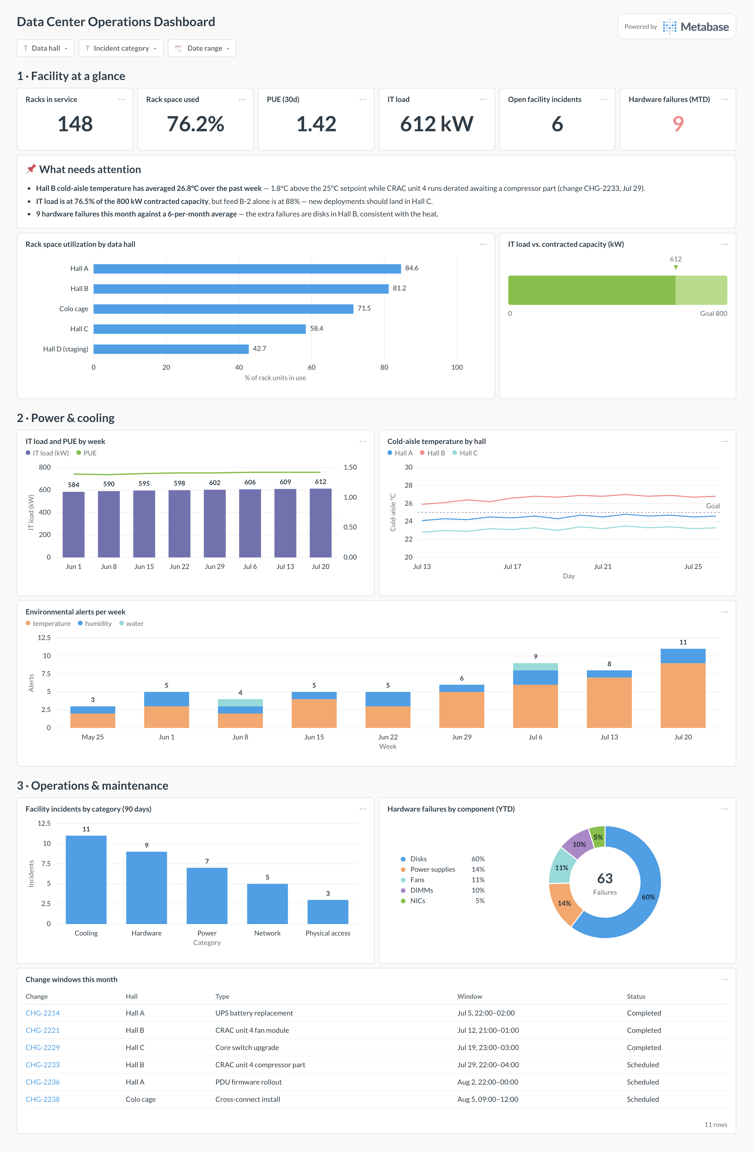
Here’s the layout this guide builds. Facility KPIs open the page — space, power, PUE, and open incidents in one row — then power and cooling, the two constraints that actually cap a data center, and finally the operations layer: incidents, change windows, and the hardware failure mix that explains a bad month.
An example data center operations dashboard in Metabase, built from DCIM, BMS, and sensor exports. Figures are illustrative.
Which cards belong on a data center operations dashboard?
The eight below cover the facility’s three stories: how full it is, whether power and cooling are holding, and what operations did about it.
Rack space utilization by data hall (row)
Power headroom — IT load against contracted capacity (progress)
IT load and PUE by week — load as bars, PUE on its own axis (combo)
Cold-aisle temperature by hall, against the setpoint (line)
Environmental alerts per week — temperature, humidity, water (stacked bar)
Facility incidents by category (bar)
Hardware failures by component, year to date (donut)
Change windows this month, with hall, type, and status (table)
What data does the dashboard need?
power_readings — IT load and total facility kWh per feed per interval, from the BMS, UPS, and smart PDUs.
sensor_readings — temperature and humidity per sensor with hall, row, and aisle position.
racks — rack inventory with hall, U capacity, U used, and power budget per rack.
change_windows — change ID, hall, type, scheduled window, and completion status from the change system.
How do you build it?
Export power and sensor data from the DCIM/BMS to the warehouse on a 5-minute schedule, keyed by feed, sensor, and hall — PUE and temperature cards are just rollups of these two tables.
Compute PUE in one shared model as facility kWh over IT kWh per day (the SQL below), so the KPI scalar and the weekly combo chart cannot drift apart.
Load rack inventory with U-used and power budget per rack, and build the space and headroom cards from it, grouped by hall.
Sync facility incidents and the change calendar from your ticketing system, categorized, so the operations section joins cleanly to halls.
Add filters for data hall, incident category, and date range, and set the environment cards to refresh every 15 minutes for the NOC display.
Example card SQL
Daily PUE and cold-aisle temperature by hallPostgreSQL
SELECT
r.reading_date,
r.data_hall,
ROUND(SUM(r.it_load_kwh), 0)              AS it_load_kwh,
ROUND(SUM(r.facility_kwh), 0)             AS facility_kwh,
ROUND(SUM(r.facility_kwh)
  / NULLIF(SUM(r.it_load_kwh), 0), 2)     AS pue,
ROUND(AVG(t.cold_aisle_temp_c), 1)        AS avg_cold_aisle_c,
MAX(t.cold_aisle_temp_c)                  AS max_cold_aisle_c
FROM power_readings r
LEFT JOIN (
SELECT
  reading_date,
  data_hall,
  AVG(temp_c) AS cold_aisle_temp_c
FROM sensor_readings
WHERE sensor_type = 'cold_aisle'
GROUP BY reading_date, data_hall
) t USING (reading_date, data_hall)
WHERE r.reading_date >= CURRENT_DATE - 90
GROUP BY r.reading_date, r.data_hall
ORDER BY r.reading_date, r.data_hall;
A data center operations dashboard tracks the facility rather than the workloads: rack space by hall, power draw and PUE, cooling and cold-aisle temperatures, facility incidents, scheduled change windows, and hardware failure rates. It is the view a facilities or DC-ops team needs — a server monitoring dashboard tells you a host is hot, this one tells you whether the room, the power feed, or the cooling plant is why. In Metabase you build it from DCIM/BMS exports and sensor rollups landed in the warehouse.
How is PUE calculated, and what's a good number?
PUE (power usage effectiveness) is total facility power divided by IT load — 1.0 would mean every watt reaches the racks, and everything above it is cooling, conversion, and lighting overhead. Modern hyperscale halls run near 1.1–1.2; a well-run enterprise room is more typically 1.4–1.8. Two caveats before publishing the number: fix the measurement boundary (does "facility" include the office floor?), and expect seasonality — free cooling makes winter PUE flattering, so chart it as a trend and compare year over year rather than against a single target.
Where does the sensor and power data come from?
From the building and power layers, not the servers. The BMS or DCIM platform exports power readings per feed and PDU (often via Modbus or BACnet gateways, or the platform's own API); smart PDUs and UPS units expose per-rack draw over SNMP; temperature and humidity sensors report through the same DCIM collector. Schedule a job that lands each as timestamped rows in the warehouse — 5-minute grain is plenty for a dashboard — and keep raw sensor IDs so a suspicious reading can be traced to the physical device that produced it.
What temperature range should the cooling cards alarm on?
Start from the ASHRAE recommended envelope for cold-aisle intake — roughly 18–27°C — and decide deliberately where in it you want to sit. Running warmer saves real cooling energy and is within spec, but it shrinks your thermal ride-through when a CRAC unit fails, which is exactly the scenario the dashboard exists to catch. A good pattern: chart per-hall cold-aisle temperature against a goal line at your chosen setpoint, and alarm on the hot-aisle delta and rate of change rather than a single absolute reading, which one badly placed sensor can fake.
Why track change windows on the same dashboard?
Because in a data center, incidents follow changes. When the incident card spikes the first question is "what changed?", and having scheduled windows next to the incident trend answers it without opening the change system. It also enforces discipline the other way: a change marked complete moments before a hardware failure in the same hall is a correlation worth an honest post-mortem. Sync the change calendar into the warehouse with hall, type, window, and status, and keep the table filtered to the current month.
Which constraint bites first — rack space, power, or cooling?
Almost always power or cooling, not space. Racks fill to their power budget long before their 42U is used, especially as GPU and high-density gear arrives — a hall can look half empty on the rack-space card while a feed sits at 90% of contracted capacity. That is why this layout pairs rack utilization with power headroom per feed: read them together. Cooling is the sneakier limit, showing up as rising cold-aisle temperatures in specific rows rather than a clean utilization number, which is why the per-hall temperature trend earns its place.
How should hardware failures be tracked and read?
As a monthly count by component, with the fleet size as the denominator in mind. Disks dominate raw counts because there are thousands of them — that is expected; what the card is for is drift: a doubling in PSU failures, or DIMM errors clustered in one hall, usually points at power quality or heat rather than bad luck. Feed it from your ticketing or maintenance log with component, hall, and rack, and read it next to MTBF so "more failures" can be separated from "more hardware".