What goes in a release management dashboard in Metabase?
A release management dashboard watches the process of shipping: calendar adherence, readiness checklist status, scope change after the cut, deployment windows, hotfixes and rollbacks per release, and approvals cycle time. It is the process twin of release quality, which tracks the defect outcomes of what shipped.
For: release managers, engineering managers, and program leads.
Grain: per release, rolled up monthly. Source: release records, issue tracker, and deploy logs joined on a shared release dimension.
What does a release management dashboard look like?
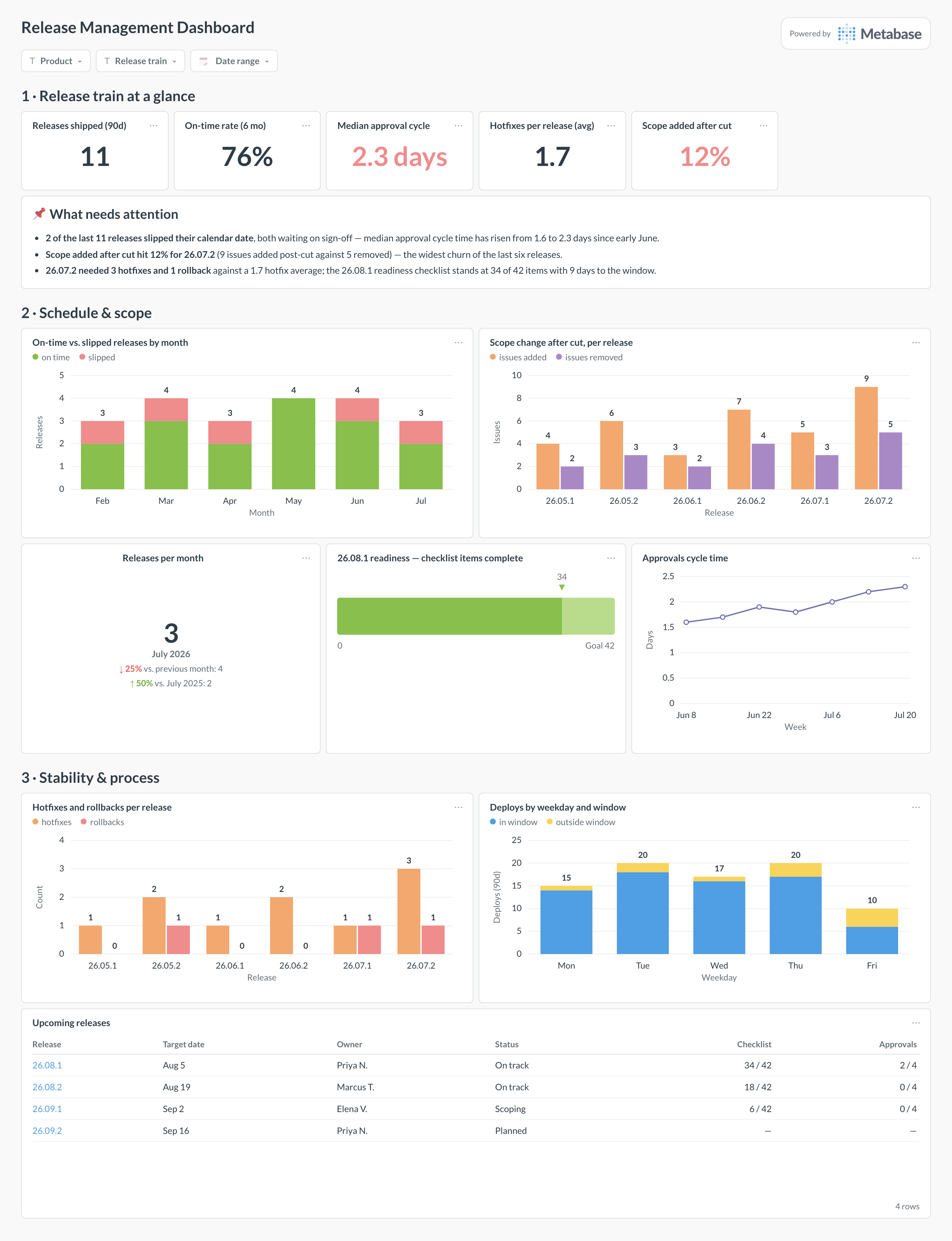
Here’s the layout this guide builds. The train’s vital signs and the attention card sit on top; schedule and scope come next — adherence, post-cut churn, and the readiness of the next release; stability and process close the page with hotfixes, deployment windows, and the upcoming release table the weekly meeting runs from.
An example release management dashboard in Metabase, built from release and issue-tracker data. Figures are illustrative.
Which cards belong on a release management dashboard?
The eight below cover the release manager’s three questions: is the train on schedule, is the next departure ready, and what did the last few departures cost.
On-time vs. slipped releases by month (stacked bar)
Scope change after cut, per release — issues added and removed (grouped bar)
Releases per month, with month-over-month comparison (trend)
Next release readiness — checklist items complete against total (progress)
Approvals cycle time, median days per week (line)
Hotfixes and rollbacks per release (grouped bar)
Deploys by weekday and window — in-window vs. outside (stacked bar)
A releases table with release_name, target_date (frozen at planning), cut_at, shipped_at, and a slip-reason category.
Issue-tracker rows linked to a release, with added_after_cut and removed_after_cut flags derived from the cut timestamp.
Readiness checklist items per release — item, owner, completed flag — from a queryable tracker template.
Approval events with requested and granted timestamps, per approval type.
Deploy logs with timestamps and a hotfix/rollback flag, for windows and the stability cards.
How do you build it?
Create the release dimension first — name, frozen target date, cut date, ship date — and make every other table join to it; this is also what lets this dashboard link to release quality per release.
Derive scope-churn flags by comparing each issue’s link and unlink timestamps from Linear or your tracker to the release’s cut date.
Land approval events with requested and granted timestamps, and compute the weekly median in a model rather than in each card.
Mark hotfix and rollback deploys in the deploy log at the moment they happen, then build the per-release stability chart from it.
Add filters for product, release train, and date range, and put the upcoming-releases table on the weekly release meeting’s agenda — the dashboard replaces the status spreadsheet, not the meeting.
Example card SQL
Per-release adherence, scope churn, and hotfixesPostgreSQL
SELECT
r.release_name,
r.target_date,
r.shipped_at::date                                    AS shipped_date,
(r.shipped_at::date <= r.target_date)                 AS on_time,
COUNT(i.id) FILTER (WHERE i.added_after_cut)          AS issues_added_after_cut,
COUNT(i.id) FILTER (WHERE i.removed_after_cut)        AS issues_removed_after_cut,
ROUND(
  100.0 * COUNT(i.id) FILTER (WHERE i.added_after_cut)
    / NULLIF(COUNT(i.id) FILTER (WHERE NOT i.removed_after_cut), 0), 1
)                                                     AS scope_added_pct,
COUNT(h.id)                                           AS hotfixes,
COUNT(h.id) FILTER (WHERE h.was_rollback)             AS rollbacks
FROM releases r
LEFT JOIN release_issues i ON i.release_id = r.id
LEFT JOIN hotfixes h        ON h.release_id = r.id
WHERE r.shipped_at >= now() - interval '6 months'
GROUP BY r.id, r.release_name, r.target_date, r.shipped_at
ORDER BY r.shipped_at;
A release management dashboard tracks the process of shipping: whether releases hit their calendar dates, how ready the next one is, how much scope churns after the cut, when deploys actually happen, and how long approvals take. It is the release manager's working view. Outcomes — the defects each release produced — deliberately live on a separate release quality dashboard: this page asks "is the train running on time", that one asks "what did the train deliver".
How is this different from a release quality dashboard?
They split on process versus outcome. Release quality measures what happened after shipping — defects per release, severity mix, escape rate. This dashboard measures the machinery before and during shipping: adherence, readiness, scope churn, approvals, windows. The two share a release dimension table so a slipped release here can be joined to its defect count there, and the most useful review looks at both: a release that shipped on time but needed three hotfixes did not really ship on time.
How do I measure release calendar adherence fairly?
Compare the shipped date to the target date that was set at planning time, and freeze that target — a target that gets re-baselined every slip produces a 100% adherence rate and no information. Count a release on time if it shipped within its planned window, and chart on-time versus slipped per month rather than a single rate, so one chaotic month doesn't hide in a quarterly average. When a release slips, record the reason as a category (approvals, scope, defects, environment) — that column turns the chart from a scoreboard into a diagnosis.
What belongs on a release readiness checklist?
Whatever your definition of done actually requires — but as verifiable items, each with an owner: tests green, migration rehearsed, rollback plan written, approvals collected, docs updated, support briefed. Keep the checklist in a tool you can query (a tracker template, or a table your pipeline writes) so the progress card computes itself instead of being updated by hand on Fridays. The dashboard shows completed-versus-total for the next release; the point is that a 34-of-42 with nine days left is visible before it becomes a slip.
Why track scope change after the cut?
Because post-cut churn is the quietest predictor of both slips and hotfixes. Issues added after the cut arrive with less review and less test soak; issues pulled late leave half-integrated seams. Count both directions per release — added and removed after the cut date — and watch the added share: a release carrying 12% post-cut scope when your average is 7% deserves a harder look at the readiness checklist, and the correlation with the hotfix chart is usually visible within a quarter.
Are deployment windows still worth enforcing?
For the releases this dashboard manages — coordinated, multi-team, customer-visible — yes, and the weekday chart shows whether the policy is real. Continuous deployment of small changes can flow all week (that traffic belongs on the DevOps dashboard), but a release train benefits from a window where support is staffed and rollback attention is guaranteed. The signal to watch is out-of-window deploys creeping up, especially Fridays: each one is either an emergency, which the hotfix chart should corroborate, or window erosion.
How do I measure approvals cycle time without blaming approvers?
Measure the queue, not the person: time from approval requested to approval granted, median per week, across all approval steps. A rising line almost never means approvers got lazy — it means more approvals were requested (scope churn), requests arrived later (readiness slipping), or the approval step lacks a deputy for vacations. Break the median down by approval type before drawing conclusions, and treat the chart as capacity-planning input; publishing per-person approval times on a shared dashboard mostly teaches people to game timestamps.