

Cumulative charts to track values over time
Cumulative value charts show how numbers stack up and compare to a goal.
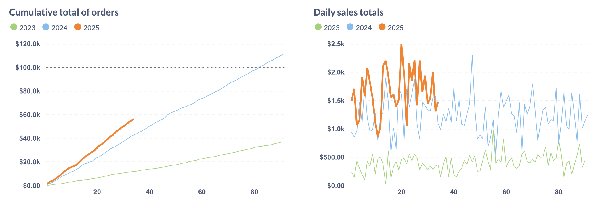
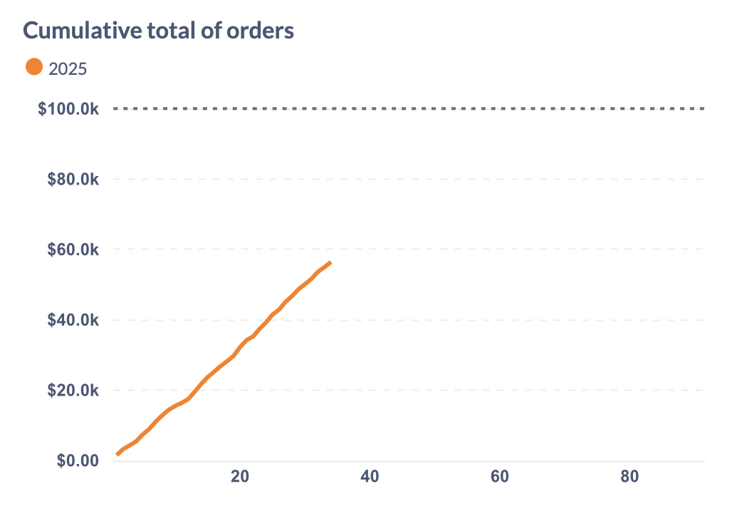
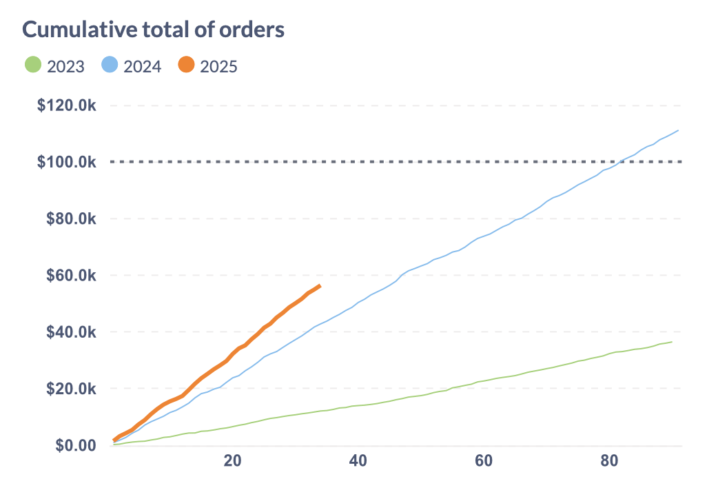
It’s common to track values over time: sales, user signups, water consumed, miles run, etc.The image above shows two ways of displaying sales for every day over the first quarter of the year, with the current year in orange and the two previous years in blue and green.
The cumulative value chart on the left shows the total sales as they add up over the course of the quarter. The dotted horizontal line represents the goal we’re trying to reach this quarter.
The line chart on the right shows the same sales as daily totals, but not adding up over time. While we might be able to more precisely compare the values for each day, we don’t see how the total tracks towards our goal. The line chart also gets too busy, even for just a single quarter.
How do cumulative value charts work?
A regular line chart shows values for each point in time, like the total amount of sales for a given day, the number of units sold in a month, etc. A cumulative value chart adds these values up over time, so they accumulate. The value it shows can usually only go up or stay the same, not go down.
The resulting line will increase at different rates depending on how much is added for each time period (usually days). If nothing is added, that section of the line will be horizontal. The more we add (like sales, units, new members), the steeper the line will be.
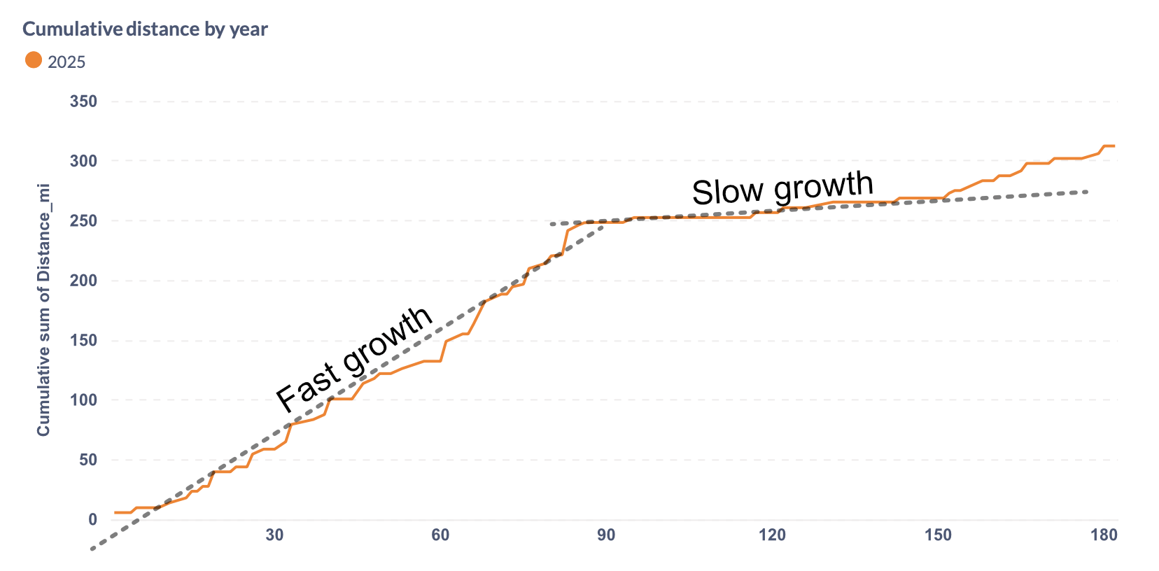
Here’s another example using different data: running data over about six months. For the first three months, our athlete put in (comparatively) many miles, leading to fast growth in total miles shown as relatively steep line. In the second quarter, they slowed down, leading to much slower growth, which results in a much flatter line.
In addition to the metric being tracked, it’s also common to show a goal line (the dotted line in the image at the top and below). It’s easy to see when that line is crossed, but even before that happens it’s usually fairly easy to visually estimate whether the current rate of change will result in the goal being achived or not.
Cumulative charts are good for period-over-period comparisons
You can use cumulative charts to compare series with earlier time periods (usually year-over-year). Cumulative charts can show the current series in a prominent color, while muting the colors of previous series.
Cumulative value charts work well for tracking metrics that increase over time. They may not show precise numerical differences, but they do show the rate of growth, and don’t require computations or custom expressions.
Comparison with other common time series visualizations
Compared to regular line charts or bar charts, cumulative charts frocus on the way numbers add up over a period of time, rather than points in time. They also create a smoother chart that tends to be easier to take in. On the flipside, bar and line charts show daily totals with more precision and can be useful to see which days are better or worse.
Progress bars also show how the total moves towards a goal, but provide less detail about the speed of change. Cumulative value charts take up more space, but show faster and slower periods.