


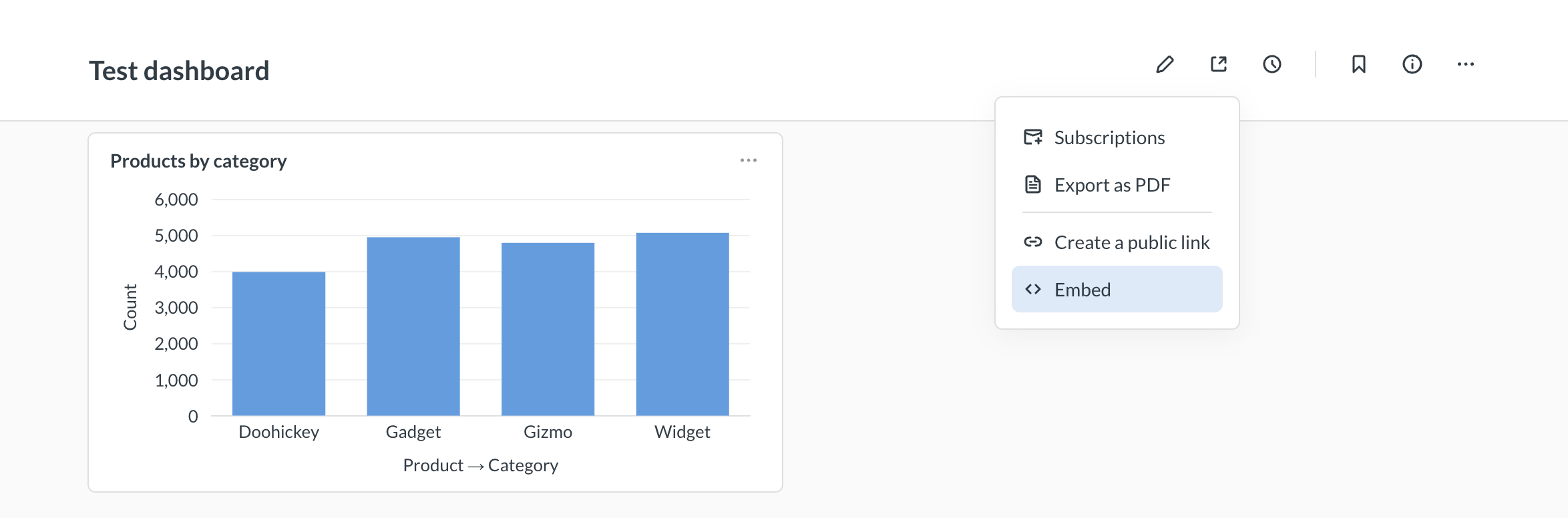
Customizing the appearance of modular embeds
You can style your embedded Metabase components with a theme.
On OSS and Starter plans, embeds come with two theme presets: light and dark.
On Pro and Enterprise plans, you can:
- Save reusable themes, then pick one in the embed wizard.
- Customize individual colors, backgrounds, fonts, and more in your embedding code. See Advanced theming.
Dark mode and light mode
By default, components that you embed using the SDK will use a light mode theme.
To use dark mode, set theme.preset to "dark" in the defineMetabaseConfig() function of your embedding code snippet:
defineMetabaseConfig({
  theme: {
    preset: "dark", // or "light"
  },
});
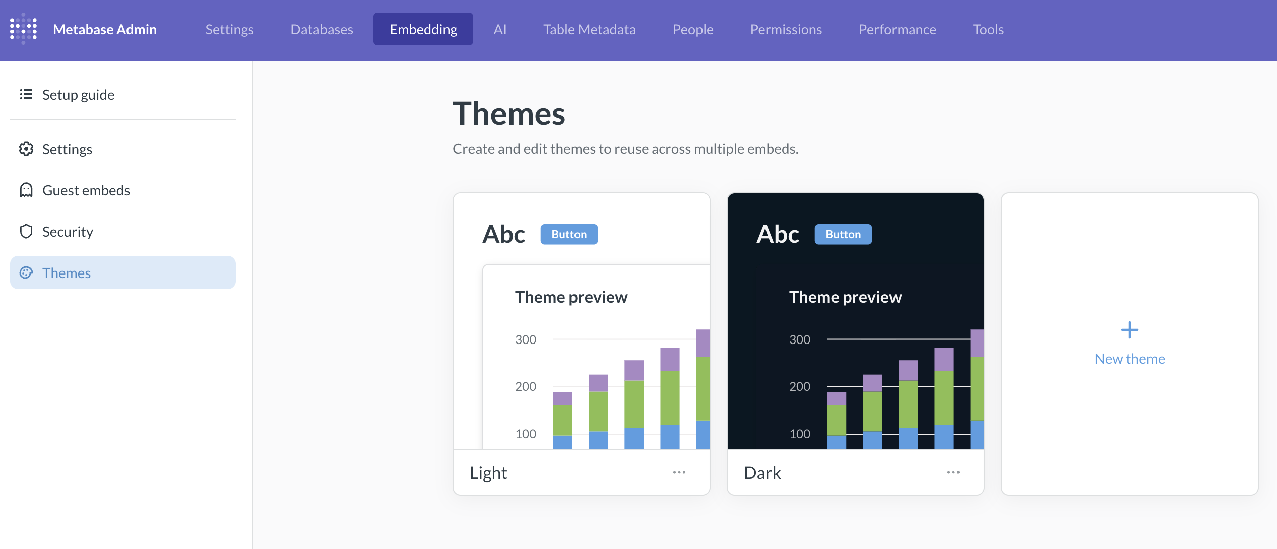
Embedding themes
Saved embedding themes are only available on Pro and Enterprise plans (both self-hosted and on Metabase Cloud).
A theme is a named set of colors and fonts that the embed wizard can copy into each new embed’s config. The embed doesn’t reference the theme, the embed carries its own inlined copy of the values. Changing or deleting the theme won’t affect existing embeds.
Manage themes
Go to Admin settings > Embedding > Themes.
Metabase ships with light and dark themes that pick up any appearance settings you’ve set on your Metabase (though you can tinker with these default themes as well, including removing theme like you can any other custom theme).
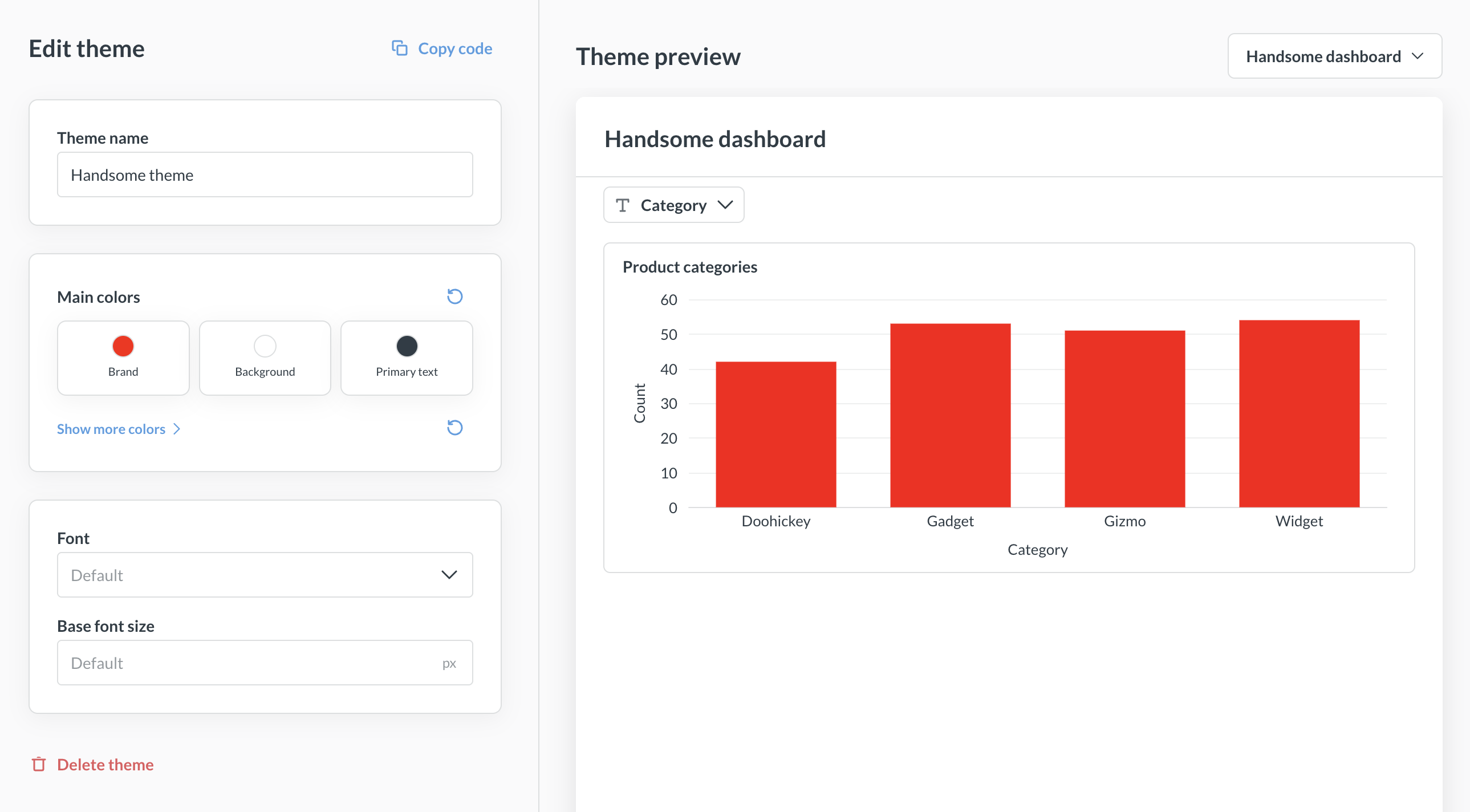
From the Themes tab, you can:
- Create a theme. Click + New theme, then set a name, colors, and font.
- Edit a theme. Click a theme card to open the editor. Changes show up in the live preview.
- Choose what the preview renders. Pick the dashboard or question used to preview the theme.
- Duplicate a theme. Handy if you want to vary an existing theme.
- Delete a theme. This deletion is eternal.
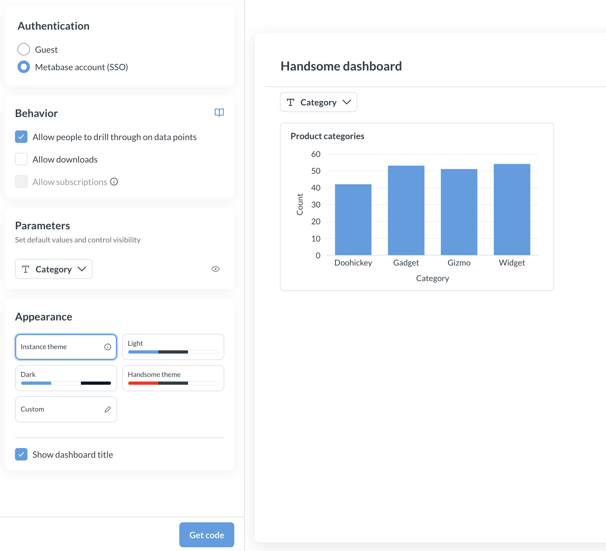
Apply a saved theme to a new embed
When you create a new embed using the embed wizard, the last customization step lets you pick:
- A saved theme from your list of themes.
- Instance theme to use Metabase’s instance defaults.
- Custom to set colors directly on this embed without saving them as a theme.
The theme you pick is inlined into the generated defineMetabaseConfig({ theme: ... }) snippet. Because each embed carries its own copy of the values, editing or deleting the theme in Metabase won’t change the themes in embeds that have already been generated. Those embeds keep the colors and fonts they were created with. To pick up theme changes in an existing embed, regenerate the snippet from the wizard, or edit the theme block in your code by hand.
Reuse a saved theme in the SDK
If you’re using the SDK, pass a theme to MetabaseProvider with defineMetabaseTheme, which accepts the same theme shape that you configure in the Themes admin UI. You can copy a saved theme’s values into your code:
import {
  MetabaseProvider,
  defineMetabaseTheme,
} from "@metabase/embedding-sdk-react";

const theme = defineMetabaseTheme({
  fontFamily: "Lato",
  colors: {
    brand: "#50e397",
    background: "#11123d",
    "text-primary": "#f9f9fc",
  },
});

export function App() {
  return (
    <MetabaseProvider authConfig={authConfig} theme={theme}>
      {/* your app */}
    </MetabaseProvider>
  );
}
For the full set of available colors and component overrides, see Theme options.
Advanced theming
Advanced theming modular embeds are only available on Pro and Enterprise plans (both self-hosted and on Metabase Cloud).
On Pro/Enterprise plan, you can configure granular appearance options, like background colors, font sizes etc. See the list of all theming options.
Add an advanced theme to your embed
If you have a saved theme, you can pick it directly in the embed wizard. The rest of this section covers further customization on top of (or instead of) a saved theme.
Some appearance options like brand, text, and background color are configurable in the embed wizard.
For other appearance settings, use the theme parameter with preset in the defineMetabaseConfig() function in your embedding code snippet. For example:
defineMetabaseConfig({
  theme: {
    colors: {
      background: "#FFFFFF",
      "text-primary": "hsla(204, 66%, 8%, 0.84)",
      brand: "hsla(208, 72%, 60%, 1.00)",
      "background-hover": "rgb(236, 236, 236)",
      "background-disabled": "rgb(231, 231, 231)",
      "background-secondary": "rgb(233, 233, 233)",
      "background-light": "rgb(233, 233, 233)",
      "text-secondary": "rgba(9, 30, 44, 0.84)",
      "text-tertiary": "rgba(11, 37, 54, 0.84)",
      "brand-hover": "rgb(185, 216, 244)",
      "brand-hover-light": "rgb(238, 245, 252)",
    },
  },
  instanceUrl: "http://localhost:3000",
});
Theme options
Advanced theme options are only available on Pro and Enterprise plans (both self-hosted and on Metabase Cloud).
For advanced theme configuration options, you can configure the theme object in the object passed to the defineMetabaseConfig function, see Add an advanced theme to your embed. Here’s the list of all options available for customization:
{
  // Specify a font to use from the set of fonts supported by Metabase.
  // You can set the font to "Custom" to use the custom font
  // configured in your Metabase instance.
  "fontFamily": "Lato",

  // Override the base font size for every component.
  // This does not usually need to be set, as the components
  // inherit the font size from the parent container, such as the body.
  "fontSize": "16px",

  // Override the base line height for every component.
  "lineHeight": 1.5,

  // Match your application's color scheme
  "colors": {
    // The primary color of your application
    "brand": "#9B5966",

    // Lighter variation of the brand color. Used for hover and accented elements.
    "brand-hover": "#DDECFA",

    // Lightest variation of the brand color. Used for hover and accented elements.
    "brand-hover-light": "#EEF6FC",

    // The color of text that is most prominent
    "text-primary": "#4C5773",

    // The color of text that is less prominent
    "text-secondary": "#696E7B",

    // The color of text that is least prominent
    "text-tertiary": "#949AAB",

    // Default background color
    "background": "#FFFFFF",

    // Light background color for some control backgrounds.
    // Defaults are derived from `background` (slightly darker in light mode, much lighter in dark mode).
    "background-light": "#F0F2F5",

    // Slightly muted background color.
    "background-secondary": "#EDF2F5",

    // Slightly darker background color used for hover and accented elements
    "background-hover": "#F9FBFC",

    // Muted background color used for disabled elements, such as disabled buttons and inputs.
    "background-disabled": "#F3F5F7",

    // Color used for borders
    "border": "#EEECEC",

    // Color used for filters context
    "filter": "#7172AD",

    // Color used for aggregations and breakouts context
    "summarize": "#88BF4D",

    // Color used to indicate successful actions and positive values/trends
    "positive": "#BADC58",

    // Color used to indicate dangerous actions and negative values/trends
    "negative": "#FF7979",

    /** Color used to outline elements in focus */
    "focus": "#CAE1F7",

    /** Color used for popover shadows */
    "shadow": "rgba(0,0,0,0.08)",

    // Overrides the chart colors. Supports up to 8 colors
    // Limitation: this does not affect charts with custom series color
    "charts": [
      // can either be a hex code
      "#9B59B6",

      // or a color object. tint and shade represents lighter and darker variations
      // only base color is required, while tint and shade are optional
      { "base": "#E74C3C", "tint": "#EE6B56", "shade": "#CB4436" }
    ]
  },

  "components": {
    // Dashboard
    "dashboard": {
      // Background color for all dashboards
      "backgroundColor": "#2F3640",

      // Border color of the dashboard grid, shown only when editing dashboards.
      // Defaults to `colors.border`
      "gridBorderColor": "#EEECEC",

      "card": {
        // Background color for all dashboard cards
        "backgroundColor": "#2D2D30",

        // Apply a border color instead of shadow for dashboard cards.
        // Unset by default.
        "border": "1px solid #EEECEC"
      }
    },

    // Question
    "question": {
      // Background color for all questions
      "backgroundColor": "#2E353B",

      // Toolbar of the default interactive question layout
      "toolbar": {
        "backgroundColor": "#F3F5F7"
      }
    },

    // Tooltips
    "tooltip": {
      // Tooltip text color.
      "textColor": "#FFFFFF",

      // Secondary text color shown in the tooltip, e.g. for tooltip headers and percentage changes.
      "secondaryTextColor": "#949AAB",

      // Tooltip background color.
      "backgroundColor": "#2E353B",

      // Tooltip background color for focused rows.
      "focusedBackgroundColor": "#0A0E10"
    },

    // Data table
    "table": {
      "cell": {
        // Text color of cells, defaults to `text-primary`
        "textColor": "#4C5773",

        // Default background color of cells, defaults to `background`
        "backgroundColor": "#FFFFFF",

        // Font size of cell values, defaults to ~12.5px
        "fontSize": "12.5px"
      },

      "idColumn": {
        // Text color of ID column, defaults to `brand`
        "textColor": "#9B5966",

        // Background color of ID column, defaults to a lighter shade of `brand`
        "backgroundColor": "#F5E9EB"
      }
    },

    // Number chart
    "number": {
      // Value displayed on number charts.
      // This also applies to the primary value in trend charts.
      "value": {
        "fontSize": "24px",
        "lineHeight": "21px"
      }
    },

    // Cartesian chart
    "cartesian": {
      // Padding around the cartesian charts.
      // Uses CSS's `padding` property format.
      "padding": "4px 8px"
    },

    // Pivot table
    "pivotTable": {
      "cell": {
        // Font size of cell values, defaults to ~12px
        "fontSize": "12px"
      },

      // Pivot row toggle to expand or collapse row
      "rowToggle": {
        "textColor": "#FFFFFF",
        "backgroundColor": "#95A5A6"
      }
    },

    "collectionBrowser": {
      "breadcrumbs": {
        "expandButton": {
          "textColor": "#8118F4",
          "backgroundColor": "#767D7C",
          "hoverTextColor": "#CE8C8C",
          "hoverBackgroundColor": "#69264B"
        }
      }
    },

    // Popover are used in components such as click actions in interactive questions.
    "popover": {
      // z-index of the popover. Defaults to 200.
      "zIndex": 200
    }
  }
}
Can’t see a modal? Bump the z-index
If your app renders its own modal, drawer, or backdrop at a high z-index, SDK-internal overlays (like a save dialog) may be hidden behind your overlay.
The SDK defaults popovers to zIndex: 200, which may be lower than your app’s overlay settings. All you need to do in this case is raise the SDK popover z-index above your overlay via defineMetabaseTheme:
import {
  MetabaseProvider,
  defineMetabaseTheme,
} from "@metabase/embedding-sdk-react";

const theme = defineMetabaseTheme({
  components: {
    //... Other theme settings
    popover: {
      // Set above your overlay's z-index.
      // For example, if your modal is at 1000, use 1001.
      zIndex: 1001,
    },
  },
});

export function App() {
  return (
    <MetabaseProvider authConfig={authConfig} theme={theme}>
      {/* your app */}
    </MetabaseProvider>
  );
}
Limitations
- CSS variables aren’t yet supported. If you’d like Metabase to support CSS variables, please upvote this feature request.
- Colors set in the visualization settings for a question will override theme colors.
Read docs for other versions of Metabase.